ProgressBar
ProgressBar 基础
基本的属性
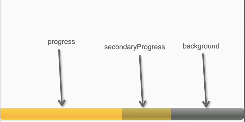
- android:max:进度条的最大值
- android:progress:进度条已完成进度值
- android:progressDrawable:设置轨道对应的 Drawable 对象
- android:secondaryProgress:设置进度条的第二进度(如播放视频时的缓冲进度)
- android:indeterminate:如果设置成 true,则进度条不精确显示进度(会一直进行动画)
- android:indeterminateDrawable:设置不显示进度的进度条的 Drawable 对象
- android:indeterminateDuration:设置不精确显示进度的持续时间
- ` style=”?android:attr/progressBarStyleHorizontal” ` 设置进度条的样式(水平样式)
style="?android:attr/progressBarStyleLarge"设置进度条的样式(垂直样式),圆形进度条
ProgressBar 效果图如下图所示:
示例:
1
2
3
4
5
6
7
8
9
10
11
12
13
14
15
16
17
18
19
20
21
22
23
24
25
26
27
28
29
30
31
32
33
34
35
36
37
<ProgressBar
	style="@android:style/Widget.ProgressBar.Small"
	android:layout_width="wrap_content"
	android:layout_height="wrap_content"
	android:layout_marginTop="10dp" />

<ProgressBar
	android:layout_width="wrap_content"
	android:layout_height="wrap_content"
	android:layout_marginTop="10dp" />

<ProgressBar
	style="@android:style/Widget.ProgressBar.Large"
	android:layout_width="wrap_content"
	android:layout_height="wrap_content"
	android:layout_marginTop="10dp" />

<ProgressBar
	android:id="@+id/sb_no_beautiful"
	style="@android:style/Widget.ProgressBar.Horizontal"
	android:layout_width="match_parent"
	android:layout_height="wrap_content"
	android:layout_marginTop="10dp"
	android:max="100"
	android:progress="50"
	android:secondaryProgress="70" />

<ProgressBar
	android:id="@+id/sb_no_beautiful2"
	style="@android:style/Widget.Holo.ProgressBar.Horizontal"
	android:layout_width="match_parent"
	android:layout_height="wrap_content"
	android:layout_marginTop="10dp"
	android:indeterminate="true"
	android:max="100"
	android:progress="50"
	android:secondaryProgress="70" />
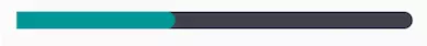
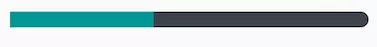
效果:
android:indeterminate
`
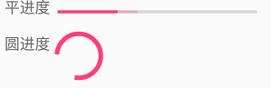
在对进度条 SeekBar 或者 ProgressBar 设置进度的时候,有些时候我们并不知具体进度值是多少,但是也需要有动态进度的提醒。如下图:
- 实现如上效果,设置
indeterminate属性为 true 即可,那么进度条将采用 “ 模糊模式 “
1
2
3
4
5
6
7
8
9
10
11
<SeekBar
    android:layout_width="match_parent"
    android:layout_height="wrap_content"
    android:layout_centerInParent="true"
    android:indeterminate="true"/>

<ProgressBar
    android:layout_width="match_parent"
    android:layout_height="wrap_content"
    style="@style/Widget.AppCompat.ProgressBar.Horizontal"
    android:indeterminate="true"/>
- 设置
indeterminate属性为 false,则进度条采用 “ 非模糊模式 “。则可以根据实际需求修改进度。
secondaryProgress
比如下载单个文件的时候,secondaryProgress 可以表示包含缓冲区的进度,progress 表示实际已经写入磁盘的进度
下载多个文件时,secondaryProgress 可以表示当前文件下载进度,progress 表示所有文件下载进度
自定义样式的 seekbar 中,progress 和 secondaryprogress 要根据其所在 layerlist 中的先后顺序,设置其中后面出现的透明度为非 100% 不透明的,这样才能让底下的另一个可见
自带样式
` @android:style/Widget.ProgressBar.Horizontal `
1
2
3
4
5
6
7
8
<style name="Widget.ProgressBar.Horizontal">
	<item name="indeterminateOnly">false</item>
	<item name="progressDrawable">@drawable/progress_horizontal</item>
	<item name="indeterminateDrawable">@drawable/progress_indeterminate_horizontal</item>
	<item name="minHeight">20dip</item>
	<item name="maxHeight">20dip</item>
	<item name="mirrorForRtl">true</item>
</style>
看看@drawable/progress_horizontal:
1
2
3
4
5
6
7
8
9
10
11
12
13
14
15
16
17
18
19
20
21
22
23
24
25
26
27
28
29
30
31
32
33
34
35
36
37
38
39
<layer-list xmlns:android="http://schemas.android.com/apk/res/android">
	<item android:id="@android:id/background">
		<shape>
			<corners android:radius="5dip" />
			<gradient
					android:startColor="#ff9d9e9d"
					android:centerColor="#ff5a5d5a"
					android:centerY="0.75"
					android:endColor="#ff747674"
					android:angle="270"/>
		</shape>
	</item>
	<item android:id="@android:id/secondaryProgress">
		<clip>
			<shape>
				<corners android:radius="5dip" />
				<gradient
						android:startColor="#80ffd300"
						android:centerColor="#80ffb600"
						android:centerY="0.75"
						android:endColor="#a0ffcb00"
						android:angle="270"/>
			</shape>
		</clip>
	</item>
	<item android:id="@android:id/progress">
		<clip>
			<shape>
				<corners android:radius="5dip" />
				<gradient
						android:startColor="#ffffd300"
						android:centerColor="#ffffb600"
						android:centerY="0.75"
						android:endColor="#ffffcb00"
						android:angle="270"/>
			</shape>
		</clip>
	</item>
</layer-list>
一个样式文件,分别操控了 background/secondaryProgress/progress,这样我们很容易推测出
再看看 @drawable/progress_indeterminate_horizontal
1
2
3
4
5
<animation-list xmlns:android="http://schemas.android.com/apk/res/android" android:oneshot="false">
    <item android:drawable="@drawable/progressbar_indeterminate1" android:duration="200" />
    <item android:drawable="@drawable/progressbar_indeterminate2" android:duration="200" />
    <item android:drawable="@drawable/progressbar_indeterminate3" android:duration="200" />
</animation-list>
这是 indeterminate 模式下的样式
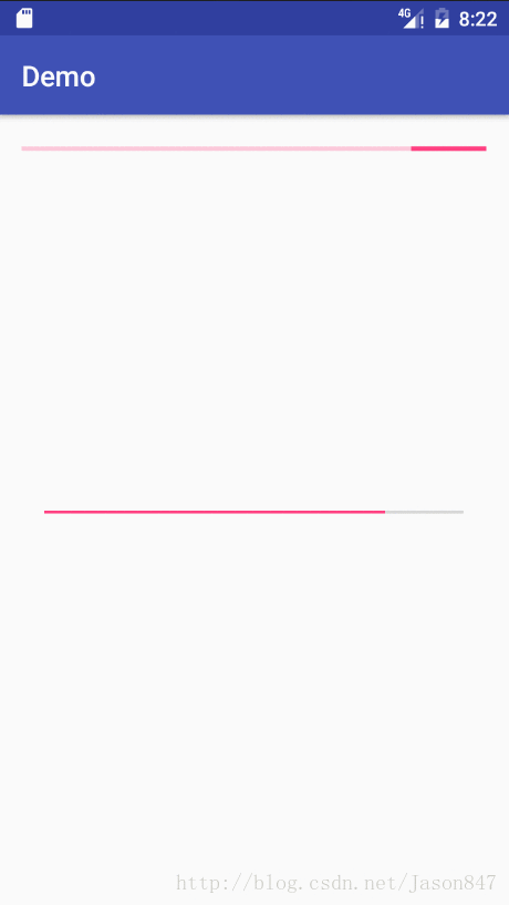
ProgressBar 问题
当前 setProgress 和上次一样,进度样式未更新
1
2
3
4
5
6
7
8
9
10
11
12
/**
 * https://stackoverflow.com/questions/18866548/android-progressbar-not-updating
 */
class FixProgressBar @JvmOverloads constructor(
    context: Context, attrs: AttributeSet? = null, defStyleAttr: Int = 0
) : ProgressBar(context, attrs, defStyleAttr) {

    override fun setProgress(progress: Int) {
        super.setProgress(0)
        super.setProgress(progress)
    }
}
自定义 ProgressBar 样式
自定义圆形 ProgressBar 样式
就是自定义 ProgressBar 的 indeterminateDrawable 属性
xml
改 indeterminateDrawable 属性
1
2
3
4
5
6
<style name="Widget.ProgressBar.Horizontal">
    <item name="android:indeterminateOnly">false</item>
    <item name="android:indeterminateDrawable">@drawable/audio_play_loading</item>
    <item name="android:minHeight">20dip</item>
    <item name="android:maxHeight">20dip</item>
</style>
代码
1
2
mLoadingDrawable = ContextCompat.getDrawable(context, R.drawable.audio_play_loading);
mPbLoading.setIndeterminateDrawable(mLoadingDrawable);
自旋转动画:
1
2
3
4
5
6
7
8
9
10
11
<?xml version="1.0" encoding="utf-8"?>
<layer-list xmlns:android="http://schemas.android.com/apk/res/android">
    <item>
        <rotate
                android:drawable="@drawable/ic_audio_play_loading"
                android:pivotX="50%"
                android:pivotY="50%"
                android:fromDegrees="0"
                android:toDegrees="360"/>
    </item>
</layer-list>
水平二级 ProgressBar
系统默认的 ProgressBar
系统默认的 ProgressBar 样式:\sdk\platforms\android-17\data\res\values\styles.xml
1、默认的 ProgressBar 样式
1
2
3
4
5
6
7
8
9
10
<style name="Widget.ProgressBar">
    <item name="android:indeterminateOnly">true</item>
    <item name="android:indeterminateDrawable">@android:drawable/progress_medium_white</item>
    <item name="android:indeterminateBehavior">repeat</item>
    <item name="android:indeterminateDuration">3500</item>
    <item name="android:minWidth">48dip</item>
    <item name="android:maxWidth">48dip</item>
    <item name="android:minHeight">48dip</item>
    <item name="android:maxHeight">48dip</item>
</style>
系统默认的水平的 ProgressBar 的样式
1
2
3
4
5
6
7
<style name="Widget.ProgressBar.Horizontal">
    <item name="android:indeterminateOnly">false</item>
    <item name="android:progressDrawable">@android:drawable/progress_horizontal</item>
    <item name="android:indeterminateDrawable">@android:drawable/progress_indeterminate_horizontal</item>
    <item name="android:minHeight">20dip</item>
    <item name="android:maxHeight">20dip</item>
</style>
progress_horizontal 为一个 xml 资源:为一个 layer-list 文件
自定义样式:二级样式
在我们的应用中的 styles.xml 中新建样式,复写要改变的样式,其他的继承父样式:
1
2
3
4
5
6
<!-- 自定义的水平滚动的进度条 -->
<style name="my_progressbar" parent="@android:style/Widget.ProgressBar.Horizontal">
    <item name="android:progressDrawable">@drawable/progress_horizontal</item>
    <item name="android:minHeight">20dip</item>
    <item name="android:maxHeight">20dip</item>
</style>
在 drawable 目录新建我们的资源文件 progress_horizontal.xml
1
2
3
4
5
6
7
8
9
10
11
12
13
14
15
<?xml version="1.0" encoding="utf-8"?>
<layer-list xmlns:android="http://schemas.android.com/apk/res/android" >
    <item
        android:id="@android:id/background"   <!-- 进度条背景 -->
        android:drawable="@drawable/security_progress_bg">
    </item>
    <item
        android:id="@android:id/secondaryProgress" <!-- 进度条二级进度 -->
        android:drawable="@drawable/security_progress">
    </item>
    <item
        android:id="@android:id/progress"
        android:drawable="@drawable/security_progress"> <!-- 进度条最外层进度 -->
    </item>
</layer-list>
背景(需要. 9?):

二级进度(需要.9?):

应用样式:
1
2
3
4
<ProgressBar
    style="@style/my_progressbar"
    android:layout_width="match_parent"
    android:layout_height="wrap_content"/>

案例:.9 图
task_prograss.xml(放在 drawable 目录下)
1
2
3
4
5
6
7
8
9
10
11
12
13
14
15
16
17
18
19
20
21
22
23
24
25
26
27
28
29
30
<?xml version="1.0" encoding="utf-8"?>
<layer-list xmlns:android="http://schemas.android.com/apk/res/android">

    <item android:id="@android:id/background">
        <shape>
            <corners android:radius="4dip" />

            <solid android:color="#3F000000" />
        </shape>
    </item>

    <item android:id="@android:id/secondaryProgress">
        <scale android:scaleWidth="100%">
            <shape>
                <corners android:radius="4dip" />
                <gradient
                    android:angle="0"
                    android:endColor="#FF9442"
                    android:startColor="#FF0F00" />
            </shape>
        </scale>
    </item>

    <item android:id="@android:id/progress">
        <scale
            android:drawable="@drawable/icon_progress_drawable"
            android:scaleWidth="100%" />
    </item>

</layer-list>
- xml 布局
1
2
3
4
5
6
7
<ProgressBar
    android:id="@+id/progress"
    style="?android:attr/progressBarStyleHorizontal"
    android:layout_width="match_parent"
    android:layout_height="8dp"
    android:layout_gravity="center_vertical"
    android:progressDrawable="@drawable/task_prograss" />
- 点 9 图
icon_progress_drawable:

- 效果

案例 2: .9 图
1
2
3
4
5
6
7
8
9
10
11
12
<ProgressBar
	android:id="@+id/pb1"
	style="?android:attr/progressBarStyleHorizontal"
	android:layout_width="match_parent"
	android:layout_height="@dimen/dp_10"
	android:layout_marginVertical="@dimen/dp_3_5"
	android:max="100"
	android:progress="20"
	android:progressDrawable="@drawable/tow_level_progress_horizontal"
	android:secondaryProgress="20"
	android:visibility="visible" />
@drawable/tow_level_progress_horizontal
1
2
3
4
5
6
7
8
9
10
11
12
13
14
15
16
17
18
19
20
21
22
23
24
25
26
27
28
29
30
31
32
33
34
35
36
37
38
39
40
41
42
43
44
45
46
<?xml version="1.0" encoding="utf-8"?>
<layer-list xmlns:android="http://schemas.android.com/apk/res/android">

    <item android:id="@android:id/background">
        <shape>
            <corners android:radius="4dip" />

            <solid android:color="@color/sui_color_black_alpha10" />
        </shape>
    </item>

    <!--<item android:id="@android:id/secondaryProgress">
        <clip>
            <shape>
                <corners android:radius="4dip" />
                <gradient
                    android:angle="0"
                    android:endColor="@color/sui_color_blue_dark_3d"
                    android:startColor="@color/sui_color_yellow" />
            </shape>
        </clip>
    </item>-->
    <item android:id="@android:id/secondaryProgress">
        <scale android:scaleWidth="100%">
            <shape>
                <corners android:radius="4dip" />
                <gradient
                    android:angle="0"
                    android:endColor="@color/sui_color_blue_dark_3d"
                    android:startColor="@color/sui_color_yellow" />
            </shape>
        </scale>
    </item>

    <!--<item android:id="@android:id/progress">
        <clip
            android:drawable="@drawable/progress_cover"
            android:scaleWidth="100%" />
    </item>-->
    <item android:id="@android:id/progress">
        <scale
            android:drawable="@drawable/progress_cover"
            android:scaleWidth="100%" />
    </item>

</layer-list>
progress_cover.9.png

- 效果:

ProgressBar 中间进度条的进度两端是圆角
ProgressBar 自定义的时候可能会遇到一个问题,希望进度条中的进度的两端都是圆角的(或者进度的末端是圆角的)
但是根据自定义的 shape 或者是 layer-list 却总是很难做到,几乎都是被 clip 成了直角的样子;
为什么是直角的?原因就是被 clip 给切了,所以我们不能够用 clip,而要使用 scale 这个标签。而上面链接给出的解答是定义一个.9 的图片就能满足要求,由于我们这里是纯色的一个进度,所以没有必要通过再制作一个.9 的图片,而只需要通过同样的方法引用我们定义的一个 shape 就可以了
1
2
3
4
5
6
7
8
9
10
11
12
13
14
15
16
17
18
19
20
21
22
23
24
25
26
27
28
29
30
31
32
33
34
35
36
37
38
39
40
41
42
43
44
45
46
47

<layer-list xmlns:android="http://schemas.android.com/apk/res/android">
    <item android:id="@android:id/background">
        <shape>
            <corners android:radius="@dimen/qb_px_3" />
            <gradient
                    android:angle="270"
                    android:centerColor="@color/transparent_30_percent_white"
                    android:centerY="0.75"
                    android:endColor="@color/transparent_30_percent_white"
                    android:startColor="@color/transparent_30_percent_white" />
        </shape>
    </item>

    <!--我的没有第二背景,故第二背景图没有画-->
    <item android:id="@android:id/secondaryProgress">
        <scale android:scaleWidth="100%">
            <shape>
                <corners
                        android:bottomRightRadius="@dimen/qb_px_3"
                        android:topRightRadius="@dimen/qb_px_3" />
                <gradient
                        android:angle="270"
                        android:centerColor="@color/white"
                        android:centerY="0.75"
                        android:endColor="@color/white"
                        android:startColor="@color/white" />
            </shape>
        </scale>
    </item>
    <!--进度条中的进度-->
    <item android:id="@android:id/progress">
        <scale android:scaleWidth="100%">
            <shape>
                <corners
                        android:bottomRightRadius="@dimen/qb_px_3"
                        android:topRightRadius="@dimen/qb_px_3" />
                <gradient
                        android:angle="270"
                        android:centerColor="@color/white"
                        android:centerY="0.75"
                        android:endColor="@color/white"
                        android:startColor="@color/white" />
            </shape>
        </scale>
    </item>
</layer-list>
.9+scale 解决
Android 开发中 Progress 需要两边都是圆角怎么办? https://segmentfault.com/q/1010000004128363
两端和进度都是圆角
1
2
3
4
5
6
7
8
9
10
11
12
13
14
15
16
17
18
19
20
21
22
23
24
25
26
27
28
29
30
31
32
33
34
35
36
37
38
39
40
41
<layer-list xmlns:android="http://schemas.android.com/apk/res/android">
    <item android:id="@android:id/background">
        <shape>
            <corners android:radius="@dimen/qb_px_3"/>
            <gradient
                    android:startColor="@color/common_medium_line_color"
                    android:centerColor="@color/common_medium_line_color"
                    android:centerY="0.75"
                    android:endColor="@color/common_medium_line_color"
                    android:angle="270"/>
        </shape>
    </item>

    <!--我的没有第二背景,故第二背景图没有画-->
    <item android:id="@android:id/secondaryProgress">
        <clip>
            <shape>
                <corners android:radius="@dimen/qb_px_3"/>
                <gradient
                        android:startColor="@color/colorAccent"
                        android:centerColor="@color/colorAccent"
                        android:centerY="0.75"
                        android:endColor="@color/colorAccent"
                        android:angle="270"/>
            </shape>
        </clip>
    </item>
    <item android:id="@android:id/progress">
        <scale android:scaleWidth="100%">
            <shape>
                <corners android:radius="@dimen/qb_px_3"/>
                <gradient
                        android:startColor="@color/colorAccent"
                        android:centerColor="@color/colorAccent"
                        android:centerY="0.75"
                        android:endColor="@color/colorAccent"
                        android:angle="270"/>
            </shape>
        </scale>
    </item>
</layer-list>
带背景的进度
- ProgressBar
1
2
3
4
5
6
7
8
9
10
<ProgressBar
	android:id="@+id/pb2"
	style="@style/StyleProgressBarMini"
	android:layout_width="match_parent"
	android:layout_height="40dp"
	android:layout_marginVertical="@dimen/dp_3_5"
	android:background="@drawable/shape_progressbar_bg"
	android:indeterminate="false"
	android:max="100"
	android:progress="50" />
- 进度条的背景设置:
drawable/shape_progressbar_bg.xmlandroid:drawable 也可以使用.9 图片
1
2
3
4
5
6
7
8
9
10
11
12
13
14
<?xml version="1.0" encoding="UTF-8"?>
<shape xmlns:android="http://schemas.android.com/apk/res/android"
    android:shape="rectangle">
    <!-- 边框填充的颜色 -->
    <solid android:color="#ffcccc" />
    <!-- 设置进度条的四个角为弧形 弧形的半径-->
    <corners android:radius="90dp" />
    <!--padding:边界的间隔-->
    <padding
        android:bottom="2dp"
        android:left="2dp"
        android:right="2dp"
        android:top="2dp" />
</shape>
- 进度条的样式设置,
values/styles.xml/StyleProgressBarMini
1
2
3
4
5
6
7
8
9
<style name="StyleProgressBarMini" parent="@android:style/Widget.ProgressBar.Horizontal">
	<item name="android:maxHeight">100dip</item>
	<item name="android:minHeight">10dip</item>
	<item name="android:indeterminateOnly">false</item>
	<item name="android:indeterminateDrawable">
		@android:drawable/progress_indeterminate_horizontal
	</item>
	<item name="android:progressDrawable">@drawable/shape_progressbar_mini</item>
</style>
- 进度条颜色设置 android:progressDrawable:
drawable/shape_progressbar_mini.xml
1
2
3
4
5
6
7
8
9
10
11
12
13
14
15
16
17
18
19
20
21
22
23
24
25
26
27
28
29
30
31
32
33
34
35
36
37
38
39
40
41
42
43
<?xml version="1.0" encoding="utf-8"?>
<layer-list xmlns:android="http://schemas.android.com/apk/res/android">
    <!-- 进度条里面的背景 -->
    <item android:id="@android:id/background">
        <shape>
            <corners android:radius="90dp" />
            <gradient
                android:angle="270"
                android:centerY="0.75"
                android:endColor="#98f7e9"
                android:startColor="#98f7e9" />
        </shape>
    </item>

    <!-- 第二进度条的背景   左边是圆形 但右边不能-->
    <item android:id="@android:id/secondaryProgress">
        <clip>
            <shape>
                <corners android:radius="5dip" />

                <gradient
                    android:angle="270"
                    android:centerY="0.75"
                    android:endColor="#df0024"
                    android:startColor="#df0024" />
            </shape>
        </clip>
    </item>

    <!--左边是圆形 但右边不能-->
    <item android:id="@android:id/progress">
        <clip>
            <shape>
                <corners android:radius="90dp" />
                <gradient
                    android:angle="0"
                    android:centerY="0.75"
                    android:endColor="#FFBC51"
                    android:startColor="#FF7F46" />
            </shape>
        </clip>
    </item>
</layer-list>
- 效果(进度条右边不是圆弧 而是直角的)
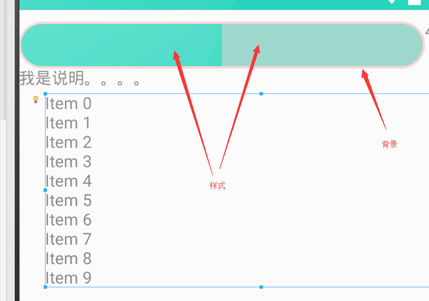
- 当前进度条圆角:不能用
clip,用scale
1
2
3
4
5
6
7
8
9
10
11
12
13
14
15
16
17
18
19
20
21
22
23
24
25
26
27
28
29
30
31
32
33
34
35
36
37
38
39
40
41
42
43
<?xml version="1.0" encoding="utf-8"?>
<layer-list xmlns:android="http://schemas.android.com/apk/res/android">
    <!-- 进度条里面的背景 -->
    <item android:id="@android:id/background">
        <shape>
            <corners android:radius="90dp" />
            <gradient
                android:angle="270"
                android:centerY="0.75"
                android:endColor="#98f7e9"
                android:startColor="#98f7e9" />
        </shape>
    </item>

    <!-- 第二进度条的背景   左边是圆形 但右边不能-->
    <item android:id="@android:id/secondaryProgress">
        <clip>
            <shape>
                <corners android:radius="5dip" />

                <gradient
                    android:angle="270"
                    android:centerY="0.75"
                    android:endColor="#df0024"
                    android:startColor="#df0024" />
            </shape>
        </clip>
    </item>

    <item android:id="@android:id/progress">
        <scale android:scaleWidth="100%">
            <shape>
                <corners android:radius="90dp" />
                <gradient
                    android:angle="0"
                    android:centerY="0.75"
                    android:endColor="#FFBC51"
                    android:startColor="#FF7F46" />
            </shape>
        </scale>
    </item>

</layer-list>
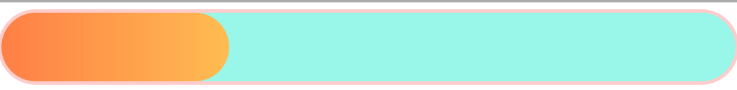
渐变进度条
圆环进度
1
2
3
4
5
6
7
8
9
10
11
12
13
14
15
16
17
18
19
20
21
22
23
24
25
26
27
28
29
30
31
32
33
34
35
36
37
38
39
40
41
42
43
44
45
46
47
48
49
50
51
52
53
54
55
56
57
58
59
60
61
62
63
64
65
66
67
68
69
70
71
72
73
74
75
76
public class MyCircleProgress extends View {

    private static final String TAG = "MyCircleProgress";

    private Paint _paint;
    private RectF _rectF;
    private Rect _rect;
    private int _current = 1, _max = 100;
    //圆弧(也可以说是圆环)的宽度
    private float _arcWidth = 30;
    //控件的宽度
    private float _width;

    public MyCircleProgress(Context context) {
        this(context, null);
    }

    public MyCircleProgress(Context context, AttributeSet attrs) {
        this(context, attrs, 0);
    }

    public MyCircleProgress(Context context, AttributeSet attrs, int defStyleAttr) {
        super(context, attrs, defStyleAttr);
        _paint = new Paint();
        _paint.setAntiAlias(true);
        _rectF = new RectF();
        _rect = new Rect();
    }

    public void SetCurrent(int _current) {
        Log.i(TAG, "当前值:" + _current + ",最大值:" + _max);
        this._current = _current;
        invalidate();
    }

    public void SetMax(int _max) {
        this._max = _max;
    }

    @Override
    protected void onMeasure(int widthMeasureSpec, int heightMeasureSpec) {
        super.onMeasure(widthMeasureSpec, heightMeasureSpec);
        //getMeasuredWidth获取的是view的原始大小,也就是xml中配置或者代码中设置的大小
        //getWidth获取的是view最终显示的大小,这个大小不一定等于原始大小
        _width = getMeasuredWidth();
    }

    @Override
    protected void onDraw(Canvas canvas) {
        super.onDraw(canvas);
        //绘制圆形
        //设置为空心圆,如果不理解绘制弧线是什么意思就把这里的属性改为“填充”,跑一下瞬间就明白了
        _paint.setStyle(Paint.Style.STROKE);
        //设置圆弧的宽度(圆环的宽度)
        _paint.setStrokeWidth(_arcWidth);
        _paint.setColor(Color.GRAY);
        //大圆的半径
        float bigCircleRadius = _width / 2;
        //小圆的半径
        float smallCircleRadius = bigCircleRadius - _arcWidth;
        //绘制小圆
        canvas.drawCircle(bigCircleRadius, bigCircleRadius, smallCircleRadius, _paint);
        _paint.setColor(BaseActivity.SPRING_GREEN);
        _rectF.set(_arcWidth, _arcWidth, _width - _arcWidth, _width - _arcWidth);
        //绘制圆弧
        canvas.drawArc(_rectF, 90, _current * 360 / _max, false, _paint);
        //计算百分比
        String txt = _current * 100 / _max + "%";
        _paint.setStrokeWidth(0);
        _paint.setTextSize(40);
        _paint.getTextBounds(txt, 0, txt.length(), _rect);
        _paint.setColor(BaseActivity.SPRING_GREEN);
        //绘制百分比
        canvas.drawText(txt, bigCircleRadius - _rect.width() / 2, bigCircleRadius + _rect.height() / 2, _paint);
    }
}
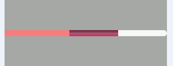
水平三级 ProgressBar
在 res 下创建 drawable 文件夹,新建文件 drawable/progressbar_color.xml
1
2
3
4
5
6
7
8
9
10
11
12
13
14
15
16
17
18
19
20
21
22
23
24
25
26
27
28
29
30
31
32
33
34
35
36
37
<?xml version="1.0" encoding="utf-8"?>
<layer-list xmlns:android="http://schemas.android.com/apk/res/android" >

    <!-- 背景  gradient是渐变,corners定义的是圆角 -->
    <item android:id="@android:id/background">
        <shape>
            <corners android:radius="10dp" />

            <solid android:color="#ffffff" />
        </shape>
    </item>
    <!-- 第二条进度条颜色 -->
    <item android:id="@android:id/secondaryProgress">
        <clip>
            <shape>
                <corners android:radius="10dip" />

                <gradient
                    android:angle="90.0"
                    android:centerColor="#ac6079"
                    android:centerY="0.45"
                    android:endColor="#6c213a"
                    android:startColor="#e71a5e" />
            </shape>
        </clip>
    </item>
    <!-- 进度条 -->
    <item android:id="@android:id/progress">
        <clip>
            <shape>
                <corners android:radius="10dip" />

                <solid android:color="#FF8080" />
            </shape>
        </clip>
    </item>
</layer-list>
然后在布局中引用就可以了。
1
2
3
4
5
6
7
8
9
<ProgressBar
    android:id="@+id/my_progress"
    android:layout_width="match_parent"
    android:layout_height="12dp"
    android:max="100"
    android:progress="40"
    android:secondaryProgress="70"
    style="?android:attr/progressBarStyleHorizontal"
    android:progressDrawable="@drawable/progressbar_color"/>