MaterialDesign动画
圆形揭露动画 (Circular Reveal)
https://developer.android.com/training/animation/reveal-or-hide-view?hl=zh-cn#Reveal
在 Android 5.0 及更高的版本中,加入了一种全新的视觉动画效果,就是揭露动画。揭露动画在系统中很常见,就是类似波纹的效果, 从某一个点向四周展开或者从四周向某一点聚合起来,可以用在 Activity 里面的 View 动画效果, 也可以使用在 Activity 跳转过渡动画中。
Circular Reveal
使用揭露动画非常简单,Android Sdk 中已经帮我们提供了一个工具类 ViewAnimationUtils 来创建揭露动画。ViewAnimationUtils 里面只有一个静态方法 createCircularReveal(View view, int centerX, int centerY, float startRadius, float endRadius), 返回一个 Animator 动画对象。
方法原型:
1
2
3
4
5
6
7
8
9
10
11
12
13
14
15
16
17
public final class ViewAnimationUtils {
    private ViewAnimationUtils() {}
    /**
     * ......
     * @param view The View will be clipped to the animating circle.
     * @param centerX The x coordinate of the center of the animating circle, relative to
     *                <code>view</code>.
     * @param centerY The y coordinate of the center of the animating circle, relative to
     *                <code>view</code>.
     * @param startRadius The starting radius of the animating circle.
     * @param endRadius The ending radius of the animating circle.
     */
    public static Animator createCircularReveal(View view,
            int centerX,  int centerY, float startRadius, float endRadius) {
        return new RevealAnimator(view, centerX, centerY, startRadius, endRadius);
    }
}
ViewAnimationUtils.createCircularReveal() 方法能够为裁剪区域添加动画以揭露或隐藏视图。我们主要使用 createCircularReveal 方法, 该方法有四个参数:
- view 第一个参数是执行揭露动画的 View 视图
- centerX 第二个参数是相对于视图 View 的坐标系,动画圆的中心的 x 坐标
- centerY 第三个参数是相对于视图 View 的坐标系,动画圆的中心的 y 坐标
- startRadius 第四个参数是动画圆的起始半径。如果为 0 表示隐藏
- endRadius 第五个参数动画圆的结束半径。如果太小,就会揭露动画就是显示不全;如果太大,就会一闪而过
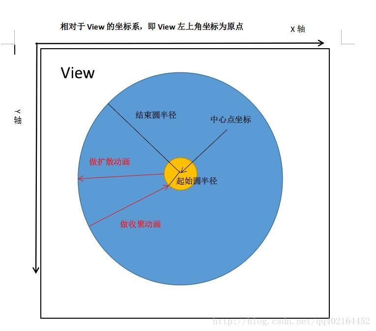
揭露动画有两种效果,一种是显示一组 UI 元素,另一种是隐藏一组 UI 元素:
- 以中心点为轴点,当开始半径小于结束半径时,从开始半径处向外扩大到结束半径处显示 View
- 以中心点为轴点,当开始半径大于结束半径时,从开始半径处向内缩小到结束半径处隐藏 View
重要特性
- 揭露动画是一个异步动画,它的回调方法都不能保证在准确的时间里调用,但误差不会很大。
- 揭露对象要先于动画开始前显示(View.VISIBLE),因为如果动画开始时,要揭露的对象处于隐藏状态,那么动画就不会有效果,因为隐藏状态是看不到效果的。所以是不能 在动画结束的回调里才设置 View VISIBLE,这时动画已经结束了不会看到任何效果了。(揭露动画时 View 需要 visible)
- 注意:揭露动画对象只能使用一次,不能被重新使用,也就是说每次使用揭露动画都要调用 ViewAnimationUtils.createCircularReveal() 返回一个揭露动画对象使用,同时一旦开始了动画就不能暂停或重新开始。揭露动画是一种异步动画,可以自动运行在 UI 线程上。 当揭露动画结束后,如果设置了 Animator.AnimatorListener 监听器,那么监听器的 onAnimationEnd(Animator) 方法会被调用, 但可能会被延迟调用,这取决于线程的响应能力。
View 上应用
1
2
3
4
5
6
7
8
9
10
11
12
13
14
15
16
17
18
19
20
21
22
23
24
25
26
27
28
29
30
31
32
33
34
35
36
37
38
39
40
41
42
43
fab.setOnClickListener(... {
launchRevealAnimation();
});
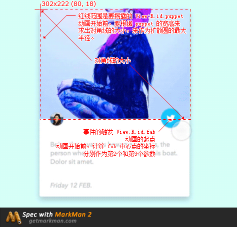
private void launchRevealAnimation() {
//求出第2个和第3个参数
int[] vLocation = new int[2];
fab.getLocationInWindow(vLocation);
int centerX = vLocation[0] + fab.getWidth() / 2;
int centerY = vLocation[1] + fab.getHeight() / 2;
//求出要揭露 View 的对角线,来作为扩散圆的最大半径
int hypotenuse = (int) Math.hypot(mPuppet.getWidth(), mPuppet.getHeight());
if (flag) {//隐藏 揭露对象
Animator circularReveal = ViewAnimationUtils.createCircularReveal(mPuppet, centerX, centerY, hypotenuse, 0);
circularReveal.setDuration(2000);
circularReveal.addListener(new Animator.AnimatorListener() {
@Override
public void onAnimationStart(Animator animation) {}
@Override
public void onAnimationEnd(Animator animation) {
mPuppet.setVisibility(View.GONE);
}
@Override
public void onAnimationCancel(Animator animation) {}
@Override
public void onAnimationRepeat(Animator animation) {}
});
circularReveal.start();
flag = false;
} else {//显示 揭露对象
Animator circularReveal = ViewAnimationUtils.createCircularReveal(mPuppet, centerX, centerY, 0, hypotenuse);
circularReveal.setDuration(2000);
//注意:这里显示 mPuppet 调用并没有在监听方法里,并且是在动画开始前调用。
mPuppet.setVisibility(View.VISIBLE);
circularReveal.start();
flag = true;
}
}
Activity 跳转使用揭露动画
待补充
Ref
https://github.com/hacket/Android-Animation-Set/tree/master/reveal-animation
Animate View State Changes / 视图状态动画
视图状态动画
所谓视图状态动画,就是 View 在状态改变时执行的动画效果。和之前我们通过 selector 选择器给 Button 设置不同状态下的背景效果是一样一样的。
因为视图状态动画是在 View 不同的状态下产生的动画效果,所以我们先来看一下 View 都有哪些状态: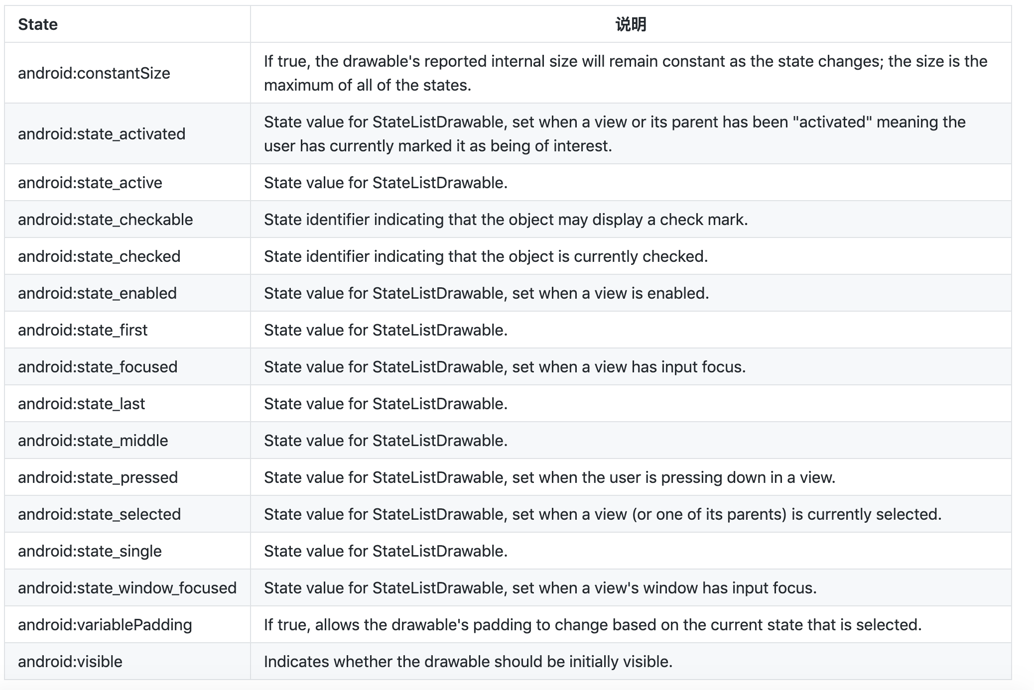
View 状态改变的动画主要是两个类:
- StateListAnimator 是个动画, 在 res/anim (或者 res/animator) 中(官方文档是放在 res/xml 中)
- AnimatedStateListDrawable 是个 Drawable, 在 res/drawable 中。
StateListAnimator
- 使用 StateListAnimator 为视图状态更改添加动画效果
https://developer.android.com/guide/topics/graphics/prop-animation#ViewState
通过 StateListAnimator 类,您可以定义在视图状态更改时运行的 Animator。此对象充当 Animator 对象的封装容器,只要指定的视图状态(例如 “ 按下 “ 或 “ 聚焦 “)发生更改,就会调用该动画。
可使用根 元素和子 元素在 XML 资源中定义 StateListAnimator,每个元素都指定一个由 StateListAnimator 类定义的不同视图状态。每个 都包含一个属性动画集的定义。
创建了一个状态列表 Animator,可在按下后更改视图的 x 和 y 比例
res/xml/animate_scale.xml
1
2
3
4
5
6
7
8
9
10
11
12
13
14
15
16
17
18
19
20
21
22
23
24
25
26
27
28
29
<?xml version="1.0" encoding="utf-8"?>
<selector xmlns:android="http://schemas.android.com/apk/res/android">
    <!-- the pressed state; increase x and y size to 150% -->
    <item android:state_pressed="true">
        <set>
            <objectAnimator android:propertyName="scaleX"
                android:duration="@android:integer/config_shortAnimTime"
                android:valueTo="1.5"
                android:valueType="floatType"/>
            <objectAnimator android:propertyName="scaleY"
                android:duration="@android:integer/config_shortAnimTime"
                android:valueTo="1.5"
                android:valueType="floatType"/>
        </set>
    </item>
    <!-- the default, non-pressed state; set x and y size to 100% -->
    <item android:state_pressed="false">
        <set>
            <objectAnimator android:propertyName="scaleX"
                android:duration="@android:integer/config_shortAnimTime"
                android:valueTo="1"
                android:valueType="floatType"/>
            <objectAnimator android:propertyName="scaleY"
                android:duration="@android:integer/config_shortAnimTime"
                android:valueTo="1"
                android:valueType="floatType"/>
        </set>
    </item>
</selector>
要将状态列表 Animator 附加到视图,请添加 android:stateListAnimator 属性,如下所示:
1
2
<Button android:stateListAnimator="@xml/animate_scale"
        ... />
或者使用代码:
1
2
val animator = AnimatorInflater.loadStateListAnimator(this, R.animator.animate_scale)
tv_animate_scale.stateListAnimator = animator
按下 z 轴变化
1
2
3
4
5
6
7
8
9
10
11
12
13
14
15
16
17
18
19
20
21
22
23
24
25
26
<?xml version="1.0" encoding="utf-8"?><!-- animate the translationZ property of a view when pressed -->
<selector xmlns:android="http://schemas.android.com/apk/res/android">
    <item android:state_pressed="true">
        <set>
            <objectAnimator
                android:duration="@android:integer/config_shortAnimTime"
                android:propertyName="translationZ"
                android:valueTo="50dp"
                android:valueType="floatType" />
            <!-- you could have other objectAnimator elements
                 here for "x" and "y", or other properties -->
        </set>
    </item>

    <item
        android:state_enabled="true"
        android:state_pressed="false">
        <set>
            <objectAnimator
                android:duration="100"
                android:propertyName="translationZ"
                android:valueTo="0"
                android:valueType="floatType" />
        </set>
    </item>
</selector>
如果是 TextView 要先设置 background 才有效果
AnimatedStateListDrawable
您还可以使用 AnimatedStateListDrawable 在状态更改间播放可绘制动画,而不是为视图的属性添加动画效果。Android 5.0 中的一些系统微件默认会使用这些动画。以下示例展示了如何将 AnimatedStateListDrawable 定义为 XML 资源:
1
2
3
4
5
6
7
8
9
10
11
12
13
14
15
16
17
18
19
20
21
22
<!-- res/drawable/myanimstatedrawable.xml -->
<animated-selector
    xmlns:android="http://schemas.android.com/apk/res/android">

    <!-- provide a different drawable for each state-->
    <item android:id="@+id/pressed" android:drawable="@drawable/drawableP"
        android:state_pressed="true"/>
    <item android:id="@+id/focused" android:drawable="@drawable/drawableF"
        android:state_focused="true"/>
    <item android:id="@id/default"
        android:drawable="@drawable/drawableD"/>

    <!-- specify a transition -->
    <transition android:fromId="@+id/default" android:toId="@+id/pressed">
        <animation-list>
            <item android:duration="15" android:drawable="@drawable/dt1"/>
            <item android:duration="15" android:drawable="@drawable/dt2"/>
            ...
        </animation-list>
    </transition>
    ...
</animated-selector>
Touch feedback
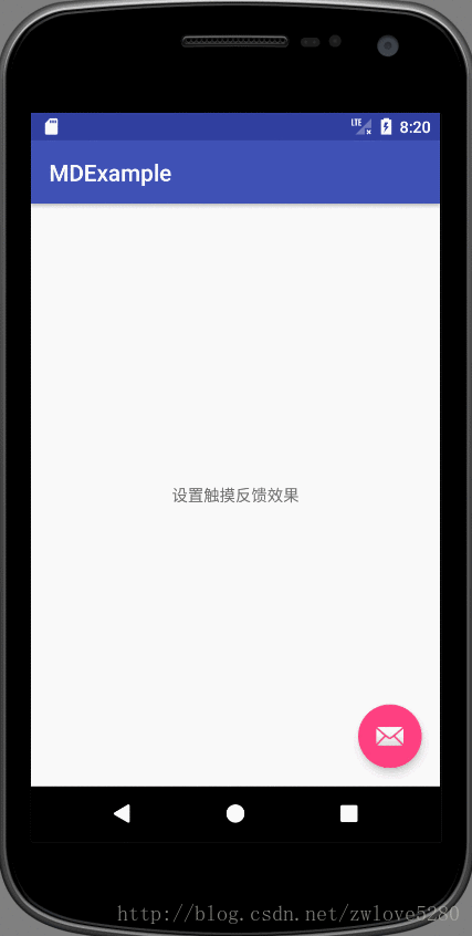
在 Android L 5.0 中加入了触摸反馈动画。其中最明显,最具代表性的就是波纹动画,比如当点击按钮或条目时会从点击的位置产生类似于波纹的扩散效果。
Material Design
Button 在 MD 中默认就有一个反馈动画,使用的是 RippleDrawable 类,这个类很有意思,它根据手指与 UI 交互的不同状态 (例如,长按,短按,抬起) 转化为不同的波纹效果 (Ripple Effect)。
并不是所有的控件都有默认的触摸反馈的波纹效果,例如 TextView
可以使用系统提供的两个属性来在 XML 中给 View 设置背景,也就是 android:background:
- android:background=”?android:attr/selectableItemBackground” 波纹有边界
- android:background=”android:attr/selectableItemBackgroundBorderless” 波纹超出边界
selectableItemBackgroundBorderless在 API 21 才可用。
设置颜色:
android:colorControlHighlight:设置波纹颜色,涟漪
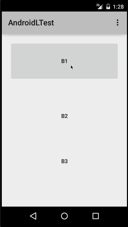
使用效果如下:
- B1 是不设任何背景的按钮
- B2 设置了?android:attr/selectableItemBackground
- B3 设置了?android:attr/selectableItemBackgroundBorderless
自定义 RippleDrawable(继承 LayerDrawable)
简单 ripple
无边界限制
1
2
3
4
<?xml version="1.0" encoding="utf-8"?>
<ripple xmlns:android="http://schemas.android.com/apk/res/android"
        android:color="@color/colorPrimary">
</ripple>


添加 layer
RippleDrawable 是继承自 LayerDrawable,所以可以加一层 layer,来限制波纹的大小
1
2
3
4
5
<?xml version="1.0" encoding="utf-8"?>
<ripple xmlns:android="http://schemas.android.com/apk/res/android"
        android:color="@color/colorPrimary">  <!--按下颜色-->
    <item android:drawable="@android:color/white"/> <!--填充颜色-->
</ripple>

带边框的波纹
添加 mask
其实 RippleDrawable 还有一个很有意思的事情,它又一个遮罩层,id 固定为 android.R.id.mask,既然叫做遮罩层,那就是限制波纹的范围了。
1
2
3
4
5
6
7
8
9
10
<?xml version="1.0" encoding="utf-8"?>
<ripple xmlns:android="http://schemas.android.com/apk/res/android"
        android:color="@color/colorPrimary">

    <item android:drawable="@android:color/white"/>

    <item
        android:id="@android:id/mask"
        android:drawable="@drawable/ripple_mask"/>
</ripple>
res/ripple_mask.xml
1
2
3
4
5
<?xml version="1.0" encoding="utf-8"?>
<shape xmlns:android="http://schemas.android.com/apk/res/android"
       android:shape="oval">
    <solid android:color="@android:color/holo_red_light"/>
</shape>
mask 设置为 GradientDrawable
res/ripple_mask.xml
1
2
3
4
5
6
7
<?xml version="1.0" encoding="utf-8"?>
<shape xmlns:android="http://schemas.android.com/apk/res/android"
       android:shape="oval">
    <stroke
        android:width="10dp"
        android:color="@android:color/black"/>
</shape>
VectorDrawable、Animated Vector Drawable
见 SVG 章节
Curved motion(曲线运动)
见 属性动画PathInterpolator