CSS布局
CSS 布局 - display
display 属性是用于控制布局的最重要的 CSS 属性。
display 属性规定 是否/如何 显示元素。
每个 HTML 元素都有一个默认的 display 值,具体取决于它的元素类型。大多数元素的默认 display 值为 block 或 inline。
块级和行内元素
块级元素(block element)
块级元素总是从新行开始,并占据可用的全部宽度(尽可能向左和向右伸展)。
块级元素的一些例子:
<div><h1> - <h6><p><form><header><footer><section>
行内元素(inline element)
内联元素不从新行开始,仅占用所需的宽度。
行内元素的一些例子:
<span><a><img>
display: inline-block
- 与 display: inline 相比,主要区别在于 display: inline-block 允许在元素上设置宽度和高度。同样,如果设置了 display: inline-block,将保留上下外边距/内边距,而 display: inline 则不会。
- 与 display: block 相比,主要区别在于 display:inline-block 在元素之后不添加换行符,因此该元素可以位于其他元素旁边。
下例展示 display: inline、display: inline-block 以及 display: block 的不同行为:
1
2
3
4
5
6
7
8
9
10
11
12
13
14
15
16
17
18
19
20
21
22
23
24
25
26
27
28
29
30
31
32
33
34
35
36
37
38
39
40
41
42
43
44
45
46
47
<!DOCTYPE html>
<html>
<head>
<style>
span.a {
display: inline; /* the default for span */
width: 100px;
height: 100px;
padding: 5px;
border: 1px solid blue;
background-color: yellow;
}
span.b {
display: inline-block;
width: 100px;
height: 100px;
padding: 5px;
border: 1px solid blue;
background-color: yellow;
}
span.c {
display: block;
width: 100px;
height: 100px;
padding: 5px;
border: 1px solid blue;
background-color: yellow;
}
</style>
</head>
<body>
<h1>display 属性</h1>
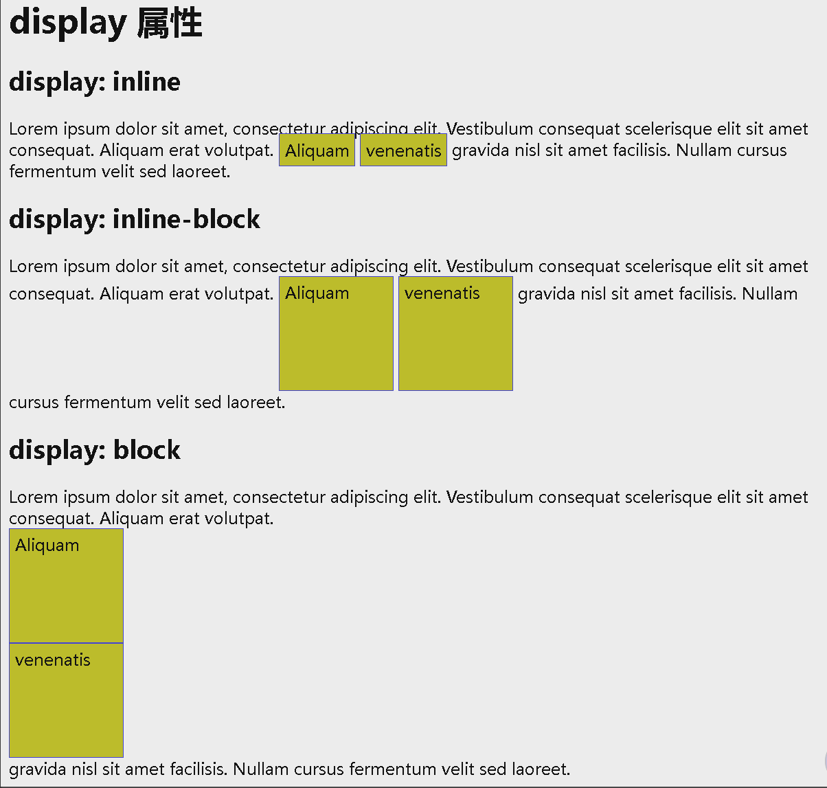
<h2>display: inline</h2>
<div>Lorem ipsum dolor sit amet, consectetur adipiscing elit. Vestibulum consequat scelerisque elit sit amet consequat. Aliquam erat volutpat. <span class="a">Aliquam</span> <span class="a">venenatis</span> gravida nisl sit amet facilisis. Nullam cursus fermentum velit sed laoreet. </div>
<h2>display: inline-block</h2>
<div>Lorem ipsum dolor sit amet, consectetur adipiscing elit. Vestibulum consequat scelerisque elit sit amet consequat. Aliquam erat volutpat. <span class="b">Aliquam</span> <span class="b">venenatis</span> gravida nisl sit amet facilisis. Nullam cursus fermentum velit sed laoreet. </div>
<h2>display: block</h2>
<div>Lorem ipsum dolor sit amet, consectetur adipiscing elit. Vestibulum consequat scelerisque elit sit amet consequat. Aliquam erat volutpat. <span class="c">Aliquam</span> <span class="c">venenatis</span> gravida nisl sit amet facilisis. Nullam cursus fermentum velit sed laoreet. </div>
</body>
</html>
使用 inline-block 来创建导航链接
display 的一种常见用法:inline-block 用于水平而不是垂直地显示列表项。下例创建了一个水平导航链接:
1
2
3
4
5
6
7
8
9
10
11
12
13
14
15
16
17
18
19
20
21
22
23
24
25
26
27
28
29
30
31
32
33
34
<!DOCTYPE html>
<html>
<head>
<style>
.nav {
background-color: yellow;
list-style-type: none;
text-align: center;
margin: 0;
padding: 0;
}
.nav li {
display: inline-block;
font-size: 20px;
padding: 20px;
}
</style>
</head>
<body>
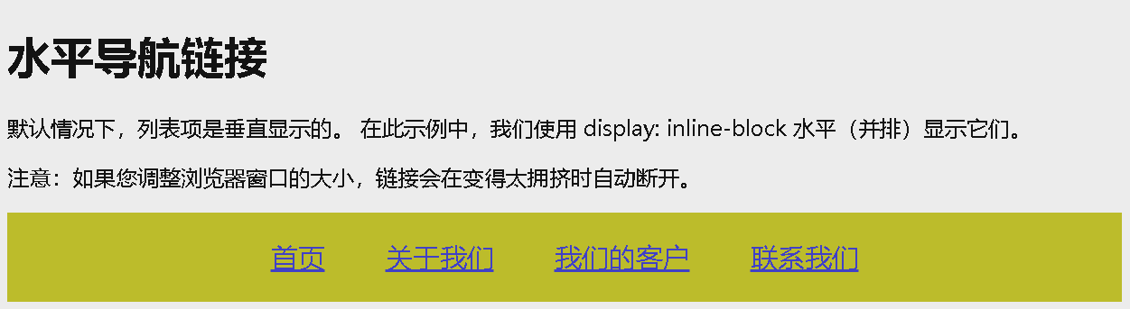
<h1>水平导航链接</h1>
<p>默认情况下,列表项是垂直显示的。 在此示例中,我们使用 display: inline-block 水平(并排)显示它们。</p>
<p>注意:如果您调整浏览器窗口的大小,链接会在变得太拥挤时自动断开。</p>
<ul class="nav">
<li><a href="#home">首页</a></li>
<li><a href="#about">关于我们</a></li>
<li><a href="#clients">我们的客户</a></li>
<li><a href="#contact">联系我们</a></li>
</ul>
</body>
</html>
Display: none
display: none; 通常与 JavaScript 一起使用,以隐藏和显示元素,而无需删除和重新创建它们。
默认情况下,<script> 元素使用 display: none;。
覆盖默认的 Display 值
每个元素都有一个默认 display 值。但是,您可以覆盖它。
将行内元素更改为块元素,反之亦然,对于使页面以特定方式显示同时仍遵循 Web 标准很有用。
示例:实现水平菜单而生成行内的 <li> 元素:
1
2
3
4
5
6
7
8
9
10
11
12
13
14
15
16
17
18
19
20
21
<!DOCTYPE html>
<html>
<head>
<style>
li {
display: inline;
}
</style>
</head>
<body>
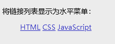
<p>将链接列表显示为水平菜单:</p>
<ul>
<li><a href="/html/default.asp" target="_blank">HTML</a></li>
<li><a href="/css/default.asp" target="_blank">CSS</a></li>
<li><a href="/js/default.asp" target="_blank">JavaScript</a></li>
</ul>
</body>
</html>
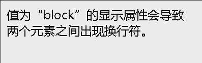
设置元素的 display 属性仅会更改元素的显示方式,而不会更改元素的种类。因此,带有
display: block;的行内元素不允许在其中包含其他块元素。
示例:将 <span> 改成块级标签
1
2
3
4
5
6
7
8
9
10
11
12
13
14
15
<!DOCTYPE html>
<html>
<head>
<style>
span {
  display: block;
}
</style>
</head>
<body>

<span>值为“block”的显示属性会导致</span> <span>两个元素之间出现换行符。</span>

</body>
</html>
隐藏元素 - display:none 还是 visibility:hidden?
- display 属性设置为 none 可以隐藏元素,且不占用空间
visibility:hidden;也可以隐藏元素。但是,该元素仍将占用与之前相同的空间。元素将被隐藏,但仍会影响布局:
示例 1:display:none;
1
2
3
4
5
6
7
8
9
10
11
12
13
14
15
16
17
<!DOCTYPE html>
<html>
<head>
<style>
h1.hidden {
display: none;
}
</style>
</head>
<body>
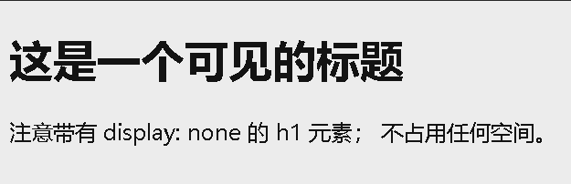
<h1>这是一个可见的标题</h1>
<h1 class="hidden">这是一个隐藏的标题</h1>
<p>注意带有 display: none 的 h1 元素; 不占用任何空间。</p>
</body>
</html>
示例 2:visibility:hidden;
1
2
3
4
5
6
7
8
9
10
11
12
13
14
15
16
17
<!DOCTYPE html>
<html>
<head>
<style>
h1.hidden {
visibility: hidden;
}
</style>
</head>
<body>
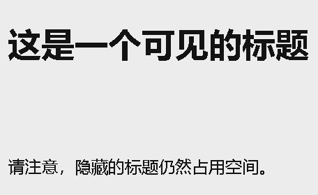
<h1>这是一个可见的标题</h1>
<h1 class="hidden">这是一个隐藏的标题</h1>
<p>请注意,隐藏的标题仍然占用空间。</p>
</body>
</html>
示例 3:display 和 visibility 区别
1
2
3
4
5
6
7
8
9
10
11
12
13
14
15
16
17
18
19
20
21
22
23
24
25
26
27
28
29
30
31
32
33
34
35
36
37
38
39
40
41
42
43
44
45
46
47
48
49
50
51
52
53
54
55
56
<!DOCTYPE html>
<html>
<head>
<style>
.imgbox {
float: left;
text-align: center;
width: 120px;
border: 1px solid gray;
margin: 4px;
padding: 6px;
}
button {
width: 100%;
}
</style>
</head>
<body>
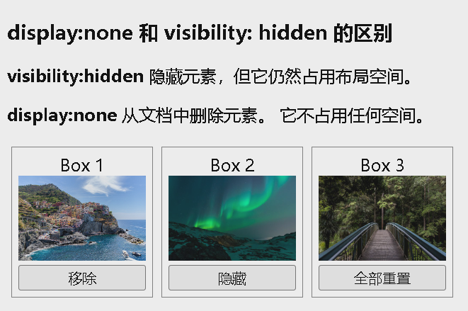
<h3>display:none 和 visibility: hidden 的区别</h3>
<p><strong>visibility:hidden</strong> 隐藏元素,但它仍然占用布局空间。</p>
<p><strong>display:none</strong> 从文档中删除元素。 它不占用任何空间。</p>
<div class="imgbox" id="imgbox1">Box 1<br>
<img src="img_5terre.jpg" alt="Italy" style="width:100%">
<button onclick="removeElement()">移除</button>
</div>
<div class="imgbox" id="imgbox2">Box 2<br>
<img src="img_lights.jpg" alt="Lights" style="width:100%">
<button onclick="changeVisibility()">隐藏</button>
</div>
<div class="imgbox">Box 3<br>
<img src="img_forest.jpg" alt="森林" style="width:100%">
<button onclick="resetElement()">全部重置</button>
</div>
<script>
function removeElement() {
document.getElementById("imgbox1").style.display = "none";
}
function changeVisibility() {
document.getElementById("imgbox2").style.visibility = "hidden";
}
function resetElement() {
document.getElementById("imgbox1").style.display = "block";
document.getElementById("imgbox2").style.visibility = "visible";
}
</script>
</body>
</html>
CSS 布局 - width 和 max-width
块级元素始终占用可用的全部宽度(尽可能向左和向右伸展)。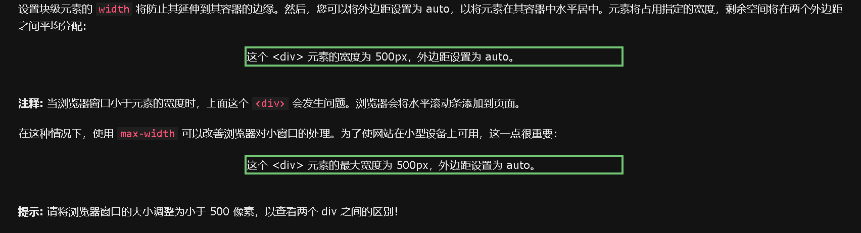
1
2
3
4
5
6
7
8
9
10
11
12
13
14
15
16
17
18
19
20
21
22
23
24
25
26
27
28
<!DOCTYPE html>
<html>
<head>
<style>
div.ex1 {
  width:500px;
  margin: auto;
  border: 3px solid #73AD21;
}

div.ex2 {
  max-width:500px;
  margin: auto;
  border: 3px solid #73AD21;
}
</style>
</head>
<body>

<div class="ex1">这个 div 元素有 width: 500px;</div>
<br>

<div class="ex2">这个 div 元素有 max-width: 500px;</div>

<p><strong>提示:</strong>将浏览器窗口拖动到小于 500px 的宽度,以查看两个 div 之间的区别!</p>

</body>
</html>
CSS 布局 - 定位 position
position 属性规定应用于元素的定位方法的类型(static、relative、fixed、absolute 或 sticky)。
position 属性规定应用于元素的定位方法的类型。
有五个不同的位置值:
- static
- relative
- fixed
- absolute
- sticky
标签使用 top、bottom、left、right 来定位;设置了 position 的影响?
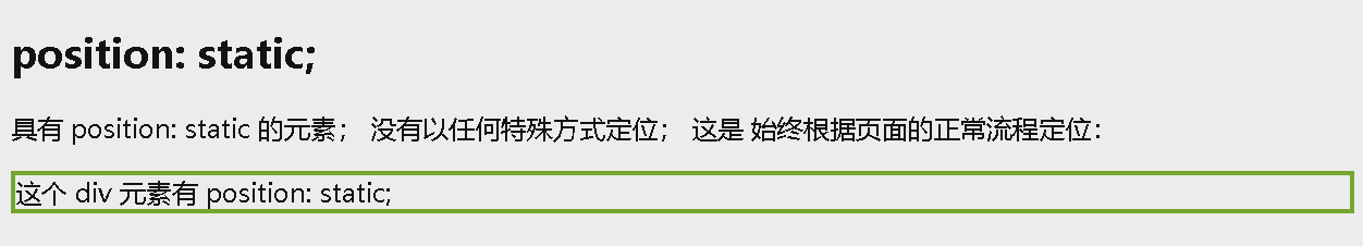
position: static
HTML 元素默认情况下的定位方式为 static(静态)。
静态定位的元素不受 top、bottom、left 和 right 属性的影响。position: static; 的元素不会以任何特殊方式定位;它始终根据页面的正常流进行定位:
示例:
1
2
3
4
5
6
7
8
9
10
11
12
13
14
15
16
17
18
19
20
21
22
23
24
<!DOCTYPE html>
<html>
<head>
<style>
div.static {
  position: static;
  left: 30px;
  border: 3px solid #73AD21;
}
</style>
</head>
<body>

<h2>position: static;</h2>

<p>具有 position: static 的元素; 没有以任何特殊方式定位; 这是
始终根据页面的正常流程定位:</p>

<div class="static">
   这个 div 元素有 position: static;
</div>

</body>
</html>
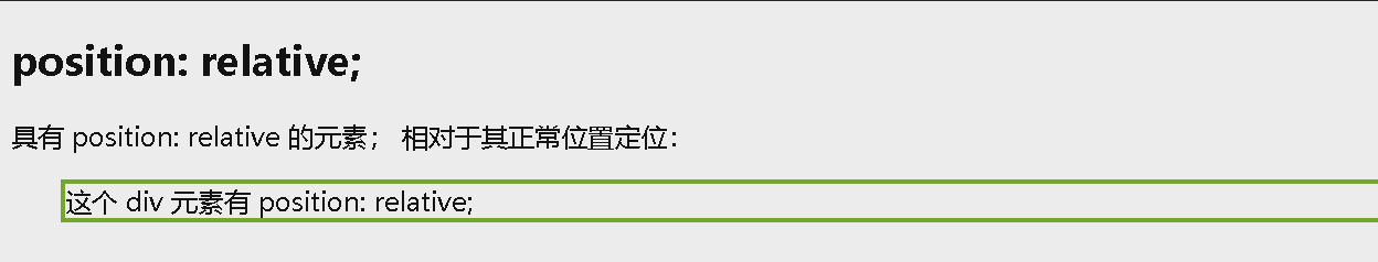
position: relative
position: relative; 的元素相对于其正常位置进行定位。
设置相对定位的元素的 top、right、bottom 和 left 属性将导致其偏离其正常位置进行调整。不会对其余内容进行调整来适应元素留下的任何空间。
示例:
1
2
3
4
5
6
7
8
9
10
11
12
13
14
15
16
17
18
19
20
21
22
23
<!DOCTYPE html>
<html>
<head>
<style>
div.relative {
  position: relative;
  left: 30px;
  border: 3px solid #73AD21;
}
</style>
</head>
<body>

<h2>position: relative;</h2>

<p>具有 position: relative 的元素; 相对于其正常位置定位:</p>

<div class="relative">
这个 div 元素有 position: relative;
</div>

</body>
</html>
position: fixed
position: fixed; 的元素是相对于视口定位的,这意味着即使滚动页面,它也始终位于同一位置。 top、right、bottom 和 left 属性用于定位此元素。
固定定位的元素不会在页面中通常应放置的位置上留出空隙。
1
2
3
4
5
6
7
8
9
10
11
12
13
14
15
16
17
18
19
20
21
22
23
<!DOCTYPE html>
<html>
<head>
<style>
div.relative {
  position: relative;
  left: 30px;
  border: 3px solid #73AD21;
}
</style>
</head>
<body>

<h2>position: relative;</h2>

<p>具有 position: relative 的元素; 相对于其正常位置定位:</p>

<div class="relative">
这个 div 元素有 position: relative;
</div>

</body>
</html>
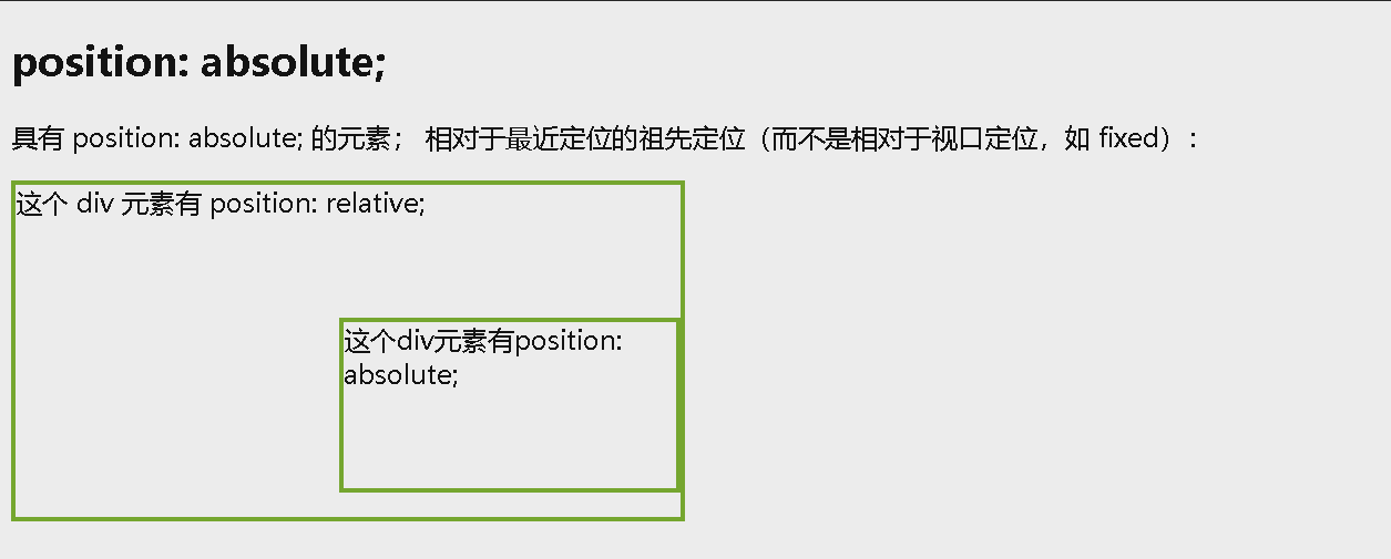
position: absolute
position: absolute; 的元素相对于最近的定位祖先元素进行定位(而不是相对于视口定位,如 fixed)。
然而,如果绝对定位的元素没有祖先,它将使用文档主体(body),并随页面滚动一起移动。
注释: “ 被定位的 “ 元素是其位置除 static 以外的任何元素。
示例:
1
2
3
4
5
6
7
8
9
10
11
12
13
14
15
16
17
18
19
20
21
22
23
24
25
26
27
28
29
30
31
32
33
<!DOCTYPE html>
<html>
<head>
<style>
div.relative {
  position: relative;
  width: 400px;
  height: 200px;
  border: 3px solid #73AD21;
}

div.absolute {
  position: absolute;
  top: 80px;
  right: 0;
  width: 200px;
  height: 100px;
  border: 3px solid #73AD21;
}
</style>
</head>
<body>

<h2>position: absolute;</h2>

<p>具有 position: absolute; 的元素; 相对于最近定位的祖先定位(而不是相对于视口定位,如 fixed):</p>

<div class="relative">这个 div 元素有 position: relative;
  <div class="absolute">这个div元素有position: absolute;</div>
</div>

</body>
</html>
position: sticky
position: sticky; 的元素根据用户的滚动位置进行定位。
粘性元素根据滚动位置在相对(relative)和固定(fixed)之间切换。起先它会被相对定位,直到在视口中遇到给定的偏移位置为止 - 然后将其 “ 粘贴 “ 在适当的位置(比如 position:fixed)。
示例:
1
2
3
4
5
6
7
8
9
10
11
12
13
14
15
16
17
18
19
20
21
22
23
24
25
26
27
28
29
30
<!DOCTYPE html>
<html>
<head>
<style>
div.sticky {
  position: -webkit-sticky;
  position: sticky;
  top: 0;
  padding: 5px;
  background-color: #cae8ca;
  border: 2px solid #4CAF50;
}
</style>
</head>
<body>

<p>尝试在此框架内<b>滚动</b>以了解粘性定位的工作原理。</p>
<p>注意:IE/Edge 15 及更早版本不支持置顶。</p>

<div class="sticky">I am sticky!</div>

<div style="padding-bottom:2000px">
  <p>在此示例中,当您到达其滚动位置时,粘性元素会粘在页面顶部 (top: 0)。</p>
  <p>向上滚动以去除粘性。</p>
  <p>一些启用滚动的文本.. Lorem ipsum dolor sit amet, illum definitiones no quo, maluisset concludaturque et eum, altera fabulas ut quo. Atqui causae gloriatur ius te, id agam omnis evertitur eum. Affert laboramus repudiandae nec et. Inciderint efficiantur his ad. Eum no molestiae voluptatibus.</p>
  <p>一些启用滚动的文本.. Lorem ipsum dolor sit amet, illum definitiones no quo, maluisset concludaturque et eum, altera fabulas ut quo. Atqui causae gloriatur ius te, id agam omnis evertitur eum. Affert laboramus repudiandae nec et. Inciderint efficiantur his ad. Eum no molestiae voluptatibus.</p>
</div>

</body>
</html>
原始: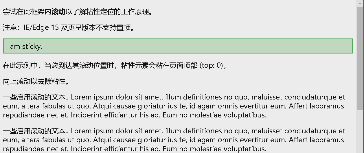
在到达其滚动位置时,sticky 元素将停留在页面顶部(top: 0):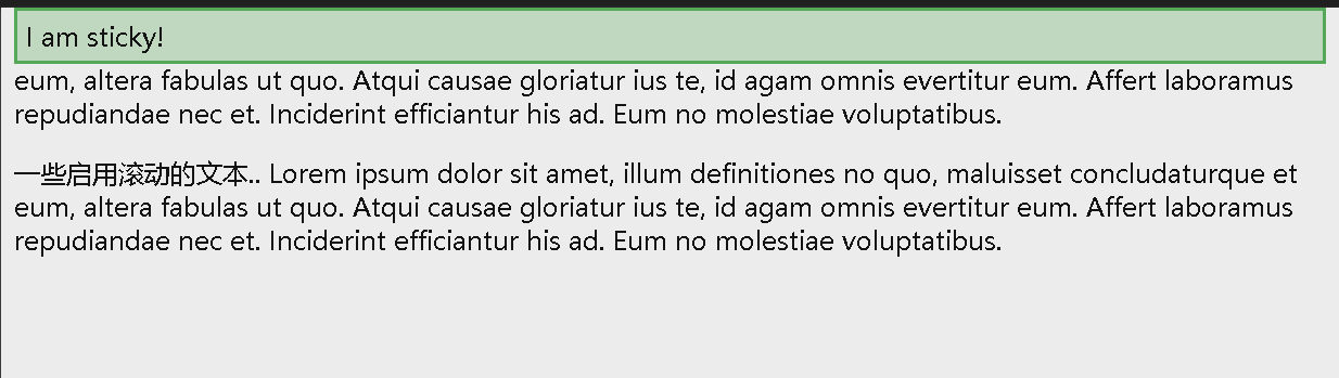
重叠元素
在对元素进行定位时,它们可以与其他元素重叠。z-index 属性指定元素的堆栈顺序(哪个元素应放置在其他元素的前面或后面)。元素可以设置正或负的堆叠顺序:
- 具有较高堆叠顺序的元素始终位于具有较低堆叠顺序的元素之前。
1
2
3
4
5
6
7
8
9
10
11
12
13
14
15
16
17
18
19
20
<!DOCTYPE html>
<html>
<head>
<style>
img {
  position: absolute;
  left: 0px;
  top: 0px;
  z-index: -1;
}
</style>
</head>
<body>

<h1>这是一个标题</h1>
<img src="w3css.gif" width="100" height="140">
<p>因为图像的 z-index 为 -1,所以它将放在文本后面。</p>

</body>
</html>
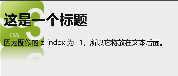
如果两个定位的元素重叠而未指定 z-index,则位于 HTML 代码中最后的元素将显示在顶部。
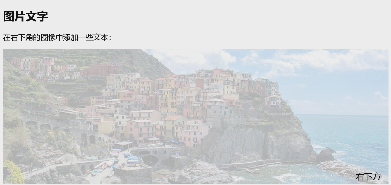
定位图像中的文本
1
2
3
4
5
6
7
8
9
10
11
12
13
14
15
16
17
18
19
20
21
22
23
24
25
26
27
28
29
30
31
32
33
34
<!DOCTYPE html>
<html>
<head>
<style>
.container {
  position: relative;
}

.bottomright {
  position: absolute;
  bottom: 8px;
  right: 16px;
  font-size: 18px;
}

img {
  width: 100%;
  height: auto;
  opacity: 0.3;
}
</style>
</head>
<body>

<h2>图片文字</h2>
<p>在右下角的图像中添加一些文本:</p>

<div class="container">
  <img src="img_5terre_wide.jpg" alt="五渔村" width="1000" height="300">
  <div class="bottomright">右下方</div>
</div>

</body>
</html>
CSS 布局 - 溢出 overflow
overflow 属性控制对太大而区域无法容纳的内容的处理方式。
overflow 属性指定在元素的内容太大而无法放入指定区域时是剪裁内容还是添加滚动条。
overflow 属性可设置以下值:
- visible - 默认。溢出没有被剪裁。内容在元素框外渲染
- hidden - 溢出被剪裁,其余内容将不可见
- scroll - 溢出被剪裁,同时添加滚动条以查看其余内容
- auto - 与 scroll 类似,但仅在必要时添加滚动条
注意 1:overflow 属性仅适用于具有指定高度的块元素。
注意 2:在 OS X Lion(在 Mac 上)中,滚动条默认情况下是隐藏的,并且仅在使用时显示(即使设置了 overflow:scroll)。
overflow: visible
默认情况下,溢出是可见的 (visible),这意味着它不会被裁剪,而是在元素框外渲染:
1
2
3
4
5
6
7
8
9
10
11
12
13
14
15
16
17
18
19
20
21
22
<!DOCTYPE html>
<html>
<head>
<style>
div {
background-color: #f00;
width: 200px;
height: 50px;
border: 1px dotted black;
overflow: visible;
}
</style>
</head>
<body>
<h2>CSS Overflow</h2>
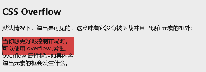
<p>默认情况下,溢出是可见的,这意味着它没有被剪裁并且呈现在元素的框外:</p>
<div>当你想更好地控制布局时,可以使用 overflow 属性。 overflow 属性指定如果内容溢出元素的框会发生什么。</div>
</body>
</html>
overflow: hidden
如果使用 hidden 值,溢出会被裁剪,其余内容被隐藏:
1
2
3
4
5
6
7
8
9
10
11
12
13
14
15
16
17
18
19
20
21
22
23
<!DOCTYPE html>
<html>
<head>
<style>
div {
background-color: #f00;
width: 200px;
height: 50px;
border: 1px dotted black;
overflow: hidden;
}
</style>
</head>
<body>
<h2>CSS Overflow</h2>
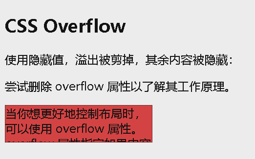
<p>使用隐藏值,溢出被剪掉,其余内容被隐藏:</p>
<p>尝试删除 overflow 属性以了解其工作原理。</p>
<div>当你想更好地控制布局时,可以使用 overflow 属性。 overflow 属性指定如果内容溢出元素的框会发生什么。</div>
</body>
</html>
overflow: scroll
如果将值设置为 scroll,溢出将被裁剪,并添加滚动条以便在框内滚动。请注意,这将在水平和垂直方向上添加一个滚动条(即使您不需要它):
1
2
3
4
5
6
7
8
9
10
11
12
13
14
15
16
17
18
19
20
21
22
<!DOCTYPE html>
<html>
<head>
<style>
div {
background-color: #eee;
width: 200px;
height: 100px;
border: 1px dotted black;
overflow: scroll;
}
</style>
</head>
<body>
<h2>CSS Overflow</h2>
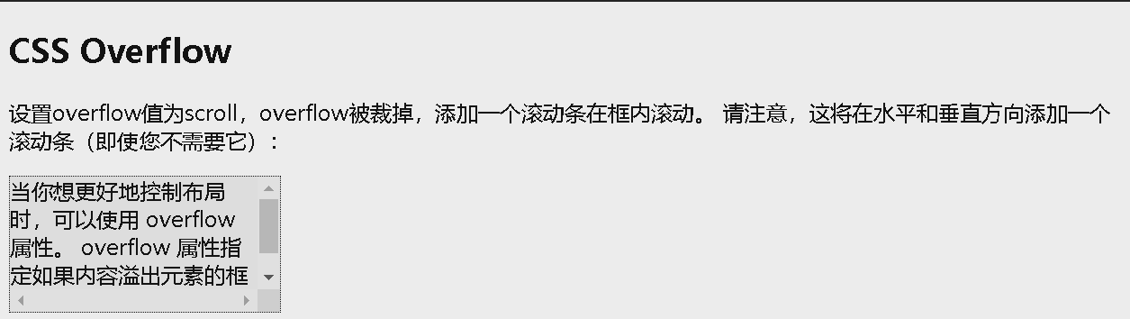
<p>设置overflow值为scroll,overflow被裁掉,添加一个滚动条在框内滚动。 请注意,这将在水平和垂直方向添加一个滚动条(即使您不需要它):</p>
<div>当你想更好地控制布局时,可以使用 overflow 属性。 overflow 属性指定如果内容溢出元素的框会发生什么。</div>
</body>
</html>
overflow: auto
auto 值类似于 scroll,但是它仅在必要时添加滚动条:
1
2
3
4
5
6
7
8
9
10
11
12
13
14
15
16
17
18
19
20
21
22
<!DOCTYPE html>
<html>
<head>
<style>
div {
background-color: #eee;
width: 200px;
height: 50px;
border: 1px dotted black;
overflow: auto;
}
</style>
</head>
<body>
<h2>CSS overflow</h2>
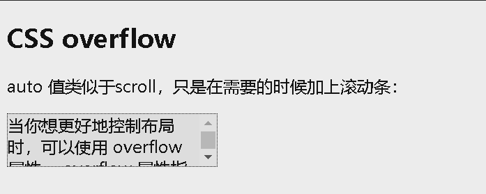
<p>auto 值类似于scroll,只是在需要的时候加上滚动条:</p>
<div>当你想更好地控制布局时,可以使用 overflow 属性。 overflow 属性指定如果内容溢出元素的框会发生什么。</div>
</body>
</html>
overflow-x 和 overflow-y
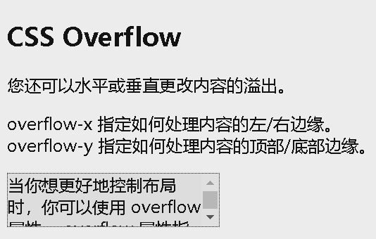
overflow-x 和 overflow-y 属性规定是仅水平还是垂直地(或同时)更改内容的溢出:
- overflow-x 指定如何处理内容的左/右边缘。
- overflow-y 指定如何处理内容的上/下边缘。
1
2
3
4
5
6
7
8
9
10
11
12
13
14
15
16
17
18
19
20
21
22
23
24
25
<!DOCTYPE html>
<html>
<head>
<style>
div {
  background-color: #eee;
  width: 200px;
  height: 50px;
  border: 1px dotted black;
  overflow-x: hidden;
  overflow-y: scroll;
}
</style>
</head>
<body>

<h2>CSS Overflow</h2>
<p>您还可以水平或垂直更改内容的溢出。</p>
<p>overflow-x 指定如何处理内容的左/右边缘。<br>
overflow-y 指定如何处理内容的顶部/底部边缘。</p>

<div>当你想更好地控制布局时,你可以使用 overflow 属性。 overflow 属性指定如果内容溢出元素的框会发生什么。</div>

</body>
</html>
CSS 布局 - 浮动 float
float
float 属性用于定位和格式化内容,例如让图像向左浮动到容器中的文本那里。
float 属性可以设置以下值之一:
- left - 元素浮动到其容器的左侧
- right - 元素浮动在其容器的右侧
- none - 元素不会浮动(将显示在文本中刚出现的位置)。默认值。
- inherit - 元素继承其父级的 float 值
最简单的用法是, float 属性可实现(报纸上)文字包围图片的效果。
示例:指定图像应在文本中向右浮动:
1
2
3
4
5
6
7
8
9
10
11
12
13
14
15
16
17
18
<!DOCTYPE html>
<html>
<head>
<style>
img {
float: right;
}
</style>
</head>
<body>
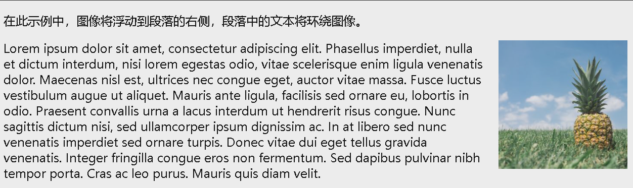
<p>在此示例中,图像将浮动到段落的右侧,段落中的文本将环绕图像。</p>
<p><img src="pineapple.jpg" alt="菠萝" style="width:170px;height:170px;margin-left:15px;">
Lorem ipsum dolor sit amet, consectetur adipiscing elit. Phasellus imperdiet, nulla et dictum interdum, nisi lorem egestas odio, vitae scelerisque enim ligula venenatis dolor. Maecenas nisl est, ultrices nec congue eget, auctor vitae massa. Fusce luctus vestibulum augue ut aliquet. Mauris ante ligula, facilisis sed ornare eu, lobortis in odio. Praesent convallis urna a lacus interdum ut hendrerit risus congue. Nunc sagittis dictum nisi, sed ullamcorper ipsum dignissim ac. In at libero sed nunc venenatis imperdiet sed ornare turpis. Donec vitae dui eget tellus gravida venenatis. Integer fringilla congue eros non fermentum. Sed dapibus pulvinar nibh tempor porta. Cras ac leo purus. Mauris quis diam velit.</p>
</body>
</html>
导航菜单
将 float 与超链接列表一起使用,来创建水平菜单:
1
2
3
4
5
6
7
8
9
10
11
12
13
14
15
16
17
18
19
20
21
22
23
24
25
26
27
28
29
30
31
32
33
34
35
36
37
38
39
40
41
42
43
44
<!DOCTYPE html>
<html>
<head>
<style>
ul {
  list-style-type: none;
  margin: 0;
  padding: 0;
  overflow: hidden;
  background-color: #333;
}

li {
  float: left;
}

li a {
  display: inline-block;
  color: white;
  text-align: center;
  padding: 14px 16px;
  text-decoration: none;
}

li a:hover {
  background-color: #111;
}

.active {
  background-color: red;
}
</style>
</head>
<body>

<ul>
  <li><a href="#home" class="active">首页</a></li>
  <li><a href="#news">最新</a></li>
  <li><a href="#contact">联系方式</a></li>
  <li><a href="#about">关于</a></li>
</ul>

</body>
</html>

clear 和 clearfix
clear 属性指定哪些元素可以浮动于被清除元素的旁边以及哪一侧。
clear 属性可设置以下值之一:
- none - 允许两侧都有浮动元素。默认值
- left - 左侧不允许浮动元素
- right- 右侧不允许浮动元素
- both - 左侧或右侧均不允许浮动元素
- inherit - 元素继承其父级的 clear 值
使用 clear 属性的最常见用法是在元素上使用了 float 属性之后。
在清除浮动时,应该对清除与浮动进行匹配:如果某个元素浮动到左侧,则应清除左侧。您的浮动元素会继续浮动,但是被清除的元素将显示在其下方。
示例:将清除向左的浮动。表示在(div 的)左侧不允许出现浮动元素:
1
2
3
4
5
6
7
8
9
10
11
12
13
14
15
16
17
18
19
20
21
22
23
24
25
26
27
28
29
30
31
32
33
34
35
36
37
38
39
40
41
42
43
<!DOCTYPE html>
<html>
<head>
<style>
.div1 {
float: left;
width: 100px;
height: 50px;
margin: 10px;
border: 3px solid #73AD21;
}
.div2 {
border: 1px solid red;
}
.div3 {
float: left;
width: 100px;
height: 50px;
margin: 10px;
border: 3px solid #73AD21;
}
.div4 {
border: 1px solid red;
clear: left;
}
</style>
</head>
<body>
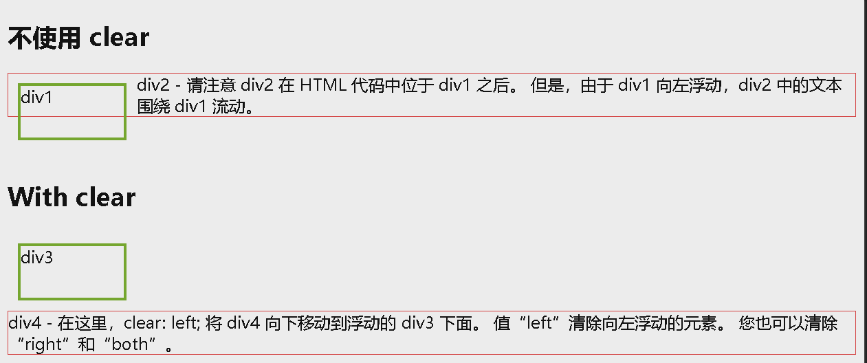
<h2>不使用 clear</h2>
<div class="div1">div1</div>
<div class="div2">div2 - 请注意 div2 在 HTML 代码中位于 div1 之后。 但是,由于 div1 向左浮动,div2 中的文本围绕 div1 流动。</div>
<br><br>
<h2>With clear</h2>
<div class="div3">div3</div>
<div class="div4">div4 - 在这里,clear: left; 将 div4 向下移动到浮动的 div3 下面。 值“left”清除向左浮动的元素。 您也可以清除“right”和“both”。</div>
</body>
</html>
如果一个元素比包含它的元素高,并且它是浮动的,它将 “ 溢出 “ 到其容器之外:我们可以向包含元素添加 overflow: auto;,来解决此问题:
1
2
3
4
5
6
7
8
9
10
11
12
13
14
15
16
17
18
19
20
21
22
23
24
25
26
27
28
29
30
31
32
33
34
35
36
37
38
39
40
<!DOCTYPE html>
<html>
<head>
<style>
div {
border: 3px solid #4CAF50;
padding: 5px;
}
.img1 {
float: right;
}
.clearfix {
overflow: auto;
}
.img2 {
float: right;
}
</style>
</head>
<body>
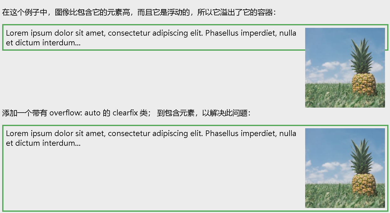
<p>在这个例子中,图像比包含它的元素高,而且它是浮动的,所以它溢出了它的容器:</p>
<div>
<img class="img1" src="pineapple.jpg" alt="菠萝" width="170" height="170">
Lorem ipsum dolor sit amet, consectetur adipiscing elit. Phasellus imperdiet, nulla et dictum interdum...
</div>
<p style="clear:right">添加一个带有 overflow: auto 的 clearfix 类; 到包含元素,以解决此问题:</p>
<div class="clearfix">
<img class="img2" src="pineapple.jpg" alt="菠萝" width="170" height="170">
Lorem ipsum dolor sit amet, consectetur adipiscing elit. Phasellus imperdiet, nulla et dictum interdum...
</div>
</body>
</html>
浮动实例
网格 / 等宽的框
1
2
3
4
5
6
7
8
9
10
11
12
13
14
15
16
17
18
19
20
21
22
23
24
25
26
27
28
29
30
31
32
33
34
35
36
37
38
39
40
41
42
<!DOCTYPE html>
<html>
<head>
<style>
* {
box-sizing: border-box;
}
.box {
float: left;
width: 33.33%;
padding: 20px;
}
.clearfix::after {
content: "";
clear: both;
display: table;
}
</style>
</head>
<body>
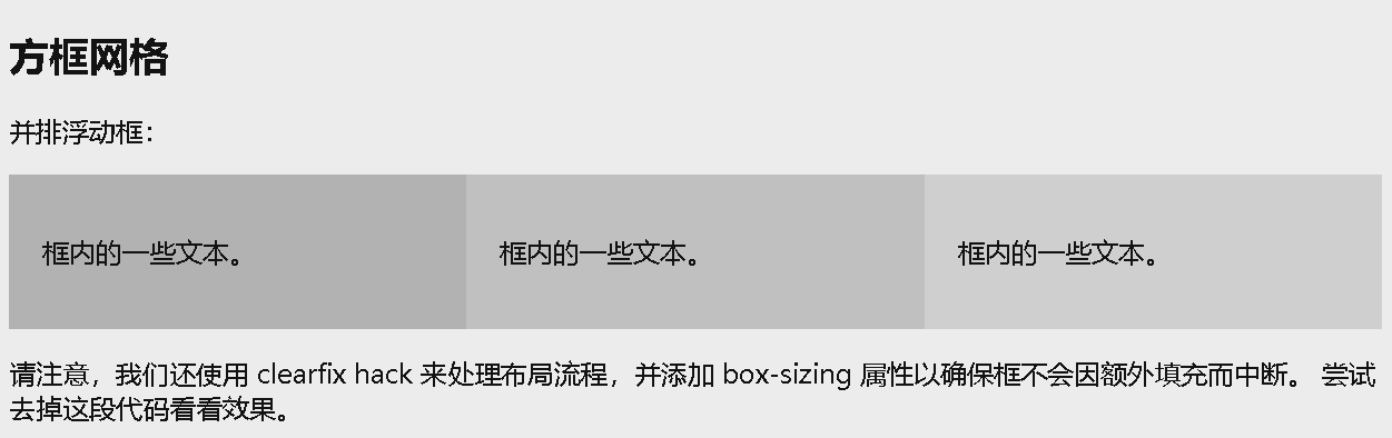
<h2>方框网格</h2>
<p>并排浮动框:</p>
<div class="clearfix">
<div class="box" style="background-color:#bbb">
<p>框内的一些文本。</p>
</div>
<div class="box" style="background-color:#ccc">
<p>框内的一些文本。</p>
</div>
<div class="box" style="background-color:#ddd">
<p>框内的一些文本。</p>
</div>
</div>
<p>请注意,我们还使用 clearfix hack 来处理布局流程,并添加 box-sizing 属性以确保框不会因额外填充而中断。 尝试去掉这段代码看看效果。</p>
</body>
</html>
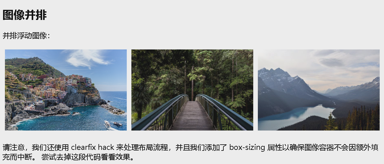
图像并排
1
2
3
4
5
6
7
8
9
10
11
12
13
14
15
16
17
18
19
20
21
22
23
24
25
26
27
28
29
30
31
32
33
34
35
36
37
38
39
40
41
42
<!DOCTYPE html>
<html>
<head>
<style>
* {
  box-sizing: border-box;
}

.img-container {
  float: left;
  width: 33.33%;
  padding: 5px;
}

.clearfix::after {
  content: "";
  clear: both;
  display: table;
}
</style>
</head>
<body>

<h2>图像并排</h2>
<p>并排浮动图像:</p>

<div class="clearfix">
  <div class="img-container">
  <img src="img_5terre.jpg" alt="Italy" style="width:100%">
  </div>
  <div class="img-container">
  <img src="img_forest.jpg" alt="森林" style="width:100%">
  </div>
  <div class="img-container">
  <img src="img_mountains.jpg" alt="山脉" style="width:100%">
  </div>
</div>

<p>请注意,我们还使用 clearfix hack 来处理布局流程,并且我们添加了 box-sizing 属性以确保图像容器不会因额外填充而中断。 尝试去掉这段代码看看效果。</p>

</body>
</html>
CSS3 Box Sizing
CSS box-sizing 属性允许我们在元素的总宽度和高度中包括内边距(填充)和边框。
默认情况下,元素的宽度和高度是这样计算的:
- width + padding + border = 元素的实际宽度
- height + padding + border = 元素的实际高度
当您设置元素的宽度/高度时,该元素通常看起来比您设置的更大(因为元素的边框和内边距已被添加到元素的指定宽度/高度中)。
下面示例展示了两个有相同指定宽度和高度的 <div> 元素:
1
2
3
4
5
6
7
8
9
10
11
12
13
14
15
16
17
18
19
20
21
22
23
24
25
26
<!DOCTYPE html>
<html>
<head>
<style>
.div1 {
  width: 300px;
  height: 100px;
  border: 1px solid blue;
}

.div2 {
  width: 300px;
  height: 100px;
  padding: 50px;
  border: 1px solid red;
}
</style>
</head>
<body>

<div class="div1">这个 div 较小(宽度为 300px,高度为 100px)。</div>
<br>
<div class="div2">这个div更大(宽度也是300px,高度也是100px)。</div>

</body>
</html>
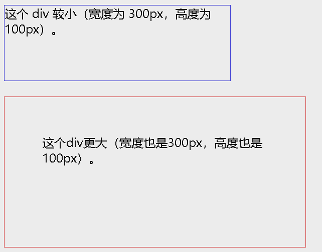
上面的两个
<div>元素在最终结果中呈现出不同的尺寸(因为 div2 指定了内边距):
box-sizing 属性解决了这个问题。
box-sizing 属性允许我们在元素的总宽度和高度中包括内边距和边框。
如果在元素上设置了 box-sizing: border-box;,则宽度和高度会包括内边距和边框:
1
2
3
4
5
6
7
8
9
10
11
12
13
14
15
16
17
18
19
20
21
22
23
24
25
26
27
28
<!DOCTYPE html>
<html>
<head>
<style>
.div1 {
  width: 300px;
  height: 100px;
  border: 1px solid blue;
  box-sizing: border-box;
}

.div2 {
  width: 300px;
  height: 100px;
  padding: 50px;
  border: 1px solid red;
  box-sizing: border-box;
}
</style>
</head>
<body>

<div class="div1">现在两个 div 的大小相同!</div>
<br>
<div class="div2">万岁!</div>

</body>
</html>
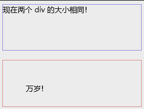
由于使用 box-sizing: border-box; 的效果如此之好,许多开发人员希望页面上的所有元素都能够以这种方式工作。
许多浏览器已经在对许多表单元素使用 box-sizing: border-box;(但并非全部 - 这就是为什么 input 和 textarea 在 width: 100%; 时看起来不同)。
1
2
3
* {
  box-sizing: border-box;
}
CSS 布局 - 水平和垂直对齐
居中对齐元素
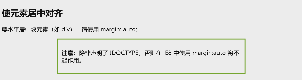
要使块元素(例如 <div> )水平居中,请使用 margin: auto;。
设置元素的宽度将防止其延伸到容器的边缘。
然后,元素将占用指定的宽度,剩余空间将在两个外边距之间平均分配:
1
2
3
4
5
6
7
8
9
10
11
12
13
14
15
16
17
18
19
20
21
22
23
<!DOCTYPE html>
<html>
<head>
<style>
.center {
  margin: auto;
  width: 60%;
  border: 3px solid #73AD21;
  padding: 10px;
}
</style>
</head>
<body>

<h2>使元素居中对齐</h2>
<p>要水平居中块元素(如 div),请使用 margin: auto;</p>

<div class="center">
  <p><b>注意:</b>除非声明了 !DOCTYPE,否则在 IE8 中使用 margin:auto 将不起作用。</p>
</div>

</body>
</html>
如果未设置 width 属性(或将其设置为 100%),则居中对齐无效。
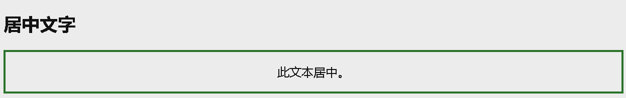
居中对齐文本
如果仅需在元素内居中文本,请使用 text-align: center;:
1
2
3
4
5
6
7
8
9
10
11
12
13
14
15
16
17
18
19
20
<!DOCTYPE html>
<html>
<head>
<style>
.center {
  text-align: center;
  border: 3px solid green;
}
</style>
</head>
<body>

<h2>居中文字</h2>

<div class="center">
  <p>此文本居中。</p>
</div>

</body>
</html>
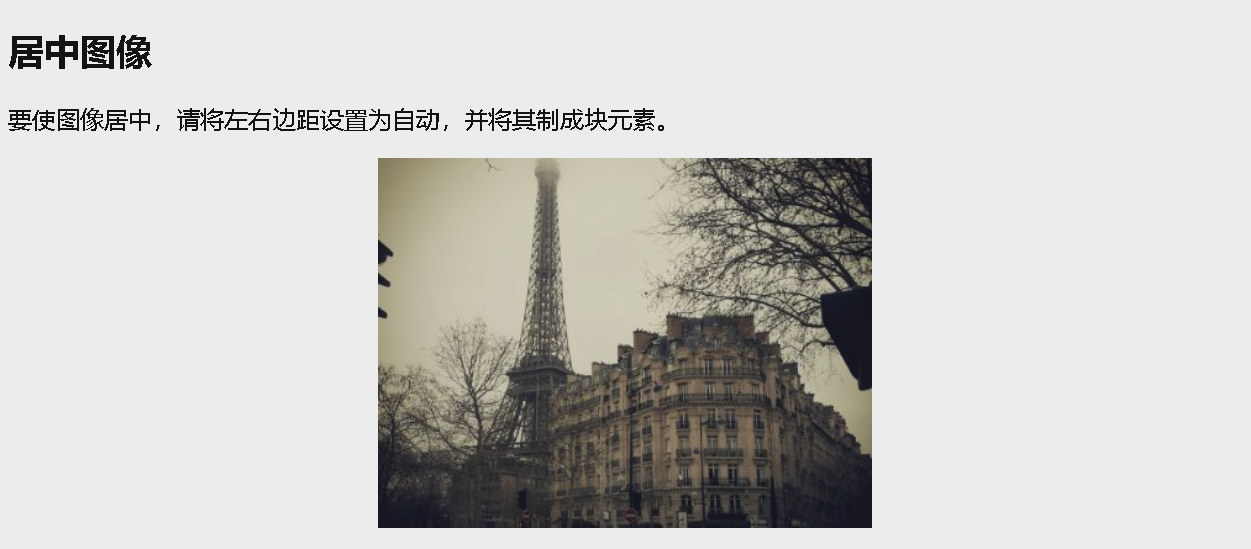
居中对齐图像
如需居中图像,请将左右外边距设置为 auto,并将其设置为块元素:
1
2
3
4
5
6
7
8
9
10
11
12
13
14
15
16
17
18
19
20
<!DOCTYPE html>
<html>
<head>
<style>
img {
  display: block;
  margin-left: auto;
  margin-right: auto;
}
</style>
</head>
<body>

<h2>居中图像</h2>
<p>要使图像居中,请将左右边距设置为自动,并将其制成块元素。</p>

<img src="paris.jpg" alt="巴黎" style="width:40%">

</body>
</html>
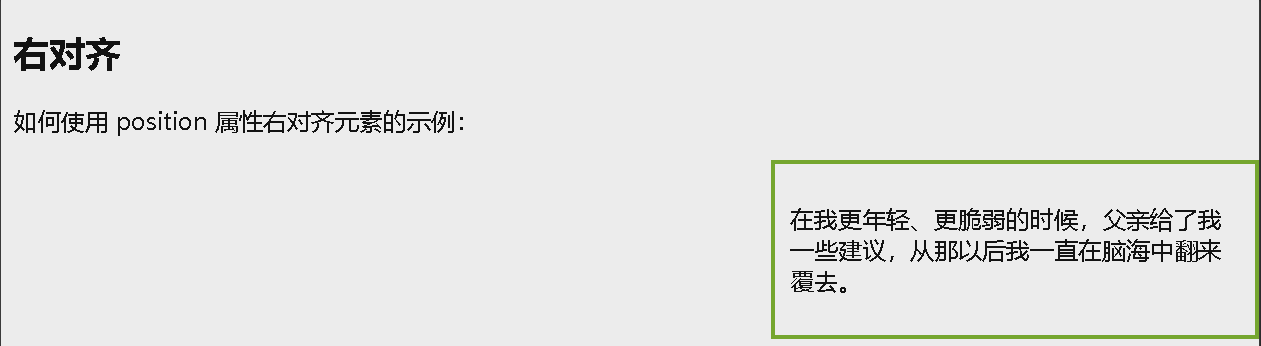
左和右对齐 - 使用 position
对齐元素的一种方法是使用 position: absolute;:
1
2
3
4
5
6
7
8
9
10
11
12
13
14
15
16
17
18
19
20
21
22
23
24
<!DOCTYPE html>
<html>
<head>
<style>
.right {
position: absolute;
right: 0px;
width: 300px;
border: 3px solid #73AD21;
padding: 10px;
}
</style>
</head>
<body>
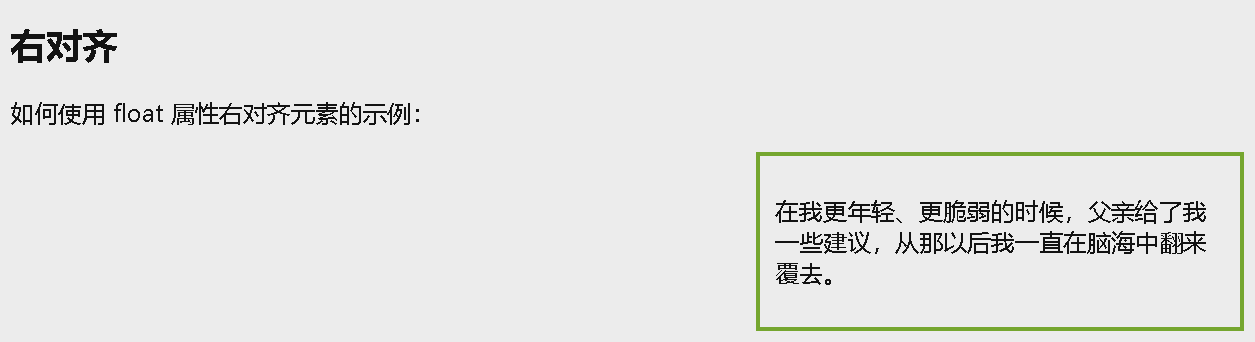
<h2>右对齐</h2>
<p>如何使用 position 属性右对齐元素的示例:</p>
<div class="right">
<p>在我更年轻、更脆弱的时候,父亲给了我一些建议,从那以后我一直在脑海中翻来覆去。</p>
</div>
</body>
</html>
绝对定位的元素将从正常流中删除,并可能出现元素重叠。
左和右对齐 - 使用 float
对齐元素的另一种方法是使用 float 属性:
1
2
3
4
5
6
7
8
9
10
11
12
13
14
15
16
17
18
19
20
21
22
23
<!DOCTYPE html>
<html>
<head>
<style>
.right {
  float: right;
  width: 300px;
  border: 3px solid #73AD21;
  padding: 10px;
}
</style>
</head>
<body>

<h2>右对齐</h2>
<p>如何使用 float 属性右对齐元素的示例:</p>

<div class="right">
  <p>在我更年轻、更脆弱的时候,父亲给了我一些建议,从那以后我一直在脑海中翻来覆去。</p>
</div>

</body>
</html>
如果一个元素比包含它的元素高,并且它是浮动的,它将溢出其容器。您可以使用 clearfix hack 来解决此问题
垂直对齐 - 使用 padding
有很多方法可以在 CSS 中垂直对齐元素。一个简单的解决方案是使用上下内边距:
1
2
3
4
5
6
7
8
9
10
11
12
13
14
15
16
17
18
19
20
21
<!DOCTYPE html>
<html>
<head>
<style>
.center {
padding: 70px 0;
border: 3px solid green;
}
</style>
</head>
<body>
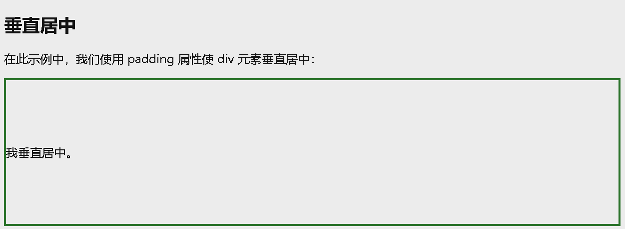
<h2>垂直居中</h2>
<p>在此示例中,我们使用 padding 属性使 div 元素垂直居中:</p>
<div class="center">
<p>我垂直居中。</p>
</div>
</body>
</html>
如需同时垂直和水平对齐,请使用 padding 和 text-align: center;:
1
2
3
4
5
6
7
8
9
10
11
12
13
14
15
16
17
18
19
20
21
22
<!DOCTYPE html>
<html>
<head>
<style>
.center {
padding: 70px 0;
border: 3px solid green;
text-align: center;
}
</style>
</head>
<body>
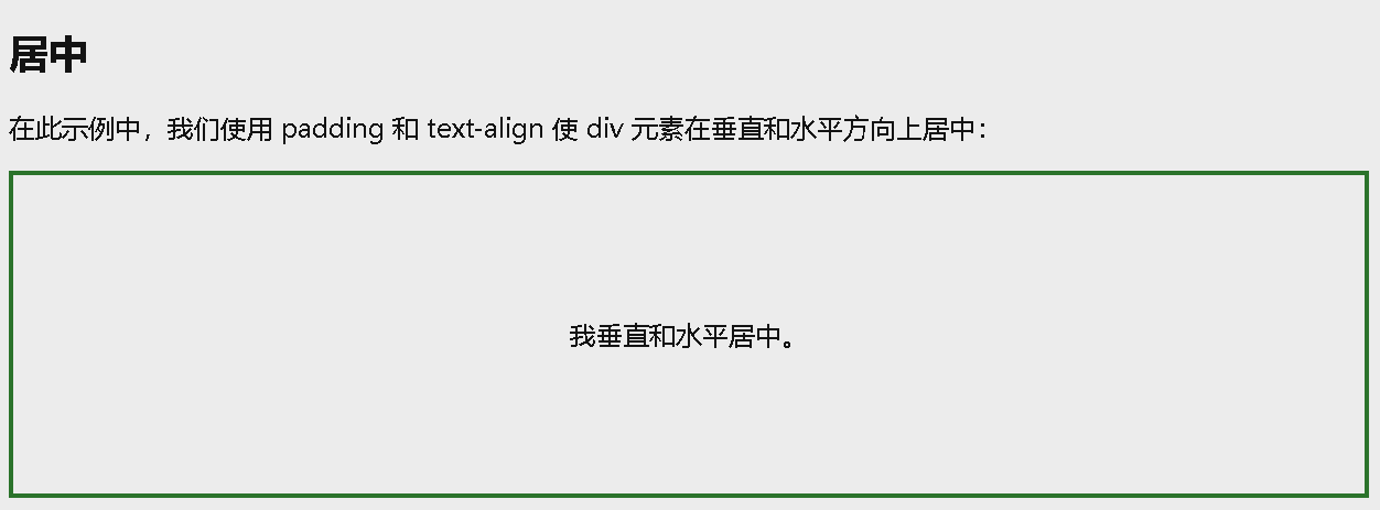
<h2>居中</h2>
<p>在此示例中,我们使用 padding 和 text-align 使 div 元素在垂直和水平方向上居中:</p>
<div class="center">
<p>我垂直和水平居中。</p>
</div>
</body>
</html>
垂直对齐 - 使用 line-height
另一个技巧是使用其值等于 height 属性值的 line-height 属性:
1
2
3
4
5
6
7
8
9
10
11
12
13
14
15
16
17
18
19
20
21
22
23
24
25
26
27
28
29
<!DOCTYPE html>
<html>
<head>
<style>
.center {
line-height: 200px;
height: 200px;
border: 3px solid green;
text-align: center;
}
/* 如果文本有多行,添加以下内容: */
.center p {
line-height: 1.5;
display: inline-block;
vertical-align: middle;
}
</style>
</head>
<body>
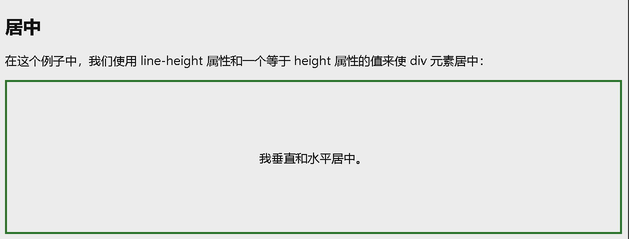
<h2>居中</h2>
<p>在这个例子中,我们使用 line-height 属性和一个等于 height 属性的值来使 div 元素居中:</p>
<div class="center">
<p>我垂直和水平居中。</p>
</div>
</body>
</html>
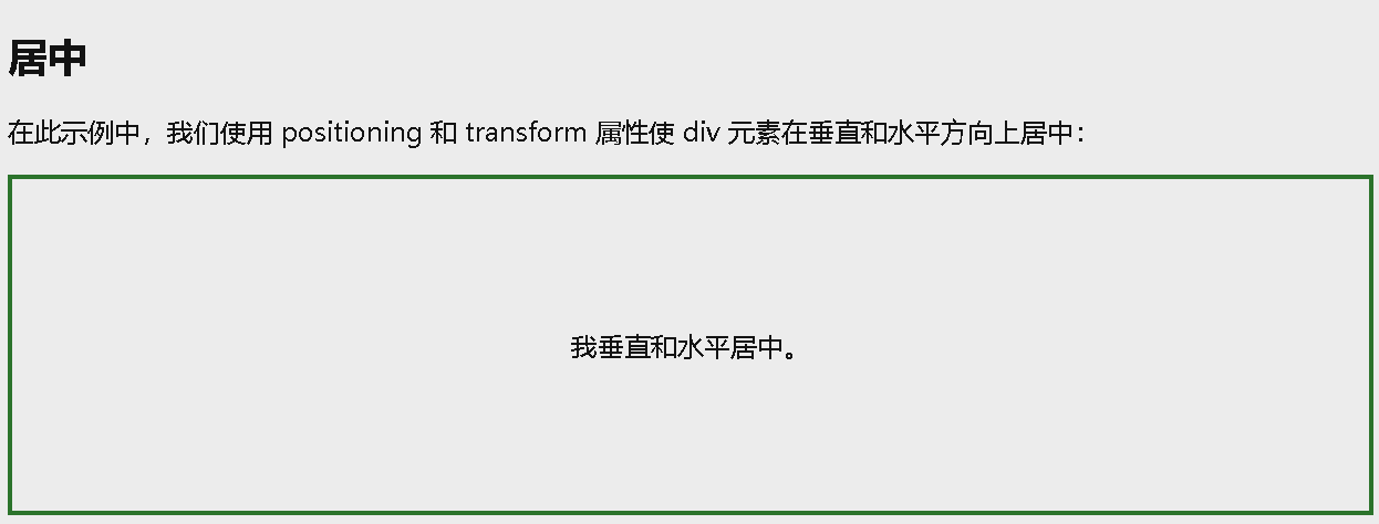
垂直对齐 - 使用 position 和 transform
如果您的选择不是 padding 和 line-height,则另一种解决方案是使用 position 和 transform 属性:
1
2
3
4
5
6
7
8
9
10
11
12
13
14
15
16
17
18
19
20
21
22
23
24
25
26
27
28
29
30
31
<!DOCTYPE html>
<html>
<head>
<style>
.center {
  height: 200px;
  position: relative;
  border: 3px solid green;
}

.center p {
  margin: 0;
  position: absolute;
  top: 50%;
  left: 50%;
  -ms-transform: translate(-50%, -50%);
  transform: translate(-50%, -50%);
}
</style>
</head>
<body>

<h2>居中</h2>
<p>在此示例中,我们使用 positioning 和 transform 属性使 div 元素在垂直和水平方向上居中:</p>

<div class="center">
  <p>我垂直和水平居中。</p>
</div>

</body>
</html>
垂直对齐 - 使用 Flexbox
您还可以使用 flexbox 将内容居中。请注意,IE10 以及更早的版本不支持 flexbox:
1
2
3
4
5
6
7
8
9
10
11
12
13
14
15
16
17
18
19
20
21
22
23
24
25
<!DOCTYPE html>
<html>
<head>
<style>
.center {
display: flex;
justify-content: center;
align-items: center;
height: 200px;
border: 3px solid green;
}
</style>
</head>
<body>
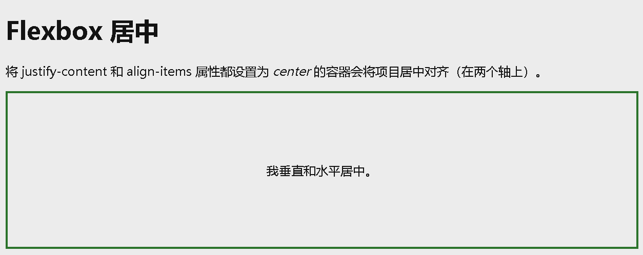
<h1>Flexbox 居中</h1>
<p>将 justify-content 和 align-items 属性都设置为 <em>center</em> 的容器会将项目居中对齐(在两个轴上)。</p>
<div class="center">
<p>我垂直和水平居中。</p>
</div>
</body>
</html>