从 Android SDK 21(即 5.0)开始,Button 控件按下自带阴影效果,阴影效果相当于是在 Z 轴的一个分量,所以导致 Button 总是在最顶层显示,同层级 View 的事件分发都是先分发给 Button。
1
2
3
| When the button is pressed, a z-translation (of 4dp) is applied, raising the button from 2dp to 6dp.
When the button isn’t pressed, the elevation is 2dp
When the button is disabled, the elevation becomes 0dp
|
frameworks/base/core/res/res/anim/button_state_list_anim_material.xml
1
2
3
4
5
6
7
8
9
10
11
12
13
14
15
16
17
18
19
20
21
22
23
24
25
26
27
28
29
30
31
32
33
34
35
36
37
38
39
40
| <selector xmlns:android="http://schemas.android.com/apk/res/android">
<item android:state_pressed="true" android:state_enabled="true">
<set>
<objectAnimator android:propertyName="translationZ"
android:duration="@integer/button_pressed_animation_duration"
android:valueTo="@dimen/button_pressed_z_material"
android:valueType="floatType"/>
<objectAnimator android:propertyName="elevation"
android:duration="0"
android:valueTo="@dimen/button_elevation_material"
android:valueType="floatType"/>
</set>
</item>
<!-- base state -->
<item android:state_enabled="true">
<set>
<objectAnimator android:propertyName="translationZ"
android:duration="@integer/button_pressed_animation_duration"
android:valueTo="0"
android:startDelay="@integer/button_pressed_animation_delay"
android:valueType="floatType"/>
<objectAnimator android:propertyName="elevation"
android:duration="0"
android:valueTo="@dimen/button_elevation_material"
android:valueType="floatType" />
</set>
</item>
<item>
<set>
<objectAnimator android:propertyName="translationZ"
android:duration="0"
android:valueTo="0"
android:valueType="floatType"/>
<objectAnimator android:propertyName="elevation"
android:duration="0"
android:valueTo="0"
android:valueType="floatType"/>
</set>
</item>
</selector>
|
1
2
3
4
5
| <!-- /Android/sdk/platforms/android-R/data/res/values/dimens_material.xml -->
<!-- Elevation when button is pressed -->
<dimen name="button_elevation_material">2dp</dimen>
<!-- Z translation to apply when button is pressed -->
<dimen name="button_pressed_z_material">4dp</dimen>
|
- 解决 1:Button 设置
android:stateListAnimator="@null" - 解决 2:提升同层级 z 轴 (elevation+tranztiaonZ) 值大于 2dp
- 解决 3:用一层布局包裹 Button
- 解决 4:用 RaiflatButton(A raised button that lowers down to 0dp of elevation)
Ref
在 RadioButton 中,自定义 RadioButton 样式时,设置了 match_parent,图片和文字不能居中
通过自定义 CenterRadioButton
1
2
3
4
5
6
7
8
9
10
11
12
13
14
15
16
17
18
19
20
21
22
23
24
25
26
27
28
29
30
| public class CenterRadioButton extends RadioButton {
public CenterRadioButton(Context context) {
super(context);
}
public CenterRadioButton(Context context, AttributeSet attrs) {
super(context, attrs);
}
public CenterRadioButton(Context context, AttributeSet attrs, int defStyleAttr) {
super(context, attrs, defStyleAttr);
}
@Override
protected void onDraw(Canvas canvas) {
if (isInEditMode()) {
return;
}
super.onDraw(canvas);
Drawable[] drawables = getCompoundDrawables();
Drawable drawable = drawables[0];
int gravity = getGravity();
int left = 0;
if (gravity == Gravity.CENTER) {
left = ((int) (getWidth() - drawable.getIntrinsicWidth() - getPaint().measureText(getText().toString())) / 2);
}
drawable.setBounds(left, 0, left + drawable.getIntrinsicWidth(), drawable.getIntrinsicHeight());
}
}
|
使用,android:button 设置为 null,通过 drawableLeft 和 drawPadding 来实现
1
2
3
4
5
6
7
8
9
10
11
12
13
14
15
16
17
18
19
20
21
22
23
24
25
26
27
28
29
30
31
32
33
34
35
36
37
38
39
40
41
42
43
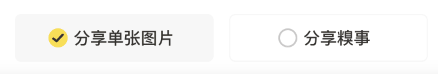
| <RadioGroup
android:id="@+id/rg_share_single_button"
android:orientation="horizontal"
android:gravity="center"
android:layout_width="match_parent"
android:layout_height="@dimen/qb_px_40"
app:layout_constraintLeft_toLeftOf="parent"
app:layout_constraintRight_toRightOf="parent"
app:layout_constraintStart_toStartOf="parent"
app:layout_constraintEnd_toEndOf="parent"
app:layout_constraintTop_toBottomOf="@+id/tv_share_single_label"
android:layout_marginTop="@dimen/qb_px_10"
android:paddingLeft="@dimen/qb_px_15"
android:paddingRight="@dimen/qb_px_15"
android:weightSum="2">
<qsbk.app.widget.CenterRadioButton
android:id="@+id/rb_share_single_left"
android:button="@null"
android:background="@drawable/selector_btn_bg_share"
android:drawableLeft="@drawable/selector_radiobutton_bg_share"
android:text="分享单张图片"
android:checked="true"
android:gravity="center"
android:drawablePadding="@dimen/qb_px_5"
android:layout_marginRight="@dimen/qb_px_13"
android:layout_marginEnd="@dimen/qb_px_13"
android:layout_weight="1"
android:layout_width="0dp"
android:layout_height="match_parent"/>
<qsbk.app.widget.CenterRadioButton
android:id="@+id/rb_share_single_right"
android:button="@null"
android:background="@drawable/selector_btn_bg_share"
android:drawableLeft="@drawable/selector_radiobutton_bg_share"
android:text="分享糗事"
android:gravity="center"
android:drawablePadding="@dimen/qb_px_5"
android:layout_weight="1"
android:layout_width="0dp"
android:layout_height="match_parent"/>
</RadioGroup>
|
效果:
更改 CheckBox 选中时的样式,CheckBox 样式
单个 CheckBox
- 自定义一个
checkbox.xml
1
2
3
4
5
| <?xml version="1.0" encoding="utf-8"?>
<selector xmlns:android="http://schemas.android.com/apk/res/android">
<item android:drawable="@drawable/check_box" android:state_checked="true" />
<item android:drawable="@drawable/check_box_b" android:state_checked="false" />
</selector>
|
- 更改 android:button=”@drawable/checkbox”
所有 CheckBox 定义 style
- 自定义一个
checkbox.xml
1
2
3
4
5
| <?xml version="1.0" encoding="utf-8"?>
<selector xmlns:android="http://schemas.android.com/apk/res/android">
<item android:drawable="@drawable/check_box" android:state_checked="true" />
<item android:drawable="@drawable/check_box_b" android:state_checked="false" />
</selector>
|
- 定义一个 CustomCheckboxTheme
1
2
3
| <style name="CustomCheckboxTheme" parent="@android:style/Widget.CompoundButton.CheckBox">
<item name="android:button">@drawable/music_tag_selector</item>
</style>
|
系统默认的 CheckBox 样式定义:
1
2
3
4
| <style name="Widget.CompoundButton.CheckBox">
<item name="android:background">@android:drawable/btn_check_label_background</item>
<item name="android:button">@android:drawable/btn_check</item>
</style>
|