Bootstrap基础
Bootstrap基础
Bootstrap 使用
引入
https://getbootstrap.com/docs/4.0/getting-started/introduction/
Vue 中引入
使用 npm 引入 Bootstrap 的安裝方式
1
npm install bootstrap
需要將 bootstrap 在 src/main.js 引入,供全局做使用:
1
2
3
4
5
6
7
8
9
10
11
12
13
14
15
//vue2
import Vue from "vue";
import App from "./App.vue";
import "bootstrap/dist/css/bootstrap.min.css"
// ... 其他要引入的套件

new Vue({
  el: "#app",
  router,
  components: { App },
  template: "<App/>",
  store,
});

import "bootstrap/dist/js/bootstrap.js"
1
2
3
4
5
6
7
8
9
//vue3
import { createApp } from "vue";
import App from "./App.vue";
import "bootstrap/dist/css/bootstrap.min.css"
// ... 其他要引入的套件

createApp(App).use(router).mount("#app");

import "bootstrap/dist/js/bootstrap.js"
样式
Background
https://getbootstrap.com/docs/5.3/utilities/background/
Background color
1
2
3
4
5
6
7
8
9
10
11
12
13
14
15
16
17
18
19
20
21
22
<div class="p-3 mb-2 bg-primary text-white">.bg-primary</div>
<div class="p-3 mb-2 bg-primary-subtle text-primary-emphasis">.bg-primary-subtle</div>
<div class="p-3 mb-2 bg-secondary text-white">.bg-secondary</div>
<div class="p-3 mb-2 bg-secondary-subtle text-secondary-emphasis">.bg-secondary-subtle</div>
<div class="p-3 mb-2 bg-success text-white">.bg-success</div>
<div class="p-3 mb-2 bg-success-subtle text-success-emphasis">.bg-success-subtle</div>
<div class="p-3 mb-2 bg-danger text-white">.bg-danger</div>
<div class="p-3 mb-2 bg-danger-subtle text-danger-emphasis">.bg-danger-subtle</div>
<div class="p-3 mb-2 bg-warning text-dark">.bg-warning</div>
<div class="p-3 mb-2 bg-warning-subtle text-warning-emphasis">.bg-warning-subtle</div>
<div class="p-3 mb-2 bg-info text-dark">.bg-info</div>
<div class="p-3 mb-2 bg-info-subtle text-info-emphasis">.bg-info-subtle</div>
<div class="p-3 mb-2 bg-light text-dark">.bg-light</div>
<div class="p-3 mb-2 bg-light-subtle text-light-emphasis">.bg-light-subtle</div>
<div class="p-3 mb-2 bg-dark text-white">.bg-dark</div>
<div class="p-3 mb-2 bg-dark-subtle text-dark-emphasis">.bg-dark-subtle</div>
<div class="p-3 mb-2 bg-body-secondary">.bg-body-secondary</div>
<div class="p-3 mb-2 bg-body-tertiary">.bg-body-tertiary</div>
<div class="p-3 mb-2 bg-body text-body">.bg-body</div>
<div class="p-3 mb-2 bg-black text-white">.bg-black</div>
<div class="p-3 mb-2 bg-white text-dark">.bg-white</div>
<div class="p-3 mb-2 bg-transparent text-body">.bg-transparent</div>
Background gradient
Sizing 尺寸
https://getbootstrap.com/docs/5.3/utilities/sizing/
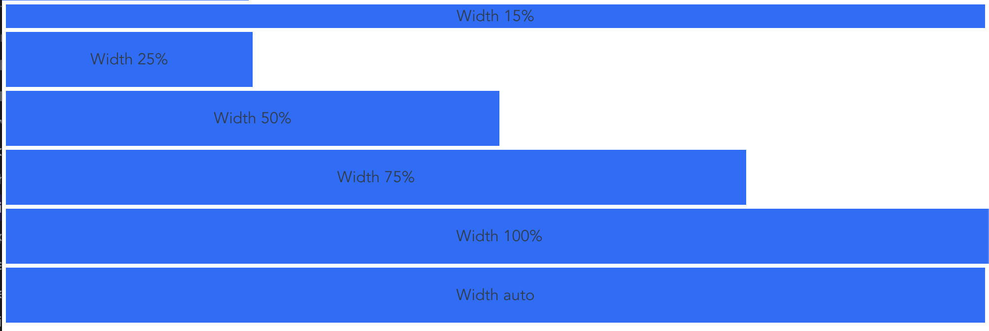
相对父容器
- width
1
2
3
4
5
6
<div class="w-15 m-1 bg-primary">Width 15%</div>
<div class="w-25 m-1 p-3 bg-primary">Width 25%</div>
<div class="w-50 m-1 p-3 bg-primary">Width 50%</div>
<div class="w-75 m-1 p-3 bg-primary">Width 75%</div>
<div class="w-100 m-1 p-3 bg-primary">Width 100%</div>
<div class="w-auto m-1 p-3 bg-primary">Width auto</div>
效果:
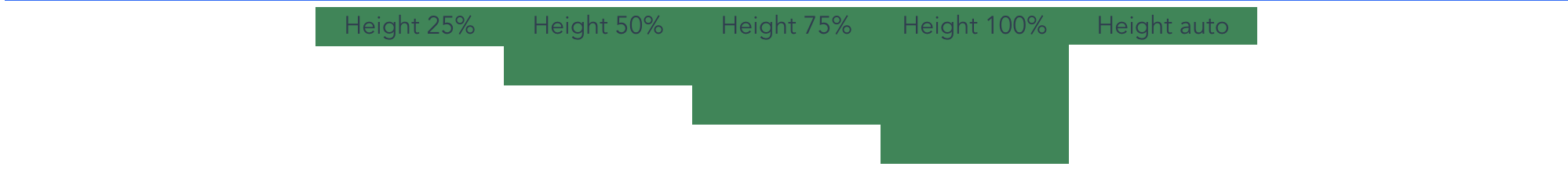
- height
1
2
3
4
5
6
7
<div style="height: 100px">
  <div class="h-25 d-inline-block bg-success" style="width: 120px">Height 25%</div>
  <div class="h-50 d-inline-block bg-success" style="width: 120px">Height 50%</div>
  <div class="h-75 d-inline-block bg-success" style="width: 120px">Height 75%</div>
  <div class="h-100 d-inline-block bg-success" style="width: 120px">Height 100%</div>
  <div class="h-auto d-inline-block bg-success" style="width: 120px">Height auto</div>
</div>
效果:
- mx-100, mx-100 最大宽度和最大高度
1
2
3
4
5
6
<div style="height: 100px;">
  <div class="mh-100" style="width: 100px; height: 200px;">Max-height 100%</div>
</div>
<div style="height: 100px;">
  <div class="mh-100" style="width: 100px; height: 200px;">Max-height 100%</div>
</div>
相对于 viewport
1
2
3
4
<div class="min-vw-100">Min-width 100vw</div>
<div class="min-vh-100">Min-height 100vh</div>
<div class="vw-100">Width 100vw</div>
<div class="vh-100">Height 100vh</div>
Spacing 边距
https://getbootstrap.com/docs/5.3/utilities/spacing/
影响元素之间的间距是可以通过 style 的 margin 或 padding 属性来实现,但这两个属性本意并不相同;margin 影响的是本元素与相邻外界元素之间的距离,这里简称外边距;padding 影响的元素本身与其内部子元素之间的距离,简称为内填充。
bootstrap 提供了简写的 class 名,名称分别以 m- 开头和 p- 开头的类
margin
| class name | 等价的 style |
|---|---|
| m-0 | 等价于 {margin:0 !important} |
| m-1 | 等价于 {margin:0.25rem !important} |
| m-2 | 等价于 {margin:0.5rem !important} |
| m-3 | 等价于 {margin:1rem !important} |
| m-4 | 等价于 {margin:1.5rem !important} |
| m-auto | 等价于{margin:auto !important} |
padding
| class name | 等价的 style |
|---|---|
| p-0 | 等价于 {padding:0 !important} |
| p-1 | 等价于 {padding:0.25rem !important} |
| p-2 | 等价于 {padding:0.5rem !important} |
| p-3 | 等价于 {padding:1rem !important} |
| p-4 | 等价于 {padding:1.5rem !important} |
| p-auto | 等价于{padding:auto !important} |
调整某一侧的边距
有几个缩写:t,b,s,e,x,y 含义分别是 top,bottom,start,end, start 和 end,top 和 bottom
t- for classes that setmargin-toporpadding-topb- for classes that setmargin-bottomorpadding-bottoms- (start) for classes that setmargin-leftorpadding-leftin LTR,margin-rightorpadding-rightin RTLe- (end) for classes that setmargin-rightorpadding-rightin LTR,margin-leftorpadding-leftin RTLx- for classes that set both*-leftand*-righty- for classes that set both*-topand*-bottom- blank - for classes that set a
marginorpaddingon all 4 sides of the element
| class 名 | 等价的 style |
|---|---|
| mt-2 | {margin-top: 0.5rem !important} |
| mb-2 | {margin-bottom: 0.5rem !important} |
| ml-2 | {margin-left: 0.5rem !important} |
| … | |
| padding 类似 |
负数
默认关闭,通过 Scss 开启:$enable-negative-margins: true
和正数不同的是前面加了个 n
1
2
3
.mt-n1 {
  margin-top: -0.25rem !important;
}
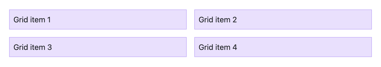
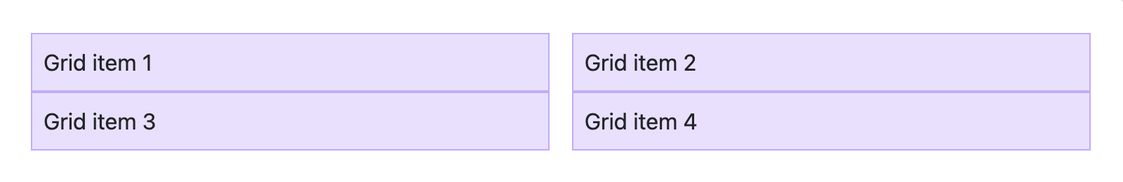
Gap
用 display: grid or display: flex,可以在父容器设置 gap
1
2
3
4
5
6
<div class="grid gap-3">
  <div class="p-2 g-col-6">Grid item 1</div>
  <div class="p-2 g-col-6">Grid item 2</div>
  <div class="p-2 g-col-6">Grid item 3</div>
  <div class="p-2 g-col-6">Grid item 4</div>
</div>
效果:
row-gap
row-gap 设置垂直方向的 space
1
2
3
4
5
6
<div class="grid gap-0 row-gap-3">
  <div class="p-2 g-col-6">Grid item 1</div>
  <div class="p-2 g-col-6">Grid item 2</div>
  <div class="p-2 g-col-6">Grid item 3</div>
  <div class="p-2 g-col-6">Grid item 4</div>
</div>
效果:
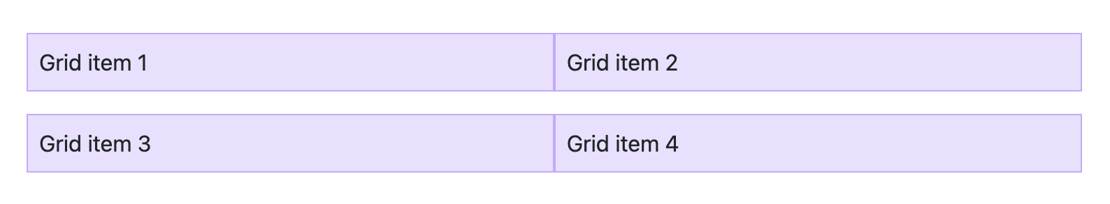
column-gap
column-gap 设置水平方向的 space
1
2
3
4
5
6
<div class="grid gap-0 column-gap-3">
  <div class="p-2 g-col-6">Grid item 1</div>
  <div class="p-2 g-col-6">Grid item 2</div>
  <div class="p-2 g-col-6">Grid item 3</div>
  <div class="p-2 g-col-6">Grid item 4</div>
</div>
效果:
Input group 输入框
List group 列表
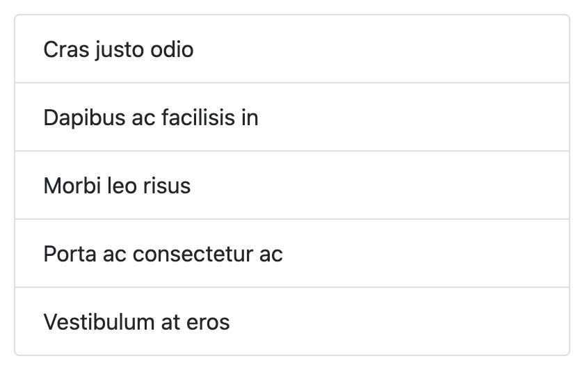
Basic
1
2
3
4
5
6
7
<ul class="list-group">
  <li class="list-group-item">Cras justo odio</li>
  <li class="list-group-item">Dapibus ac facilisis in</li>
  <li class="list-group-item">Morbi leo risus</li>
  <li class="list-group-item">Porta ac consectetur ac</li>
  <li class="list-group-item">Vestibulum at eros</li>
</ul>
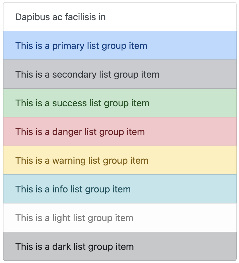
Contextual classes 带 stateful background 的
1
2
3
4
5
6
7
8
9
10
11
12
13
<div class="list-group">
  <a href="#" class="list-group-item list-group-item-action">Dapibus ac facilisis in</a>


  <a href="#" class="list-group-item list-group-item-action list-group-item-primary">This is a primary list group item</a>
  <a href="#" class="list-group-item list-group-item-action list-group-item-secondary">This is a secondary list group item</a>
  <a href="#" class="list-group-item list-group-item-action list-group-item-success">This is a success list group item</a>
  <a href="#" class="list-group-item list-group-item-action list-group-item-danger">This is a danger list group item</a>
  <a href="#" class="list-group-item list-group-item-action list-group-item-warning">This is a warning list group item</a>
  <a href="#" class="list-group-item list-group-item-action list-group-item-info">This is a info list group item</a>
  <a href="#" class="list-group-item list-group-item-action list-group-item-light">This is a light list group item</a>
  <a href="#" class="list-group-item list-group-item-action list-group-item-dark">This is a dark list group item</a>
</div>
本文由作者按照 CC BY 4.0 进行授权