06.Flutter Color和Theme
Color
将颜色字符串转成 Color 对象
1
2
3
4
5
Color(0xffdc380d); // 如果颜色固定可以直接使用整数值
// 颜色是一个字符串变量
var c = "dc380d";
Color(int.parse(c,radix:16)|0xFF000000) // 通过位运算符将Alpha设置为FF
Color(int.parse(c,radix:16)).withAlpha(255)  // 通过方法将Alpha设置为FF
颜色亮度
Color 类中提供了一个 computeLuminance() 方法,它可以返回一个 [0-1] 的一个值,数字越大颜色就越浅。
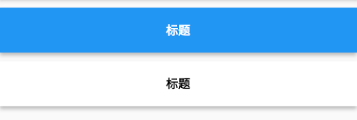
案例:我们要实现一个背景颜色和 Title 可以自定义的导航栏,并且背景色为深色时我们应该让 Title 显示为浅色;背景色为浅色时,Title 显示为深色。
1
2
3
4
5
6
7
8
9
10
11
12
13
14
15
16
17
18
19
20
21
22
23
24
25
26
27
28
29
30
31
32
33
34
35
36
37
38
39
40
class NavBar extends StatelessWidget {
  final String title;
  final Color color; //背景颜色

  NavBar({
    Key? key,
    required this.color,
    required this.title,
  });

  @override
  Widget build(BuildContext context) {
    return Container(
      constraints: BoxConstraints(
        minHeight: 52,
        minWidth: double.infinity,
      ),
      decoration: BoxDecoration(
        color: color,
        boxShadow: [
          //阴影
          BoxShadow(
            color: Colors.black26,
            offset: Offset(0, 3),
            blurRadius: 3,
          ),
        ],
      ),
      child: Text(
        title,
        style: TextStyle(
          fontWeight: FontWeight.bold,
          //根据背景色亮度来确定Title颜色
          color: color.computeLuminance() < 0.5 ? Colors.white : Colors.black,
        ),
      ),
      alignment: Alignment.center,
    );
  }
}
使用:
1
2
3
4
5
6
7
8
Column(
  children: <Widget>[
    //背景为蓝色,则title自动为白色
    NavBar(color: Colors.blue, title: "标题"),
    //背景为白色,则title自动为黑色
    NavBar(color: Colors.white, title: "标题"),
  ]
)
MaterialColor
MaterialColor 是实现 Material Design 中的颜色的类,它包含一种颜色的 10 个级别的渐变色。MaterialColor 通过 “[]” 运算符的索引值来代表颜色的深度,有效的索引有:50,100,200,…,900,数字越大,颜色越深。MaterialColor 的默认值为索引等于 500 的颜色
- Colors.blue
- Colors.blue.shade50
Theme
Theme 组件可以为 Material APP 定义主题数据(ThemeData)。Material 组件库里很多组件都使用了主题数据,如导航栏颜色、标题字体、Icon 样式等。Theme 内会使用 InheritedWidget 来为其子树共享样式数据。
ThemeData
ThemeData 用于保存是 Material 组件库的主题数据,Material 组件需要遵守相应的设计规范,而这些规范可自定义部分都定义在 ThemeData 中了,所以我们可以通过 ThemeData 来自定义应用主题。在子组件中,我们可以通过 Theme.of 方法来获取当前的 ThemeData。
注意:Material Design 设计规范中有些是不能自定义的,如导航栏高度,ThemeData 只包含了可自定义部分。
ThemeData 部分数据定义:
1
2
3
4
5
6
7
8
9
10
11
12
13
14
15
ThemeData({
  Brightness? brightness, //深色还是浅色
  MaterialColor? primarySwatch, //主题颜色样本,见下面介绍
  Color? primaryColor, //主色,决定导航栏颜色
  Color? cardColor, //卡片颜色
  Color? dividerColor, //分割线颜色
  ButtonThemeData buttonTheme, //按钮主题
  Color dialogBackgroundColor,//对话框背景颜色
  String fontFamily, //文字字体
  TextTheme textTheme,// 字体主题,包括标题、body等文字样式
  IconThemeData iconTheme, // Icon的默认样式
  TargetPlatform platform, //指定平台,应用特定平台控件风格
  ColorScheme? colorScheme,
  // ...
})
- primarySwatch,它是主题颜色的一个 “ 样本色 “,通过这个样本色可以在一些条件下生成一些其他的属性,例如,如果没有指定 primaryColor,并且当前主题不是深色主题,那么 primaryColor 就会默认为 primarySwatch 指定的颜色,还有一些相似的属性如 indicatorColor 也会受 primarySwatch 影响
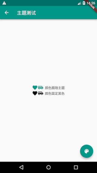
案例:路由换肤功能
1
2
3
4
5
6
7
8
9
10
11
12
13
14
15
16
17
18
19
20
21
22
23
24
25
26
27
28
29
30
31
32
33
34
35
36
37
38
39
40
41
42
43
44
45
46
47
48
49
50
51
52
53
class ThemeTestRoute extends StatefulWidget {
  const ThemeTestRoute({super.key});

  @override
  _ThemeTestRouteState createState() => _ThemeTestRouteState();
}

class _ThemeTestRouteState extends State<ThemeTestRoute> {
  var _themeColor = Colors.teal; //当前路由主题色

  @override
  Widget build(BuildContext context) {
    ThemeData themeData = Theme.of(context);
    return Theme(
      data: ThemeData(
          primarySwatch: _themeColor, //用于导航栏、FloatingActionButton的背景色等
          iconTheme: IconThemeData(color: _themeColor) //用于Icon颜色
          ),
      child: Scaffold(
        appBar: AppBar(title: const Text("主题测试")),
        body: Column(
          mainAxisAlignment: MainAxisAlignment.center,
          children: <Widget>[
            //第一行Icon使用主题中的iconTheme
            const Row(mainAxisAlignment: MainAxisAlignment.center, children: <Widget>[
              Icon(Icons.favorite),
              Icon(Icons.airport_shuttle),
              Text("  颜色跟随主题")
            ]),
            //为第二行Icon自定义颜色(固定为黑色)
            Theme(
              data: themeData.copyWith(
                iconTheme: themeData.iconTheme.copyWith(color: Colors.black),
              ),
              child: const Row(
                  mainAxisAlignment: MainAxisAlignment.center,
                  children: <Widget>[
                    Icon(Icons.favorite),
                    Icon(Icons.airport_shuttle),
                    Text("  颜色固定黑色")
                  ]),
            ),
          ],
        ),
        floatingActionButton: FloatingActionButton(
            onPressed: () => //切换主题
                setState(() => _themeColor =
                    _themeColor == Colors.teal ? Colors.blue : Colors.teal),
            child: const Icon(Icons.palette)),
      ),
    );
  }
}
- 可以通过局部主题覆盖全局主题:
themeData.copyWith(iconTheme: themeData.iconTheme.copyWith(color: Colors.black))
为什么局部主题可以覆盖全局主题?这主要是因为 widget 中使用主题样式时是通过 Theme.of(BuildContext context) 来获取的,我们看看其简化后的代码:
1
2
3
4
static ThemeData of(BuildContext context, { bool shadowThemeOnly = false }) {
   // 简化代码,并非源码
   return context.dependOnInheritedWidgetOfExactType<_InheritedTheme>().theme.data
}
context.dependOnInheritedWidgetOfExactType 会在 widget 树中从当前位置向上查找第一个类型为 _InheritedTheme 的 widget。所以当局部指定 Theme 后,其子树中通过 Theme.of() 向上查找到的第一个 _InheritedTheme 便是我们指定的 Theme。
- 如果想要对整个应用换肤,则可以去修改 MaterialApp 的 theme 属性