03.Flutter布局类组件
布局
布局类组件都会包含一个或多个子组件,不同的布局类组件对子组件排列(layout)方式不同,如表 4-1 所示:
| Widget | 说明 | 用途 |
|---|---|---|
| LeafRenderObjectWidget | 非容器类组件基类 | Widget 树的叶子节点,用于没有子节点的 widget,通常基础组件都属于这一类,如 Image。 |
| SingleChildRenderObjectWidget | 单子组件基类 | 包含一个子 Widget,如:ConstrainedBox、DecoratedBox 等 |
| MultiChildRenderObjectWidget | 多子组件基类 | 包含多个子 Widget,一般都有一个 children 参数,接受一个 Widget 数组。如 Row、Column、Stack 等 |
- 布局类组件就是指直接或间接继承 (包含)
SingleChildRenderObjectWidget和MultiChildRenderObjectWidget的Widget,它们一般都会有一个 child 或 children 属性用于接收子 Widget。
继承关系 Widget > RenderObjectWidget > (Leaf/SingleChild/MultiChild)RenderObjectWidget
- RenderObjectWidget 类中定义了创建、更新 RenderObject 的方法,子类必须实现他们;RenderObject 是最终布局、渲染 UI 界面的对象。
Flutter 布局模型
Flutter 布局总纲——向下传递约束,向上传递尺寸
Flutter 中有两种布局模型:
- 基于
RenderBox的盒模型布局 - 基于
Sliver ( RenderSliver )按需加载列表布局
两种布局方式在细节上略有差异,但大体流程相同,布局流程如下:
- 上层组件向下层组件传递约束(constraints)条件。
- 下层组件确定自己的大小,然后告诉上层组件大小。注意下层组件的大小必须符合父组件的约束。
- 上层组件确定下层组件相对于自身的偏移和确定自身的大小(大多数情况下会根据子组件的大小来确定自身的大小)。
任何时候子组件都必须先遵守父组件的约束,在此基础上再应用子组件约束(相当于父组件的约束和自身的大小求一个交集)
盒模型 Box
盒模型布局组件有两个特点:
- 组件对应的渲染对象都继承自 RenderBox 类。
- 在布局过程中父级传递给子级的约束信息由
BoxConstraints描述。
约束
BoxConstraints
约束是 Flutter 布局的核心,在 Flutter 中,约束的表现形式是通过 Constraints 类来实现的,所有的非滚动布局模型,都通过 BoxConstraints 来进行约束。BoxConstraints 是盒模型布局过程中父渲染对象传递给子渲染对象的约束信息,BoxConstraints 默认的构造函数如下:
1
2
3
4
5
6
7
8
9
10
11
12
13
14
15
16
17
18
19
20
21
22
23
24
25
26
27
28
29
30
31
32
class BoxConstraints extends Constraints {
  const BoxConstraints({
    this.minWidth = 0.0,
    this.maxWidth = double.infinity,
    this.minHeight = 0.0,
    this.maxHeight = double.infinity,
  });
  BoxConstraints.tight(Size size)
    : minWidth = size.width,
      maxWidth = size.width,
      minHeight = size.height,
      maxHeight = size.height;
  const BoxConstraints.tightFor({
    double? width,
    double? height,
  }) : minWidth = width ?? 0.0,
       maxWidth = width ?? double.infinity,
       minHeight = height ?? 0.0,
       maxHeight = height ?? double.infinity;
  BoxConstraints.loose(Size size)
    : minWidth = 0.0,
      maxWidth = size.width,
      minHeight = 0.0,
      maxHeight = size.height;
  const BoxConstraints.expand({
    double? width,
    double? height,
  }) : minWidth = width ?? double.infinity,
       maxWidth = width ?? double.infinity,
       minHeight = height ?? double.infinity,
       maxHeight = height ?? double.infinity;
}
- 4 个属性定义了:最大宽度,最大高度,最小宽度,最小高度;约束本质上就是「宽」「高」上的「最大」「最小」范围
tight(Size)生成固定宽高的约束,即 minWidth 和 maxWidget 相等,height 一样loose(Size)生成 width 和 height 不超过 Size 的约束expand()成一个尽可能大的用以填充另一个容器的 BoxConstraints;即给定了 widget/height 就是该值,为空就是 double.infinity
BoxConstraints 具有传递性,约束会在组件树上传递,当前 Widget 会受到来自父级的约束,同时也会将约束传递给它的子 Widget
约束如何传递?
通过一个案例来理解下约束是如何进行传递的?
1
2
3
4
5
6
7
8
9
10
11
12
13
14
15
MaterialApp(
  home: Container(
    color: Colors.cyan.shade200,
    width: 10,
    height: 10,
    child: Center(
      child: Container(
        color: Colors.red.shade200,
        width: 300,
        height: 300,
        child: FlutterLogo(size: 1000),
      ),
    ),
  ),
);
疑问?
- 第一个 Container 的 10x10 能否生效
- 第二个 Container 的 300x300 能否生效
- FlutterLogo 的 1000x1000 能否生效
效果:
第一个 Container 的尺寸被无视了,第二个 Container 的尺寸生效了,FlutterLogo 的尺寸也被无视了。
在 Flutter 中,每个组件都有自己的布局行为:
- Root,传递紧约束,即它的子元素,必须是设备的尺寸,不然 Root 根本不知道未被撑满的内容该如何显示
- Container,在有 Child 的时候,传递紧约束,即子元素必须和它一样大,否则 Container 也不知道该怎么放置 Child
- Center,将紧约束转换为松约束,Center 可以将父级的紧约束,变松,这样它的子元素可以选择放置在居中的位置,而子元素具体有多大?只要不超过父容器大小都可以
父容器一层层向下先传递约束,即最大最小宽高,子元素根据父元素的约束,修改自己的约束,并继续向下传递,到根子节点之后,将根据约束修正后得到的尺寸,返回给父级,直到根节点。
这也是为什么有些元素设置的尺寸,会被约束吃掉的原因。在 Flutter 中,元素的尺寸,在不同的父级组件下,会展示出不同的约束效果,从而展示出不同的样式,这是和 Android View 非常不同的一点。
调试约束
LayoutBuilder
1
2
3
4
5
6
7
8
9
10
11
12
13
14
15
16
17
18
19
20
21
22
23
24
25
LayoutBuilder layoutBuilder(Widget widget) {
  return LayoutBuilder(
      builder: (BuildContext context, BoxConstraints constraints) {
    print('【$widget】 constraints $constraints');
    return widget;
  });
}

@override
Widget build(BuildContext context) {
  return MaterialApp(
    home: layoutBuilder(Container(
      color: Colors.cyan.shade200,
      width: 10,
      height: 10,
      child: layoutBuilder(Center(
        child: layoutBuilder(Container(
          color: Colors.red.shade200,
          width: 300,
          height: 300,
          child: const FlutterLogo(size: 1000),
        )),
      )),
    )),
  );
I/flutter ( 3449): 【Container(bg: Color(0xff80deea), constraints: BoxConstraints(w=10.0, h=10.0))】 constraints BoxConstraints(w=411.4, h=866.3) I/flutter ( 3449): 【Center(alignment: Alignment.center)】 constraints BoxConstraints(w=411.4, h=866.3) I/flutter ( 3449): 【Container(bg: Color(0xffef9a9a), constraints: BoxConstraints(w=300.0, h=300.0))】 constraints BoxConstraints(0.0<=w<=411.4, 0.0<=h<=866.3)
Flutter Inspector
在 Flutter Inspector 中,我们可以查看当前 Widget Tree 的约束情况,在 Layout Explorer 中,可以看到约束的具体数值
在 Widget Detail Tree 中,我们还可以看到具体的 BoxConstraints 对象
多重约束限制
有多重限制时,对于 minWidth 和 minHeight 来说,是取父子中相应数值较大的。实际上,只有这样才能保证父限制与子限制不冲突。
1
2
3
4
5
6
7
ConstrainedBox(
  constraints: BoxConstraints(minWidth: 90.0, minHeight: 20.0),
  child: ConstrainedBox(
    constraints: BoxConstraints(minWidth: 60.0, minHeight: 60.0),
    child: redBox,
  )
)
maxWidth 和 minHeight 多重限制呢?取父限制和子限制较小的值?待验证
打破约束限制 UnconstrainedBox
任何时候子组件都必须遵守其父组件的约束,但前提条件是它们必须是父子关系,假如有一个组件 A,它的子组件是 B,B 的子组件是 C,则 C 必须遵守 B 的约束,同时 B 必须遵守 A 的约束,但是 A 的约束不会直接约束到 C,除非 B 将 A 对它自己的约束透传给了 C。 利用这个原理,就可以实现一个这样的 B 组件:
- B 组件中在布局 C 时不约束 C(可以为无限大)。
- C 根据自身真实的空间占用来确定自身的大小。
- B 在遵守 A 的约束前提下结合子组件的大小确定自身大小。
而这个 B 组件就是 UnconstrainedBox 组件,也就是说 UnconstrainedBox 的子组件将不再受到约束,大小完全取决于自己。
案例 1:
1
2
3
4
5
6
7
8
9
ConstrainedBox(
  constraints: BoxConstraints(minWidth: 60.0, minHeight: 100.0),  //父
  child: UnconstrainedBox( //“去除”父级限制
    child: ConstrainedBox(
      constraints: BoxConstraints(minWidth: 90.0, minHeight: 20.0),//子
      child: redBox,
    ),
  )
)
上面代码中,如果没有中间的 UnconstrainedBox,那么根据上面所述的多重限制规则,那么最终将显示一个 90×100 的红色框。但是由于 UnconstrainedBox “ 去除 “ 了父 ConstrainedBox 的限制,则最终会按照子 ConstrainedBox 的限制来绘制 redBox,即 90×20
但是,请注意,UnconstrainedBox 对父组件限制的 “ 去除 “ 并非是真正的去除:上面例子中虽然红色区域大小是 90×20,但上方仍然有 80 的空白空间。也就是说父限制的 minHeight(100.0) 仍然是生效的,只不过它不影响最终子元素 redBox 的大小,但仍然还是占有相应的空间,可以认为此时的父 ConstrainedBox 是作用于子 UnconstrainedBox 上,而 redBox 只受子 ConstrainedBox 限制
案例 2:如 Material 组件库中的 AppBar(导航栏)的右侧菜单中,我们使用 SizedBox 指定了 loading 按钮的大小
1
2
3
4
5
6
7
8
9
10
11
12
13
 AppBar(
   title: Text(title),
   actions: <Widget>[
     SizedBox(
       width: 20,
       height: 20,
       child: CircularProgressIndicator(
         strokeWidth: 3,
         valueColor: AlwaysStoppedAnimation(Colors.white70),
       ),
     )
   ],
)

我们会发现右侧 loading 按钮大小并没有发生变化!这正是因为 AppBar 中已经指定了 actions 按钮的约束条件,所以我们要自定义 loading 按钮大小,就必须通过 UnconstrainedBox 来 “ 去除 “ 父元素的限制,代码如下:
1
2
3
4
5
6
7
8
9
10
11
12
13
14
15
AppBar(
  title: Text(title),
  actions: <Widget>[
    UnconstrainedBox(
      child: SizedBox(
        width: 20,
        height: 20,
        child: CircularProgressIndicator(
          strokeWidth: 3,
          valueColor: AlwaysStoppedAnimation(Colors.white70),
        ),
      ),
    )
  ],
)

需要注意,UnconstrainedBox 虽然在其子组件布局时可以取消约束(子组件可以为无限大),但是 UnconstrainedBox 自身是受其父组件约束的,所以当 UnconstrainedBox 随着其子组件变大后,如果 UnconstrainedBox 的大小超过它父组件约束时,也会导致溢出报错。
控件的约束
Flex 约束
- Box 布局:单个 Child 的容器布局
- Flex 布局:类似 Column 和 Row 这样的布局方式;Row 本质上是 direction: Axis.horizontal 的 Flex Widget,Column 本质上是 direction: vertical 的 Flex Widget。
在 Column 和 Row 中,有两类约束组件,一种是明确知道自身尺寸的 Widget,例如 Text、Button,有约束的 Container 等,还有一种是弹性组件,例如 Expanded 和 Flexible 等组件。
所以 Column 和 Row 在布局时,采用的是Flex 约束进行布局,布局按照下面的规则进行:
- 先按照 unbound 约束,计算所有非 Flex 布局的组件的尺寸
- 再对 Flex 组件进行布局,布局根据 flex 属性来分配剩余空间(Flex 组件向下传递紧约束)
- 上面的布局规则是针对主轴来说的,Flex 的主轴约束为 unbound,Flex 约束在交叉轴上会设置为松约束(如果 crossAxisAlignment 设置为 stretch,那么会变成紧约束)
以 Row 为例,Row 对 child 的约束会修改为松约束,从而不会限制 child 在主轴方向上的尺寸,所以当 Row 内的 Child 宽度大于屏幕宽度时,就会产生内容溢出的警告。
所以我们通常会在 Flex 组件中使用 Expanded 组件来避免内容的溢出。Expanded 组件会将主轴方向上的 Child 施加紧约束,从而避免溢出。
1
2
3
4
5
6
7
class Expanded extends Flexible {
  const Expanded({
    super.key,
    super.flex,
    required super.child,
  }) : super(fit: FlexFit.tight);
}
Expanded 其实就是 Flexible 的封装,只是将 fit 设置为了 FlexFit.tight
案例:
1
2
3
4
5
6
7
8
9
10
11
12
13
14
15
16
17
18
19
20
21
22
23
24
25
26
27
28
29
30
31
32
33
34
35
36
37
38
39
40
41
42
43
44
45
46
47
48
49
50
51
52
53
54
55
56
57
58
59
60
61
62
63
64
65
66
67
68
69
70
71
72
73
74
75
76
77
78
79
80
81
82
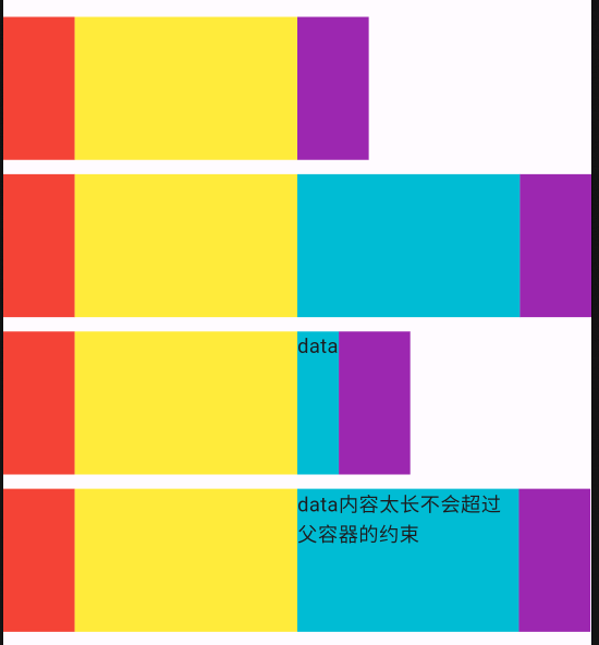
// 先计算非Flex Widget的尺寸,再将剩余空间按照Flex进行拆分,Flexible是loose,没有child就是0
Widget rowConstraints() {
return Center(
child: SizedBox(
height: 100,
child: Row(
crossAxisAlignment: CrossAxisAlignment.stretch,
children: [
Container(width: 50, color: Colors.red),
Expanded(child: ColoredBox(color: Colors.yellow)),
Flexible(child: ColoredBox(color: Colors.cyan), fit: FlexFit.loose),
Container(width: 50, color: Colors.purple),
],
),
),
);
}
// Flexible中的fit改为FlexFit.tight,对Flexible就是紧约束了,会填充剩余尺寸
Widget rowConstraints2() {
return Center(
child: SizedBox(
height: 100,
child: Row(
crossAxisAlignment: CrossAxisAlignment.stretch,
children: [
Container(width: 50, color: Colors.red),
Expanded(child: ColoredBox(color: Colors.yellow)),
Flexible(
child: ColoredBox(
color: Colors.cyan,
),
fit: FlexFit.tight),
Container(width: 50, color: Colors.purple),
],
),
),
);
}
Widget rowConstraints3() {
return Center(
child: SizedBox(
height: 100,
child: Row(
crossAxisAlignment: CrossAxisAlignment.stretch,
children: [
Container(width: 50, color: Colors.red),
Expanded(child: ColoredBox(color: Colors.yellow)),
Flexible(
child: ColoredBox(
color: Colors.cyan,
child: Text('data'),
),
fit: FlexFit.loose),
Container(width: 50, color: Colors.purple),
],
),
),
);
}
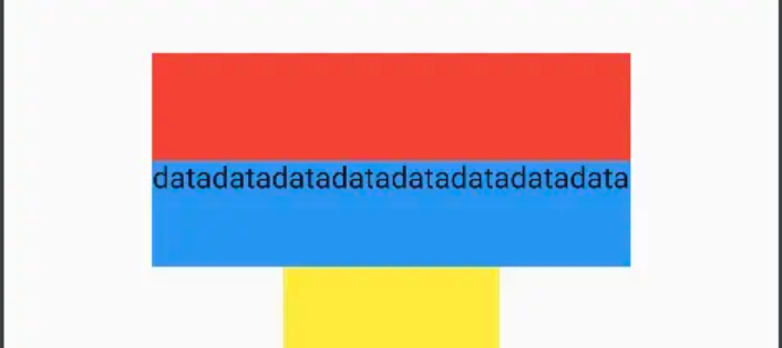
// 当Flexible内容变长时,会限制其最大宽度
Widget rowConstraints4() {
return Center(
child: SizedBox(
height: 100,
child: Row(
crossAxisAlignment: CrossAxisAlignment.stretch,
children: [
Container(width: 50, color: Colors.red),
Expanded(child: ColoredBox(color: Colors.yellow)),
Flexible(
child: ColoredBox(
color: Colors.cyan,
child: Text('data内容太长不会超过父容器的约束'),
),
fit: FlexFit.loose),
Container(width: 50, color: Colors.purple),
],
),
),
);
}
Wrap 约束
Wrap 组件与 Flex 组件有些类似,但又有些不同
- Row 中的 child 组件如果超过了屏幕宽度,就会导致内容溢出,因为 Flex 组件其主轴上的约束为 unbound
- 而 Wrap 组件,其主轴上的约束会被修改为松约束,交叉轴上的约束会被改为 unbound,这样就可以实现流式的布局效果
所以 Wrap 组件和 Flex 组件在本质上是相反的两种布局行为
Stack 布局约束
Stack 是一类比较特殊的层叠组件,它的约束方式和 Column、Row 相似,但又不完全一样,在 Stack 中,同样也分为两类组件,一类是 Positioned 组件,一类是非 Positioned 组件,然后 Stack 会按照下面的布局方式进行。
- 先按照非 Positioned 组件的尺寸进行计算,将自身尺寸设置为非 Positioned 组件的最大值
- 再对 Positioned 组件进行布局,按照位置约束进行布局,但不能再改变 Stack 的尺寸
特殊场景下:如果全部是 Positioned 组件,那么 Stack 将获得父容器的最大约束,如果全部是非 Positioned 组件,那么 Stack 将获得子元素的最大尺寸
从约束上来说,Stack 同样会放松父布局的紧约束,其行为和 Align 是类似的。
Stack 的 Fit 属性
Stack 有个 Fit 属性,需要特别注意,它可以设置为:
- StackFit.loose:向下传递松约束(默认行为)
- StackFit.expand:向下传递紧约束
- StackFit.passthrough:将父级的约束向下传递
Stack 设置 Fit 属性后,并不会对自身尺寸有影响,它改变的是 Child 的尺寸,通过修改约束是紧约束还是松约束,来影响 Child 的尺寸,从而改变自己的尺寸。所以 Stack 的 Fit 属性默认是 loose,即松约束。如果设置为 expand,那么 Stack 将向 Child 传递一个紧约束。
ConstrainedBox
ConstrainedBox 用于对子组件添加额外的约束。
案例:让子组件的最小高度是 50
1
2
3
4
5
6
7
8
9
10
11
12
13
14
15
ConstrainedBox demoWidget() {
    Widget redBox = const DecoratedBox(
      decoration: BoxDecoration(color: Colors.red),
    );
    return ConstrainedBox(
      constraints: const BoxConstraints(
          minWidth: double.infinity, //宽度尽可能大
          minHeight: 50.0 //最小高度为50像素
          ),
      child: Container(
        height: 5.0,
        child: redBox,
      ),
    );
}
SizedBox
SizedBox 用于给子元素指定固定的宽高
1
2
3
4
5
SizedBox(
  width: 80.0,
  height: 80.0,
  child: redBox
)
实际上 SizedBox 只是 ConstrainedBox 的一个定制,上面代码等价于:
1
2
3
4
5
6
ConstrainedBox(
  constraints: BoxConstraints.tightFor(width: 80.0,height: 80.0),
  child: redBox,
)
// 而BoxConstraints.tightFor(width: 80.0,height: 80.0)等价于:
BoxConstraints(minHeight: 80.0,maxHeight: 80.0,minWidth: 80.0,maxWidth: 80.0)
IntrinsicHeight 与 IntrinsicWidth
它的主要功能,就是为了实现类似 Android 约束布局中的 Barrier 的功能
IntrinsicWidth 的作用——在宽度或者高度上施加紧约束来限制 Child 的尺寸,其约束来自于 Child 的固有宽度或者高度。
案例:
1
2
3
4
5
6
7
8
Column(
  mainAxisSize: MainAxisSize.min,
  mainAxisAlignment: MainAxisAlignment.center,
  children: [
    Container(height: 100, width: 50, color: Colors.red),
    Container(height: 100, color: Colors.blue),
  ],
)
由于蓝色的 Container 没有 width 约束,所以它在交叉轴方向上的大小是父布局最大尺寸
加上 IntrinsicWidth:
1
2
3
4
5
6
7
8
9
10
IntrinsicWidth(
  child: Column(
    mainAxisSize: MainAxisSize.min,
    mainAxisAlignment: MainAxisAlignment.center,
    children: [
      Container(height: 100, width: 50, color: Colors.red),
      Container(height: 100, color: Colors.blue),
    ],
  ),
)
可以发现,蓝色 Container 被强制加上了红色 Container 的尺寸约束
应用
- 3 个不同 widget 的按钮展示相同的 widget
1
2
3
4
5
6
7
8
9
10
11
12
IntrinsicWidth(
  child: Column(
    mainAxisSize: MainAxisSize.min,
    mainAxisAlignment: MainAxisAlignment.center,
    crossAxisAlignment: CrossAxisAlignment.stretch,
    children: const [
      OutlinedButton(onPressed: null, child: Text('btn1')),
      OutlinedButton(onPressed: null, child: Text('btn222')),
      OutlinedButton(onPressed: null, child: Text('btn333333')),
    ],
  ),
)
- 红色组件跟随蓝色 width 变化
1
2
3
4
5
6
7
8
9
10
IntrinsicWidth(
  child: Column(
    mainAxisAlignment: MainAxisAlignment.center,
    children: [
      Container(color: Colors.red, height: 50),
      Container(color: Colors.blue, height: 50, child: Text('data' * 8)),
      Container(width: 100, color: Colors.yellow, height: 50),
    ],
  )
)
如果没有 IntrinsicWidget,红色 Container 没有宽度限制,会撑满屏幕宽度;所以我们现在想让红色 Container 跟随蓝色 Container 的宽度而变化,那就可以使用 IntrinsicWidth。
其他
AspectRatio
可以指定子组件的长宽比
LimitedBox
用于指定最大宽高
FractionallySizedBox
可以根据父容器宽高的百分比来设置子组件宽高等
线性布局 Row/Column
所谓线性布局,即指沿水平或垂直方向排列子组件。Flutter 中通过 Row 和 Column 来实现线性布局,类似于 Android 中的 LinearLayout 控件。Row 和 Column 都继承自 Flex。
主轴和副轴
线性布局,有主轴和纵轴之分,如果布局是沿水平方向,那么主轴就是指水平方向,而纵轴即垂直方向;如果布局沿垂直方向,那么主轴就是指垂直方向,而纵轴就是水平方向。在线性布局中,有两个定义对齐方式的枚举类 MainAxisAlignment 和 CrossAxisAlignment,分别代表主轴对齐和纵轴对齐。
- main 轴:如果你用 column 组件,那垂直就是主轴,如果你用 Row 组件,那水平就是主轴。
- cross 轴:cross 轴我们称为幅轴,是和主轴垂直的方向。比如 Row 组件,那垂直就是幅轴,Column 组件的幅轴就是水平方向的。
Row 和 Column 都只会在主轴方向占用尽可能大的空间,而纵轴的长度则取决于他们最大子元素的长度
- Row 在水平方向默认是最大值
- Column 在垂直方向默认是最大值
Row
Row 可以沿水平方向排列其子 widget。Row 定义:
1
2
3
4
5
6
7
8
9
Row({
  ...
  TextDirection textDirection,
  MainAxisSize mainAxisSize = MainAxisSize.max,
  MainAxisAlignment mainAxisAlignment = MainAxisAlignment.start,
  VerticalDirection verticalDirection = VerticalDirection.down,
  CrossAxisAlignment crossAxisAlignment = CrossAxisAlignment.center,
  List<Widget> children = const <Widget>[],
})
- textDirection:表示水平方向子组件的布局顺序 (是从左往右还是从右往左),默认为系统当前 Locale 环境的文本方向 (如中文、英语都是从左往右,而阿拉伯语是从右往左)。
- mainAxisSize:表示 Row 在主轴 (水平) 方向占用的空间,默认是
MainAxisSize.max,表示尽可能多的占用水平方向的空间,此时无论子 widgets 实际占用多少水平空间,Row 的宽度始终等于水平方向的最大宽度;而 MainAxisSize.min 表示尽可能少的占用水平空间,当子组件没有占满水平剩余空间,则 Row 的实际宽度等于所有子组件占用的水平空间; - mainAxisAlignment:表示子组件在 Row 所占用的水平空间内对齐方式,如果 mainAxisSize 值为 MainAxisSize.min,则此属性无意义,因为子组件的宽度等于 Row 的宽度。只有当 mainAxisSize 的值为 MainAxisSize.max 时,此属性才有意义,
- MainAxisAlignment.start 表示沿 textDirection 的初始方向对齐,如 textDirection 取值为 TextDirection.ltr 时,则 MainAxisAlignment.start 表示左对齐,textDirection 取值为 TextDirection.rtl 时表示从右对齐。
- MainAxisAlignment.end 和 MainAxisAlignment.start 正好相反;
- MainAxisAlignment.center 表示居中对齐。可以这么理解:
textDirection是mainAxisAlignment的参考系。
- verticalDirection:表示 Row 纵轴(垂直)的对齐方向,默认是 VerticalDirection.down,表示从上到下。
- **crossAxisAlignment: **表示子组件在纵轴方向的对齐方式,Row 的高度等于子组件中最高的子元素高度,它的取值和 MainAxisAlignment 一样 (包含 start、end、 center 三个值),不同的是 crossAxisAlignment 的参考系是 verticalDirection
- verticalDirection 值为 VerticalDirection.down 时,crossAxisAlignment.start 指顶部对齐
- verticalDirection 值为 VerticalDirection.up 时,crossAxisAlignment.start 指底部对齐
- crossAxisAlignment.end 和 crossAxisAlignment.start 正好相反;
- children :子组件数组。
Row 示例:
1
2
3
4
5
6
7
8
9
10
11
12
13
14
15
16
17
18
19
20
21
22
23
24
25
26
27
28
29
30
31
32
33
34
35
36
37
Column(
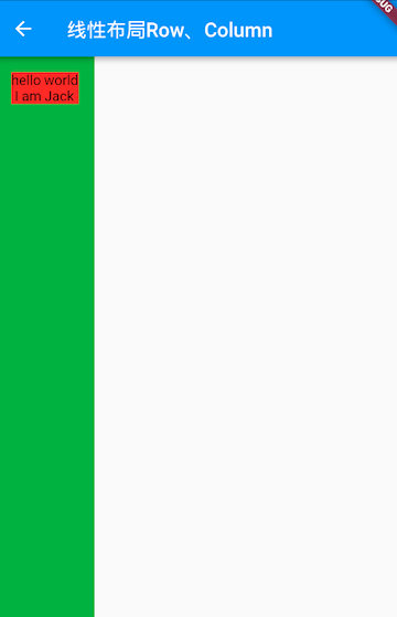
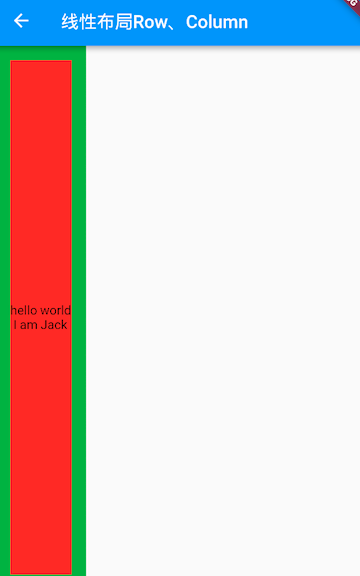
//测试Row对齐方式,排除Column默认居中对齐的干扰
crossAxisAlignment: CrossAxisAlignment.start,
children: <Widget>[
Row(
mainAxisAlignment: MainAxisAlignment.center,
children: <Widget>[
Text(" hello world "),
Text(" I am Jack "),
],
),
Row(
mainAxisSize: MainAxisSize.min,
mainAxisAlignment: MainAxisAlignment.center,
children: <Widget>[
Text(" hello world "),
Text(" I am Jack "),
],
),
Row(
mainAxisAlignment: MainAxisAlignment.end,
textDirection: TextDirection.rtl,
children: <Widget>[
Text(" hello world "),
Text(" I am Jack "),
],
),
Row(
crossAxisAlignment: CrossAxisAlignment.start,
verticalDirection: VerticalDirection.up,
children: <Widget>[
Text(" hello world ", style: TextStyle(fontSize: 30.0),),
Text(" I am Jack "),
],
),
],
);
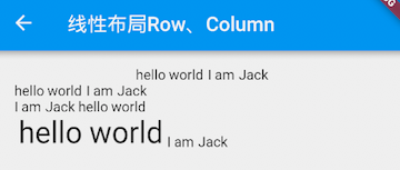
第一个 Row 很简单,默认为居中对齐;第二个 Row,由于 mainAxisSize 值为 MainAxisSize.min,Row 的宽度等于两个 Text 的宽度和,所以对齐是无意义的,所以会从左往右显示;第三个 Row 设置 textDirection 值为 TextDirection.rtl,所以子组件会从右向左的顺序排列,而此时 MainAxisAlignment.end 表示左对齐,所以最终显示结果就是图中第三行的样子;第四个 Row 测试的是纵轴的对齐方式,由于两个子 Text 字体不一样,所以其高度也不同,我们指定了 verticalDirection 值为 VerticalDirection.up,即从低向顶排列,而此时 crossAxisAlignment 值为 CrossAxisAlignment.start 表示底对齐。
Row 控件可以分为灵活排列和非灵活排列两种。
- 非灵活布局
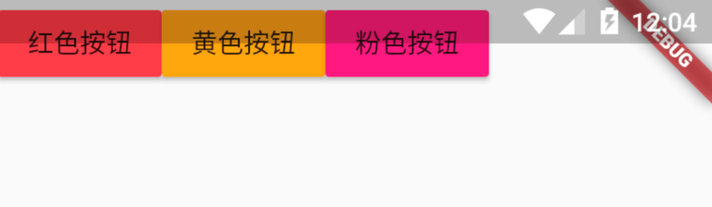
- 灵活布局:在布局外加 Expanded 就成了灵活布局
1
2
3
4
5
6
7
8
9
10
11
12
13
14
15
16
17
18
19
20
21
22
23
24
25
26
class MyRow extends StatelessWidget {
  @override
  Widget build(BuildContext context) {
    return Row(
      children: <Widget>[
        Expanded(
            child: RaisedButton(
              onPressed: () {},
              color: Colors.redAccent,
              child: Text('红色按钮'),
            )),
        Expanded(
            child: new RaisedButton(
              onPressed: () {},
              color: Colors.orangeAccent,
              child: new Text('黄色按钮'),
            )),
        Expanded(
            child: new RaisedButton(
                onPressed: () {},
                color: Colors.pinkAccent,
                child: new Text('粉色按钮')))
      ],
    );
  }
}
Column
Column 组件即垂直布局控件,能够将子组件垂直排列。
- crossAxisAlignment: 子控件的对齐方式,默认 center 居中
- CrossAxisAlignment.star:居左对齐。
- CrossAxisAlignment.end:居右对齐。
- CrossAxisAlignment.center:居中对齐。
- Column 基本属性示例:
1
2
3
4
5
6
7
8
9
10
11
12
13
14
15
16
17
18
19
20
21
22
23
24
25
26
27
28
29
30
31
32
Widget demoWidget() {
  return Column(
    textDirection: TextDirection.rtl,
    verticalDirection: VerticalDirection.up,
    mainAxisAlignment: MainAxisAlignment.center,
    crossAxisAlignment: CrossAxisAlignment.center,
    children: <Widget>[
      Center(
        child: Text("我是Column1。。。。"),
      ), // 文字水平居中
      // Expanded(child: Text("。。。。。。。。。。。我是Column2。。。。")),
      Text("我是Column3。。。。"),
      Text("我是Column4。。。。"),

      Container(
        decoration: BoxDecoration(
          color: Colors.green,
        ),
        child: Column(
          crossAxisAlignment: CrossAxisAlignment.center,
          children: <Widget>[
            Text(
              "hi",
              style: TextStyle(backgroundColor: Colors.red),
            ),
            Text("world", style: TextStyle(backgroundColor: Colors.blue)),
          ],
        ),
      )
    ],
  );
}
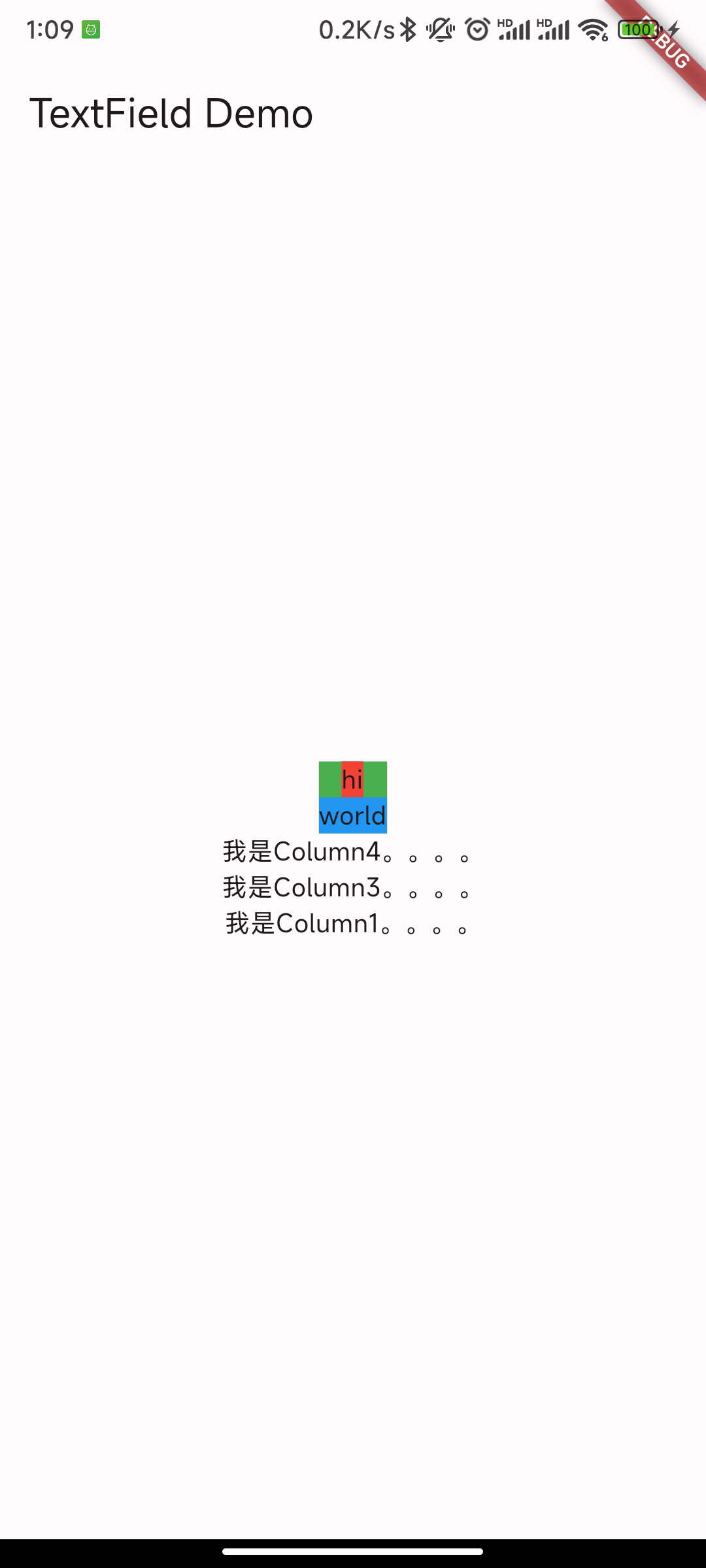
Column 在水平方向以最大宽度的组件为宽度,所以宽度为 world 组件的宽度 mainAxisAlignment 居中,垂直方向居中对齐 crossAxisAlignment 居中,水平方向居中对齐 textDirection 为 rtl,从右到左 verticalDirection 为 up,组件从下往上摆放
- 将 Column 的宽度指定为屏幕宽度
1
2
3
4
5
6
7
8
9
10
ConstrainedBox(
  constraints: BoxConstraints(minWidth: double.infinity),
  child: Column(
    crossAxisAlignment: CrossAxisAlignment.center,
    children: <Widget>[
      Text("hi"),
      Text("world"),
    ],
  ),
);
- 将 minWidth 设为
double.infinity,可以使宽度占用尽可能多的空间。 - Center 组件
嵌套组件尺寸问题
如果 Row 里面嵌套 Row,或者 Column 里面再嵌套 Column,那么只有最外面的 Row 或 Column 会占用尽可能大的空间,里面 Row 或 Column 所占用的空间为实际大小
1
2
3
4
5
6
7
8
9
10
11
12
13
14
15
16
17
18
19
20
21
22
Container(
  color: Colors.green,
  child: Padding(
    padding: const EdgeInsets.all(16.0),
    child: Column(
      crossAxisAlignment: CrossAxisAlignment.start,
      mainAxisSize: MainAxisSize.max, //有效,外层Colum高度为整个屏幕
      children: <Widget>[
        Container(
          color: Colors.red,
          child: Column(
            mainAxisSize: MainAxisSize.max,//无效,内层Colum高度为实际高度
            children: <Widget>[
              Text("hello world "),
              Text("I am Jack "),
            ],
          ),
        )
      ],
    ),
  ),
);
如果要让里面的 Column 占满外部 Column,可以使用 Expanded 组件:
1
2
3
4
5
6
7
8
9
10
11
12
13
14
15
16
17
18
19
20
21
22
23
24
25
Container(
    color: Colors.green,
    child: Padding(
      padding: const EdgeInsets.all(16.0),
      child: Column(
        crossAxisAlignment: CrossAxisAlignment.start,
        mainAxisSize: MainAxisSize.max, //有效,外层Colum高度为整个屏幕
        children: <Widget>[
          Expanded(
            child: Container(
              color: Colors.red,
              child: Column(
                mainAxisAlignment: MainAxisAlignment.center, //垂直方向居中对齐
                children: <Widget>[
                  Text("hello world "),
                  Text("I am Jack "),
                ],
              ),
            ),
          )
        ],
      ),
    ),
  );
弹性布局 Flex/Expanded
弹性布局允许子组件按照一定比例来分配父容器空间。弹性布局的概念在其他 UI 系统中也都存在,如 H5 中的弹性盒子布局,Android 中 的 FlexboxLayout 等。Flutter 中的弹性布局主要通过 Flex 和 Expanded 来配合实现。
Flex
Flex 组件可以沿着水平或垂直方向排列子组件,如果你知道主轴方向,使用 Row 或 Column 会方便一些,因为 Row 和 Column 都继承自 Flex,参数基本相同,所以能使用 Flex 的地方基本上都可以使用 Row 或 Column。
Flex 本身功能是很强大的,它也可以和 Expanded 组件配合实现弹性布局。
Flex 继承自 MultiChildRenderObjectWidget,对应的 RenderObject 为 RenderFlex,RenderFlex 中实现了其布局算法。
1
2
3
4
5
Flex({
  // ...
  required this.direction, //弹性布局的方向, Row默认为水平方向,Column默认为垂直方向
  List<Widget> children = const <Widget>[],
})
Expanded
Expanded 只能作为 Flex 的孩子(否则会报错),它可以按比例 “ 扩伸 “Flex 子组件所占用的空间。因为 Row 和 Column 都继承自 Flex,所以 Expanded 也可以作为它们的孩子。
1
2
3
4
const Expanded({
  int flex = 1,
  required Widget child,
})
flex 参数为弹性系数,如果为 0 或 null,则 child 是没有弹性的,即不会被扩伸占用的空间。如果大于 0,所有的 Expanded 按照其 flex 的比例来分割主轴的全部空闲空间;值越大占用空间越大
1
2
3
4
5
6
7
8
9
10
11
12
13
14
15
16
17
18
19
20
21
22
23
24
25
26
27
28
29
30
31
32
33
34
35
36
37
38
39
40
41
42
43
44
45
46
47
48
49
50
51
52
53
54
55
56
57
58
59
60
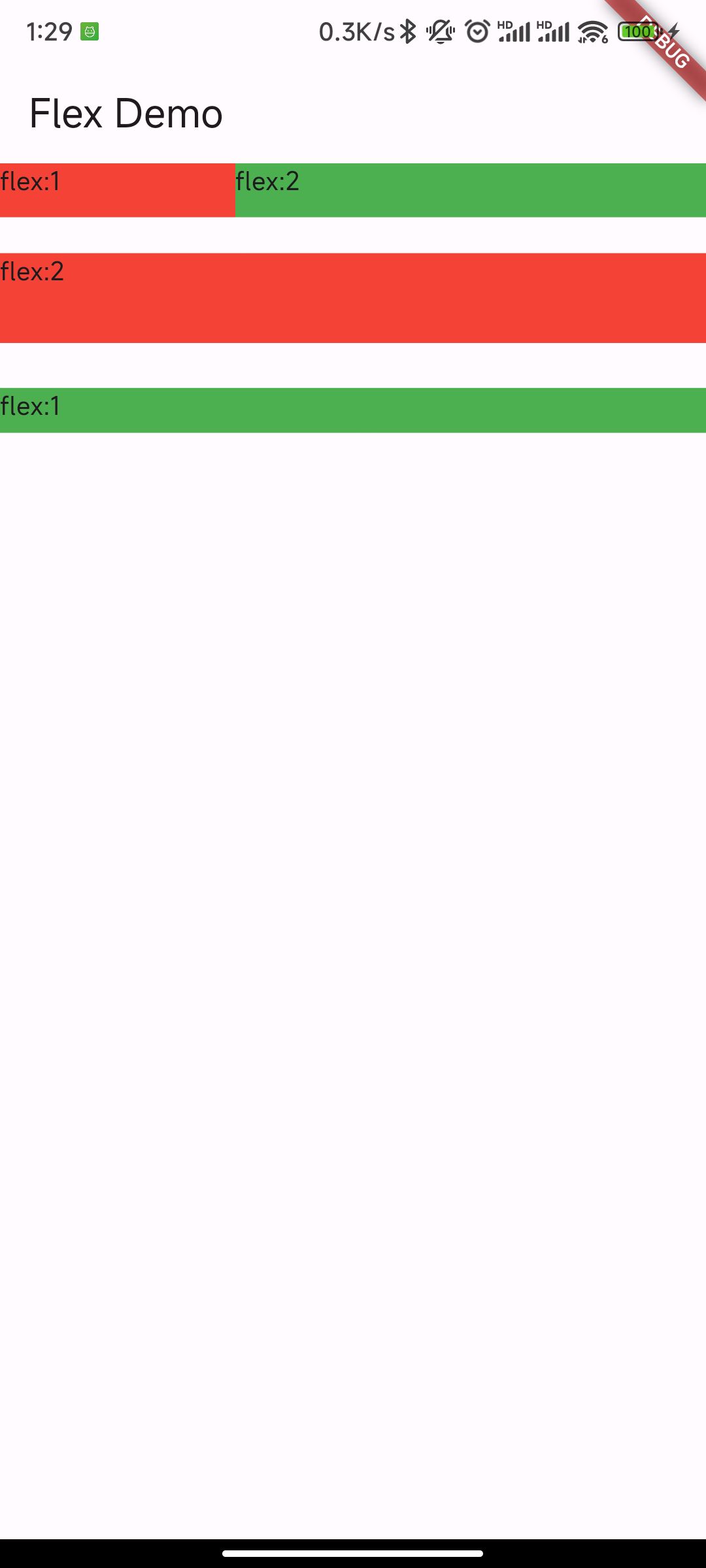
Widget demoWidget() {
return Column(
children: <Widget>[
//Flex的两个子widget按1:2来占据水平空间
Flex(
direction: Axis.horizontal,
children: <Widget>[
Expanded(
flex: 1,
child: Container(
height: 30.0,
color: Colors.red,
child: const Text('flex:1'),
),
),
Expanded(
flex: 2,
child: Container(
height: 30.0,
color: Colors.green,
child: const Text('flex:2')),
),
],
),
Padding(
padding: const EdgeInsets.only(top: 20.0),
child: SizedBox(
height: 100.0,
//Flex的三个子widget,在垂直方向按2:1:1来占用100像素的空间
child: Flex(
direction: Axis.vertical,
children: <Widget>[
Expanded(
flex: 2,
child: Container(
width: double.infinity,
height: 30.0,
color: Colors.red,
child: const Text('flex:2'),
),
),
const Spacer(
flex: 1,
),
Expanded(
flex: 1,
child: Container(
width: double.infinity,
height: 30.0,
color: Colors.green,
child: const Text('flex:1'),
),
),
],
),
),
),
],
);
}
Spacer 的功能是占用指定比例的空间,实际上它只是 Expanded 的一个包装类
流式布局 Wrap/Flow
Wrap
Wrap 定义:
1
2
3
4
5
6
7
8
9
10
11
12
Wrap({
  ...
  this.direction = Axis.horizontal,
  this.alignment = WrapAlignment.start,
  this.spacing = 0.0,
  this.runAlignment = WrapAlignment.start,
  this.runSpacing = 0.0,
  this.crossAxisAlignment = WrapCrossAlignment.start,
  this.textDirection,
  this.verticalDirection = VerticalDirection.down,
  List<Widget> children = const <Widget>[],
})
Wrap 的很多属性和 Row 一样,除了超出显示范围后 Wrap 会折行外,其他行为基本相同;Wrap 特有的属性:
- spacing:主轴方向子 widget 的间距
- runSpacing:纵轴方向的间距
- runAlignment:纵轴方向的对齐方式
示例:
1
2
3
4
5
6
7
8
9
10
11
12
13
14
15
16
17
18
19
20
21
22
23
 Wrap(
   spacing: 8.0, // 主轴(水平)方向间距
   runSpacing: 4.0, // 纵轴(垂直)方向间距
   alignment: WrapAlignment.center, //沿主轴方向居中
   children: <Widget>[
     Chip(
       avatar: CircleAvatar(backgroundColor: Colors.blue, child: Text('A')),
       label: Text('Hamilton'),
     ),
     Chip(
       avatar: CircleAvatar(backgroundColor: Colors.blue, child: Text('M')),
       label: Text('Lafayette'),
     ),
     Chip(
       avatar: CircleAvatar(backgroundColor: Colors.blue, child: Text('H')),
       label: Text('Mulligan'),
     ),
     Chip(
       avatar: CircleAvatar(backgroundColor: Colors.blue, child: Text('J')),
       label: Text('Laurens'),
     ),
   ],
)
效果: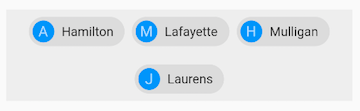
Flow
很少会使用 Flow,因为其过于复杂,需要自己实现子 widget 的位置转换。
Flow 主要用于一些需要自定义布局策略或性能要求较高 (如动画中) 的场景。Flow 有如下优点:
- 性能好;Flow 是一个对子组件尺寸以及位置调整非常高效的控件,Flow 用转换矩阵在对子组件进行位置调整的时候进行了优化:在 Flow 定位过后,如果子组件的尺寸或者位置发生了变化,在 FlowDelegate 中的 paintChildren() 方法中调用 context.paintChild 进行重绘,而 context.paintChild 在重绘时使用了转换矩阵,并没有实际调整组件位置。
- 灵活;由于我们需要自己实现 FlowDelegate 的 paintChildren() 方法,所以我们需要自己计算每一个组件的位置,因此,可以自定义布局策略。
缺点:
- 使用复杂。
- Flow 不能自适应子组件大小,必须通过指定父容器大小或实现 TestFlowDelegate 的 getSize 返回固定大小。
层叠布局 Stack
层叠布局和 Web 中的绝对定位、Android 中的 FrameLayout 布局是相似的,子组件可以根据距父容器四个角的位置来确定自身的位置。层叠布局允许子组件按照代码中声明的顺序堆叠起来。Flutter 中使用 Stack 和 Positioned 这两个组件来配合实现绝对定位。Stack 允许子组件堆叠,而 Positioned 用于根据 Stack 的四个角来确定子组件的位置。
Stack
Stack 定义:
1
2
3
4
5
6
7
Stack({
  this.alignment = AlignmentDirectional.topStart,
  this.textDirection,
  this.fit = StackFit.loose,
  this.clipBehavior = Clip.hardEdge,
  List<Widget> children = const <Widget>[],
})
- alignment:没有定位(没有使用 Positioned)或部分定位的子组件的对齐方式。
- AlignmentDirectional.topStart LTR 方向在左上角;RTL 在右上角
- Alignment.topLeft 左上角
- Alignment.center 居中
- …
- FractionalOffset(0.3, 0.2),默认从容器左上角,距离左上角 x 和 y 轴的百分比距离
- textDirection:和 Row、Wrap 的 textDirection 功能一样,都用于确定 alignment 对齐的参考系,
即:textDirection 的值为 TextDirection.ltr,则 alignment 的 start 代表左,end 代表右,即从左往右的顺序;textDirection 的值为 TextDirection.rtl,则 alignment 的 start 代表右,end 代表左,即从右往左的顺序。
- fit:用于确定没有定位的子组件如何去适应 Stack 的大小。
StackFit.loose表示使用子组件的大小(默认)StackFit.expand表示扩伸到 Stack 的大小。
- clipBehavior:此属性决定对超出 Stack 显示空间的部分如何剪裁,Clip 枚举类中定义了剪裁的方式
Clip.hardEdge表示直接剪裁,不应用抗锯齿Clip.antiAliasClip.antiAliasWithSaveLayerClip.none
什么是定位组件、部分定位组件?
- 定位组件:Positioned 包裹的子组件就是定位的子组件;fit 和 alignment 控制的都是未定位的子组件
- 部分定位,指在某一个轴上没有定位:left、right 为横轴,top、bottom 为纵轴,只要包含某个轴上的一个定位属性就算在该轴上有定位(只有横轴或者纵轴一个方向有定位,另外一个方向没有)
属性
alignment
- alignment: 控制层叠的位置的,建议在两个内容进行层叠时使用。它有两个值 X 轴距离和 Y 轴距离,值是从 0 到 1 的,都是从上层容器的左上角开始算起的
1
2
3
4
5
6
7
8
9
10
11
12
13
14
15
16
17
18
19
20
21
22
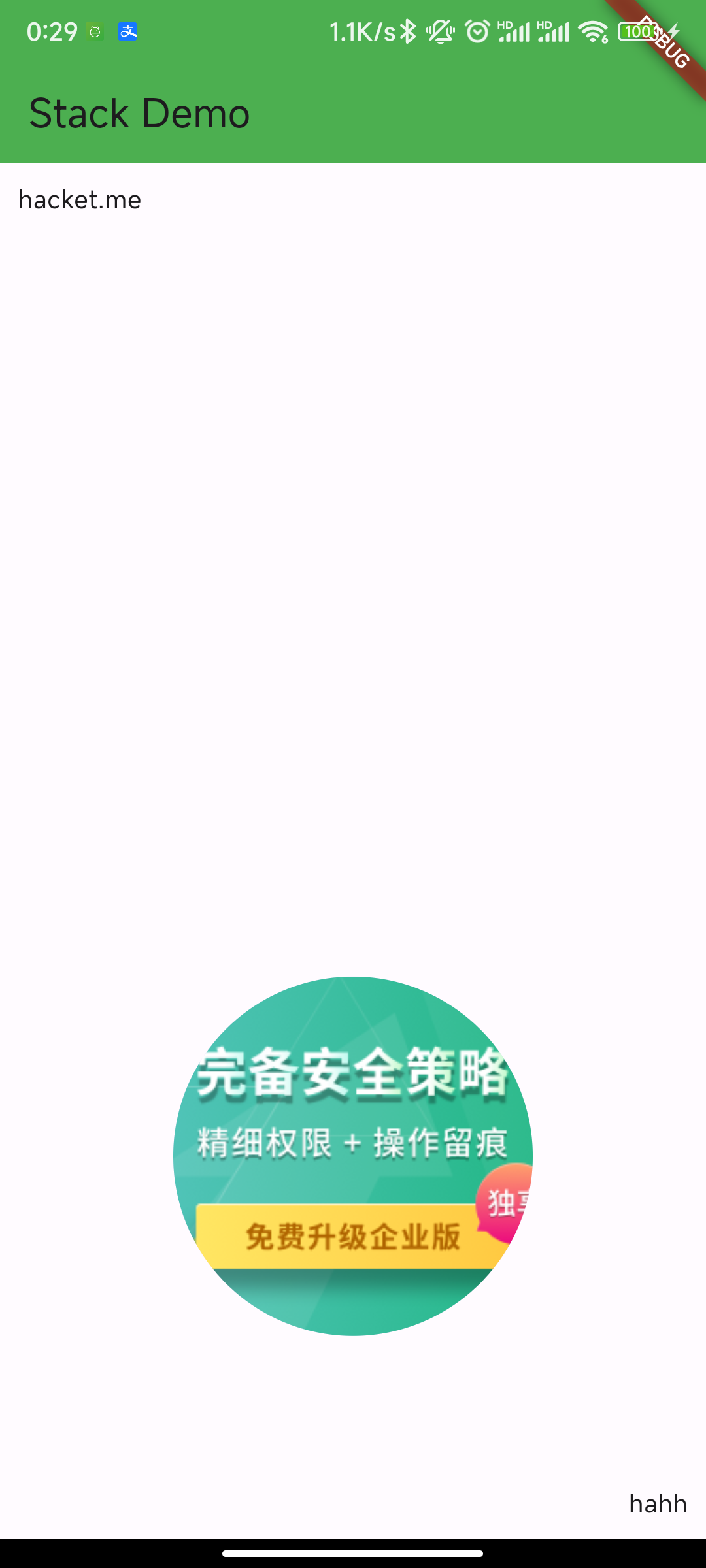
Widget demoWidget3() {
return ConstrainedBox(
// 通过ConstrainedBox来确保Stack占满屏幕
constraints: const BoxConstraints.expand(),
child: Stack(
alignment: const FractionalOffset(0.5, 0.5),
children: <Widget>[
const CircleAvatar(
backgroundImage: NetworkImage(
"https://images.gitee.com/uploads/images/2018/1226/113453_a425da51_1305863.png"),
radius: 100.0,
),
Container(
decoration: const BoxDecoration(
color: Colors.lightBlue,
),
padding: const EdgeInsets.all(5.0),
child: const Text("我是啊干"),
),
],
));
}
Positioned 属性
Positioned 用于定位 Stack 子组件,Positioned 必须是 Stack 的子组件。
Positioned 定义:
1
2
3
4
5
6
7
8
9
10
const Positioned({
  Key? key,
  this.left,
  this.top,
  this.right,
  this.bottom,
  this.width,
  this.height,
  required Widget child,
})
Positioned 组件可以指定距 Stack 各边的距离
- 提供 top、bottom、left、right 四种定位属性,分别表示距离上下左右的距离。
- 只能用于 Stack 组件中。
- left、right 和 width3 个参数只能设置其中 2 个,因为设置了其中 2 个,第三个已经确定了,同理 top、bottom 和 height 也只能设置其中 2 个。
- width: 层叠定位组件的宽度
- height: 层叠定位组件的高度
Positioned 提供便捷的构建方式,比如 Positioned.fromRect、Positioned.fill 等,这些便捷的构建方式万变不离其宗,只不过换了一种方式设置 top、bottom、left、right 四种定位属性。
Positioned 示例 1:alignment 和 Positioned 属性
1
2
3
4
5
6
7
8
9
10
11
12
13
14
15
16
17
18
19
20
21
//通过ConstrainedBox来确保Stack占满屏幕
ConstrainedBox(
  constraints: BoxConstraints.expand(),
  child: Stack(
    alignment:Alignment.center , //指定未定位或部分定位widget的对齐方式
    children: <Widget>[
      Container(
        child: Text("Hello world",style: TextStyle(color: Colors.white)),
        color: Colors.red,
      ),
      Positioned(
        left: 18.0,
        child: Text("I am Jack"),
      ),
      Positioned(
        top: 18.0,
        child: Text("Your friend"),
      )
    ],
  ),
);
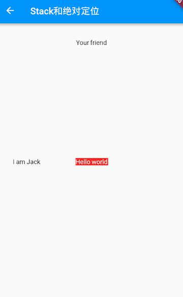
由于第一个子文本组件 Text(“Hello world”) 没有指定定位,并且 alignment 值为 Alignment.center,所以它会居中显示。第二个子文本组件 Text(“I am Jack”) 只指定了水平方向的定位 (left),所以属于部分定位,即垂直方向上没有定位,那么它在垂直方向的对齐方式则会按照 alignment 指定的对齐方式对齐,即垂直方向居中。对于第三个子文本组件 Text(“Your friend”),和第二个 Text 原理一样,只不过是水平方向没有定位,则水平方向居中。
Positioned 示例 2:
1
2
3
4
5
6
7
8
9
10
11
12
13
14
15
16
17
18
19
20
21
22
23
24
25
26
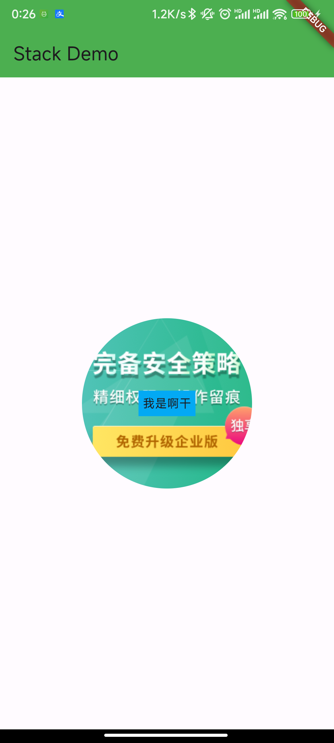
Widget demoWidget0() {
return ConstrainedBox(
// 通过ConstrainedBox来确保Stack占满屏幕
constraints: const BoxConstraints.expand(),
child: const Stack(
alignment: FractionalOffset(0.5, 0.8),
children: <Widget>[
CircleAvatar(
backgroundImage: NetworkImage(
"https://images.gitee.com/uploads/images/2018/1226/113453_a425da51_1305863.png"),
radius: 100.0,
),
Positioned(
top: 10.0,
left: 10.0,
child: Text('hacket.me'),
),
Positioned(
bottom: 10.0,
right: 10.0,
child: Text('hahh'),
),
],
),
);
}
CircleAvatar 是无定位组件,受到 alignment 对齐方式影响,摆放在 x 轴 0.5 的位置,y 轴 0.8 的位置 第一个 Positioned 距离 top 和 left 都是 10 的距离,左上角 第二个 Positioned 距离 bottom 和 right 都是 10 的距离,右上角
示例
示例 1:
1
2
3
4
5
6
7
8
9
10
11
12
13
14
15
16
17
18
19
Stack(
  children: <Widget>[
    Container(
      height: 200,
      width: 200,
      color: Colors.red,
    ),
    Container(
      height: 170,
      width: 170,
      color: Colors.blue,
    ),
    Container(
      height: 140,
      width: 140,
      color: Colors.yellow,
    )
  ],
);
效果: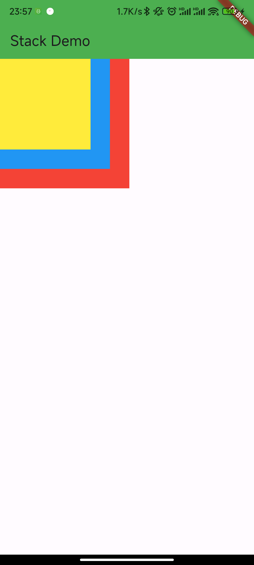
Stack 未定位的子组件的默认左上角对齐,通过 alignment 参数控制
1
2
3
4
5
6
7
8
9
10
11
12
13
14
15
16
17
18
19
20
Stack(
  alignment: Alignment.center, //指定未定位或部分定位widget的对齐方式
  children: <Widget>[
    Container(
      height: 200,
      width: 200,
      color: Colors.red,
    ),
    Container(
      height: 170,
      width: 170,
      color: Colors.blue,
    ),
    Container(
      height: 140,
      width: 140,
      color: Colors.yellow,
    )
  ],
));
IndexedStack
什么是 IndexedStack?
管 IndexedStack 是 Stack 的子类,Stack 是将所有的子组件叠加显示,而 IndexedStack 只显示指定的子组件。
示例:
1
2
3
4
5
6
7
8
9
10
11
12
13
14
15
16
17
18
19
20
21
22
23
24
25
26
27
28
29
30
31
32
33
34
35
36
37
38
39
40
41
42
43
44
45
46
47
48
49
50
51
52
53
54
55
56
57
58
59
60
61
62
63
64
65
66
67
68
69
70
71
72
73
74
75
IndexedStack(
    index: _index,
    children: <Widget>[
      Center(
        child: Container(
          height: 300,
          width: 300,
          color: Colors.red,
          alignment: Alignment.center,
          child: Icon(
            Icons.fastfood,
            size: 60,
            color: Colors.blue,
          ),
        ),
      ),
      Center(
        child: Container(
          height: 300,
          width: 300,
          color: Colors.green,
          alignment: Alignment.center,
          child: Icon(
            Icons.cake,
            size: 60,
            color: Colors.blue,
          ),
        ),
      ),
      Center(
        child: Container(
          height: 300,
          width: 300,
          color: Colors.yellow,
          alignment: Alignment.center,
          child: Icon(
            Icons.local_cafe,
            size: 60,
            color: Colors.blue,
          ),
        ),
      ),
    ],
);
// 通过点击按钮更新_index值
Row(
    mainAxisAlignment: MainAxisAlignment.center,
    children: <Widget>[
      IconButton(
        icon: Icon(Icons.fastfood),
        onPressed: () {
          setState(() {
            _index = 0;
          });
        },
      ),
      IconButton(
        icon: Icon(Icons.cake),
        onPressed: () {
          setState(() {
            _index = 1;
          });
        },
      ),
      IconButton(
        icon: Icon(Icons.local_cafe),
        onPressed: () {
          setState(() {
            _index = 2;
          });
        },
      ),
    ],
);
对齐和相对定位 Align
Align
Align 组件可以调整子组件相对父组件的位置,Align 定义:
1
2
3
4
5
6
7
Align({
  Key key,
  this.alignment = Alignment.center,
  this.widthFactor,
  this.heightFactor,
  Widget child,
})
- alignment 需要一个 AlignmentGeometry 类型的值,表示子组件在父组件中的起始位置。AlignmentGeometry 是一个抽象类,它有两个常用的子类:Alignment 和 FractionalOffset
- widthFactor和heightFactor 用于确定 Align 组件本身宽高的属性;它们是两个缩放因子,会分别乘以子元素的宽、高,最终的结果就是 Align 组件的宽高。如果值为 null,则组件的宽高将会占用尽可能多的空间。
示例:
1
2
3
4
5
6
7
8
9
10
11
Container(
  height: 120.0,
  width: 120.0,
  color: Colors.blue.shade50,
  child: Align(
    alignment: Alignment.topRight,
    child: FlutterLogo(
      size: 60,
    ),
  ),
)

FlutterLogo 是 Flutter SDK 提供的一个组件,内容就是 Flutter 的 logo 。在上面的例子中,我们显式指定了 Container 的宽、高都为 120。如果我们不显式指定宽高,而通过同时指定 widthFactor 和 heightFactor 为 2 也是可以达到同样的效果
1
2
3
4
5
6
7
8
9
10
11
12
Align(
  widthFactor: 2,
  heightFactor: 2,
  alignment: Alignment.topRight,
  child: FlutterLogo(
    size: 60,
  ),
),
// 因为FlutterLogo的宽高为 60,则Align的最终宽高都为2*60=120。

// 右上角
static const Alignment topRight = Alignment(1.0, -1.0);
Alignment 原点中心点
Alignment 继承自 AlignmentGeometry,表示矩形内的一个点,他有两个属性 x、y,分别表示在水平和垂直方向的偏移,Alignment 定义如下:
1
Alignment(this.x, this.y)
Alignment Widget 会以矩形的中心点作为坐标原点,即 Alignment(0.0, 0.0) 。x、y 的值从 -1 到 1 分别代表矩形左边到右边的距离和顶部到底边的距离,因此 2 个水平(或垂直)单位则等于矩形的宽(或高),如 Alignment(-1.0, -1.0) 代表矩形的左侧顶点,而 Alignment(1.0, 1.0) 代表右侧底部终点,而 Alignment(1.0, -1.0) 则正是右侧顶点,即 Alignment.topRight。为了使用方便,矩形的原点、四个顶点,以及四条边的终点在 Alignment 类中都已经定义为了静态常量。
Alignment 可以通过其坐标转换公式将其坐标转为子元素的具体偏移坐标:
实际偏移坐标 (x,y) = (Alignment.x * (parentWidth - childWidth) / 2 + (parentWidth - childWidth) / 2, Alignment.y * (parentHeight - childHeight) / 2 + (parentHeight - childHeight) / 2) // 其中 childWidth 为子元素的宽度,childHeight 为子元素高度。
FractionalOffset 原点左上角
FractionalOffset 继承自 Alignment,它和 Alignment 唯一的区别就是坐标原点不同!FractionalOffset 的坐标原点为矩形的左侧顶点,这和布局系统的一致,所以理解起来会比较容易。FractionalOffset 的坐标转换公式为:
实际偏移 = (FractionalOffse.x * (parentWidth - childWidth), FractionalOffse.y * (parentHeight - childHeight))
1
2
3
4
5
6
7
8
9
10
11
Container(
  height: 120.0,
  width: 120.0,
  color: Colors.blue[50],
  child: Align(
    alignment: FractionalOffset(0.2, 0.6),
    child: FlutterLogo(
      size: 60,
    ),
  ),
)

FractionalOffset(0.2, 0.6) 带入坐标转换公式得 FlutterLogo 实际偏移为(12,36),和实际运行效果吻合
Align 和 Stack 对比
Align 和 Stack/Positioned 都可以用于指定子元素相对于父元素的偏移,但它们还是有两个主要区别:
- 定位参考系统不同
- Stack/Positioned 定位的参考系可以是父容器矩形的四个顶点
- 而 Align 则需要先通过 alignment 参数来确定坐标原点,不同的 alignment 会对应不同原点,最终的偏移是需要通过 alignment 的转换公式来计算出。
- Stack 可以有多个子元素,并且子元素可以堆叠,而 Align 只能有一个子元素,不存在堆叠
Center
Center 组件可用来居中子元素,
1
2
3
4
class Center extends Align {
  const Center({ Key? key, double widthFactor, double heightFactor, Widget? child })
    : super(key: key, widthFactor: widthFactor, heightFactor: heightFactor, child: child);
}
Center 继承自 Align,它比 Align 只少了一个 alignment 参数;由于 Align 的构造函数中 alignment 值为 Alignment.center,所以,我们可以认为 Center 组件其实是对齐方式确定(Alignment.center)了的 Align。
示例:
1
2
3
4
5
6
7
8
9
10
11
12
13
14
15
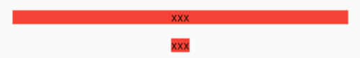
DecoratedBox(
decoration: BoxDecoration(color: Colors.red),
child: Center(
child: Text("xxx"),
),
),
DecoratedBox(
decoration: BoxDecoration(color: Colors.red),
child: Center(
widthFactor: 1,
heightFactor: 1,
child: Text("xxx"),
),
);
// widthFactor或heightFactor为null时组件的宽高将会占用尽可能多的空间
LayoutBuilder、AfterLayout
LayoutBuilder
通过 LayoutBuilder,我们可以在布局过程中拿到父组件传递的约束信息,然后我们可以根据约束信息动态的构建不同的布局。
它主要有两个使用场景:
- 可以使用 LayoutBuilder 来根据设备的尺寸来实现响应式布局。
- LayoutBuilder 可以帮我们高效排查问题。比如我们在遇到布局问题或者想调试组件树中某一个节点布局的约束时 LayoutBuilder 就很有用。
AfterLayout
https://book.flutterchina.club/chapter4/layoutbuilder.html#_4-8-2-afterlayout