02.Flutter基础组件
Text 文本
Text 属性
基本属性
- textAlign 文本的对齐方式;可以选择左对齐、右对齐还是居中。注意,对齐的参考系是 Text widget 本身。
- center: 文本以居中形式对齐,这个也算比较常用的了。
- left: 左对齐,经常使用,让文本居左进行对齐,效果和 start 一样。
- right : 右对齐,使用频率也不算高。
- start: 以开始位置进行对齐,类似于左对齐。
- end: 以为本结尾处进行对齐,不常用。有点类似右对齐.
如果 Text 文本内容宽度不足一行,指定了居中对齐,Text 的宽度和文本内容长度相等,那么这时指定对齐方式是没有意义的,只有 Text 宽度大于文本内容长度时指定此属性才有意义。
- maxLines 文本显示的最大行数,默认情况下,文本是自动折行的,如果指定此参数,则文本最多不会超过指定的行。如果有多余的文本,可以通过 overflow 来指定截断方式,默认是直接截断
- overflow overflow 属性是用来设置文本溢出时,如何处理,它有下面几个常用的值供我们选择
- clip:默认,直接切断,剩下的文字就没有了,感觉不太友好,体验性不好。
- ellipsis: 在后边显示省略号,体验性较好,这个在工作中经常使用。
- fade: 溢出的部分会进行一个渐变消失的效果,当然是上线的渐变,不是左右的哦。
- textScaleFactor 代表文本相对于当前字体大小的缩放因子,相对于去设置文本的样式 style 属性的 fontSize,它是调整字体大小的一个快捷方式。该属性的默认值可以通过
MediaQueryData.textScaleFactor获得,如果没有 MediaQuery,那么会默认值将为 1.0。
案例:
1
2
3
4
5
6
7
8
9
10
11
12
13
14
15
16
17
18
19
20
21
22
23
24
25
26
27
28
29
30
31
32
33
34
35
36
37
38
39
40
41
42
43
44
45
46
47
48
49
50
51
52
53
54
55
56
57
58
class TextDemo extends StatelessWidget {
  const TextDemo({super.key});

  @override
  Widget build(BuildContext context) {
    return MaterialApp(
      theme: ThemeData(
        colorScheme: ColorScheme.fromSeed(seedColor: Colors.deepPurple),
        useMaterial3: true,
      ),
      home: Scaffold(
        appBar: AppBar(
          title: const Text("Text Demo"),
        ),
        body: Container(
          decoration: BoxDecoration(
            color: Colors.grey,
            border: Border.all(
                color: Colors.black,
                width: 1.0,
              ),
            borderRadius: const BorderRadius.all(Radius.circular(4.0))),
          child: Column(
            mainAxisAlignment: MainAxisAlignment.start,
            crossAxisAlignment: CrossAxisAlignment.start, // 默认center
            children: [
              const Text(
                "Hello world",
                textAlign: TextAlign.left, // 文本居左,文本和Text宽度一样无效
              ),
              Text(
                "Hello world! I'm Jack. " * 4,
                maxLines: 1,
                overflow: TextOverflow.ellipsis, // 超出部分,省略号
              ),
              const Text(
                "Hello world",
                textScaleFactor: 1.5,
              ),
              Text(
                "Hello world(align center) " * 1, //字符串重复1次
                textAlign: TextAlign.center, // 文本居中,文本和Text宽度一样无效
              ),
              Text(
                "Hello world(align center) " * 6, //字符串重复6次
                textAlign: TextAlign.center, // 换行居中
              ),
              const Text("Hello world textScaleFactor:1.0",
                         textAlign: TextAlign.center, textScaleFactor: 1.0),
              const Text("Hello world textScaleFactor:2.0",
                         textAlign: TextAlign.center, textScaleFactor: 1.5)
            ],
          ),
        ),
      ),
    );
  }
}
效果: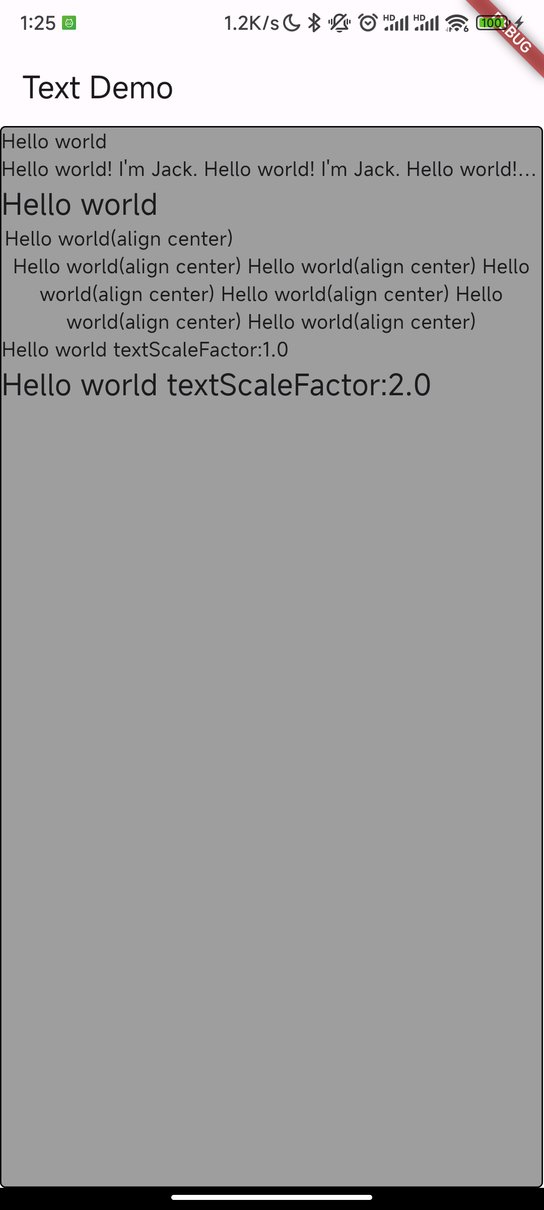
TextStyle 文本样式
TextStyle 用于指定文本显示的样式如颜色、字体、粗细、背景等。
- color 文本颜色
- decoration TextDecoration 文本装饰,如上划线 overline,下划线 underline,中划线 lineThrough
- decorationColor
- decorationStyle
- fontFamily 由于不同平台默认支持的字体集不同,所以在手动指定字体时一定要先在不同平台测试一下。
- fontSize 该属性和 Text 的 textScaleFactor 都用于控制字体大小。但是有两个主要区别:
- fontSize 可以精确指定字体大小,而 textScaleFactor 只能通过缩放比例来控制
- textScaleFactor 主要是用于系统字体大小设置改变时对 Flutter 应用字体进行全局调整,而 fontSize 通常用于单个文本,字体大小不会跟随系统字体大小变化
- fontStyle
- fontWeight
- hashCode
- height 该属性用于指定行高,但它并不是一个绝对值,而是一个因子,具体的行高等于 fontSize*height。
- inherit
- letterSpacing
- textRaseline
- wordSpacing
案例:
1
2
3
4
5
6
7
8
9
10
11
12
13
14
15
16
17
18
19
20
21
22
23
24
25
26
27
28
29
30
31
32
33
34
35
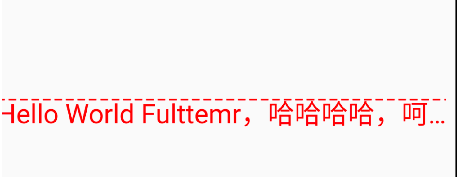
import 'package:flutter/material.dart';
//void main() {
// runApp(MyApp());
//}
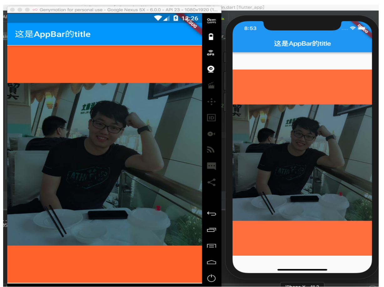
void main() => runApp(MyApp());
class MyApp extends StatelessWidget {
@override
Widget build(BuildContext context) {
return MaterialApp(
title: '这是title',
home: Scaffold(
appBar: AppBar(
title: Text("这是AppBar的title"),
),
body: Center(
child: Text(
"Hello World Fulttemr,哈哈哈哈,呵呵呵,我非常喜欢Flutter,呵呵呵呵呵呵呵呵呵呵,是啊啊啊。。!",
textAlign: TextAlign.left, // 文字对齐方式
maxLines: 1, // 文字最大行数
overflow: TextOverflow.ellipsis, // 超过最大行数显示方式
style: TextStyle( // 文字样式
fontSize: 24.0,
color: Color.fromARGB(255, 255, 0, 0),
decoration: TextDecoration.overline,
decorationStyle: TextDecorationStyle.dashed,
),
),
),
),
);
}
}
DefaultTextStyle
在 Widget 树中,文本的样式默认是可以被继承的(子类文本类组件未指定具体样式时可以使用 Widget 树中父级设置的默认样式),因此,如果在 Widget 树的某一个节点处设置一个默认的文本样式,那么该节点的子树中所有文本都会默认使用这个样式,而 DefaultTextStyle 正是用于设置默认文本样式的。
案例:
1
2
3
4
5
6
7
8
9
10
11
12
13
14
15
16
17
18
19
20
21
DefaultTextStyle(
  //1.设置文本默认样式
  style: TextStyle(
    color:Colors.red,
    fontSize: 20.0,
  ),
  textAlign: TextAlign.start,
  child: Column(
    crossAxisAlignment: CrossAxisAlignment.start,
    children: <Widget>[
      Text("hello world"),
      Text("I am Jack"),
      Text("I am Jack",
        style: TextStyle(
          inherit: false, //2.不继承默认样式
          color: Colors.grey
        ),
      ),
    ],
  ),
);
效果: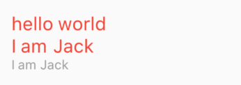
TextSpan
类似于 TextView 的 Span。TextSpan 定义:
1
2
3
4
5
6
const TextSpan({
  TextStyle style,
  String text,
  List<TextSpan> children,
  GestureRecognizer recognizer,
});
- style 和 text 属性代表该文本片段的样式和内容
- children 是一个 TextSpan 的数组,也就是说 TextSpan 可以包括其他 TextSpan
- recognizer 用于对该文本片段上用于手势进行识别处理
案例:
1
2
3
4
5
6
7
8
9
10
11
12
13
14
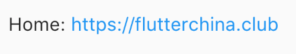
Text.rich(TextSpan(
children: [
TextSpan(
text: "Home: "
),
TextSpan(
text: "https://flutterchina.club",
style: TextStyle(
color: Colors.blue
),
recognizer: _tapRecognizer
),
]
))
字体
在 Flutter 应用程序中使用不同的字体。例如,我们可能会使用设计人员创建的自定义字体,或者其他第三方的字体,如 Google Fonts 中的字体。
使用 package 包中的字体
要使用 Package 中定义的字体,必须提供 package 参数。例如,假设上面的字体声明位于 my_package 包中。
1
2
3
4
const textStyle = const TextStyle(
  fontFamily: 'Raleway',
  package: 'my_package', // 指定包名
);
如果在 package 包内部使用它自己定义的字体,也应该在创建文本样式时指定 package 参数。
一个包也可以只提供字体文件而不需要在 pubspec.yaml 中声明。 这些文件应该存放在包的 lib/文件夹中。字体文件不会自动绑定到应用程序中,应用程序可以在声明字体时有选择地使用这些字体。假设一个名为 my_package 的包中有一个字体文件:
1
lib/fonts/Raleway-Medium.ttf
然后,应用程序可以声明一个字体,如下面的示例所示:
1
2
3
4
5
6
7
 flutter:
   fonts:
     - family: Raleway
       fonts:
         - asset: assets/fonts/Raleway-Regular.ttf
         - asset: packages/my_package/fonts/Raleway-Medium.ttf
           weight: 500
lib/是隐含的,所以它不应该包含在 asset 路径中。
在这种情况下,由于应用程序本地定义了字体,所以在创建 TextStyle 时可以不指定 package 参数:
1
2
3
const textStyle = const TextStyle(
  fontFamily: 'Raleway',
);
自定义字体
- 下载字体 TiltPrism-Regular.ttf
- 将字体放到同 lib 同级目录的 asstes/fonts 下
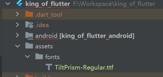
- pubspec.yaml 中声明
1
2
3
4
5
flutter:
  fonts: # 和assets同级
  	- family: TiltPrism-Regular
  		fonts:
  			- asset: assets/fonts/TiltPrism-Regular.ttf
- 代码引入
1
2
3
4
5
6
7
8
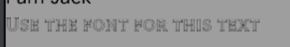
// 声明文本样式
static const tiltPrismFamily = TextStyle(
fontFamily: 'TiltPrism-Regular',
);
const Text(
"Use the font for this text",
style: tiltPrismFamily,
)
- 效果
按钮
Material 组件库中提供了多种按钮组件如 ElevatedButton、TextButton、OutlinedButton 等,它们都是直接或间接对 RawMaterialButton 组件的包装定制,他们大多数属性都和 RawMaterialButton 一样。
相同点:
- 按下时都会有 “ 水波动画 “(又称 “ 涟漪动画 “,就是点击时按钮上会出现水波扩散的动画)。
- 有一个 onPressed 属性来设置点击回调,当按钮按下时会执行该回调,如果不提供该回调则按钮会处于禁用状态,禁用状态不响应用户点击。
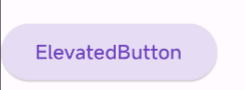
ElevatedButton
ElevatedButton 即 “ 漂浮 “ 按钮,它默认带有阴影和灰色背景。按下后,阴影会变大。
1
2
3
4
ElevatedButton(
  child: Text("ElevatedButton"),
  onPressed: () {},
);
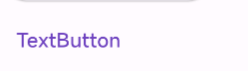
TextButton
TextButton 即文本按钮,默认背景透明并不带阴影。按下后,会有背景色
1
2
3
4
TextButton(
  child: const Text("TextButton"),
  onPressed: () {},
)
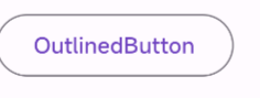
OutlinedButton
OutlinedButton 默认有一个边框,不带阴影且背景透明。按下后,边框颜色会变亮、同时出现背景和阴影 (较弱)
1
2
3
4
OutlinedButton(
    child: const Text("OutlinedButton"),
    onPressed: () {},
  )
IconButton
IconButton 是一个可点击的 Icon,不包括文字,默认没有背景,点击后会出现背景
1
2
3
4
IconButton(
    icon: const Icon(Icons.thumb_up),
    onPressed: () {},
  )

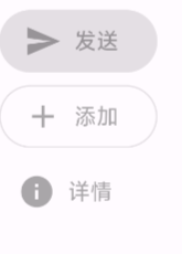
带图标的按钮
ElevatedButton、TextButton、OutlinedButton 都有一个 icon 构造函数,通过它可以轻松创建带图标的按钮
1
2
3
4
5
6
7
8
9
10
11
12
13
14
15
ElevatedButton.icon(
    icon: const Icon(Icons.send),
    label: const Text("发送"),
    onPressed: null,
  ),
  OutlinedButton.icon(
    icon: const Icon(Icons.add),
    label: const Text("添加"),
    onPressed: null,
  ),
  TextButton.icon(
    icon: const Icon(Icons.info),
    label: const Text("详情"),
    onPressed: null,
  )
RaisedButton
- child:可以放入容器,图标,文字。让你构建多彩的按钮。
- onPressed:点击事件的相应,一般会调用 Navigator 组件。
TextField 输入框和表单
Material 组件库中提供了输入框组件 TextField 和表单组件 Form。
TextField 输入框
TextField 属性
TextField 定义:
1
2
3
4
5
6
7
8
9
10
11
12
13
14
15
16
17
18
19
20
21
22
23
24
25
26
const TextField({
    // ...
    TextEditingController controller,
    FocusNode focusNode,
    InputDecoration decoration = const InputDecoration(),
    TextInputType keyboardType,
    TextInputAction textInputAction,
    TextStyle style,
    TextAlign textAlign = TextAlign.start,
    bool autofocus = false,
    bool obscureText = false,
    int maxLines = 1,
    int maxLength,
    this.maxLengthEnforcement,
    ToolbarOptions? toolbarOptions,
    ValueChanged<String> onChanged,
    VoidCallback onEditingComplete,
    ValueChanged<String> onSubmitted,
    List<TextInputFormatter> inputFormatters,
    bool enabled,
    this.cursorWidth = 2.0,
    this.cursorRadius,
    this.cursorColor,
    this.onTap,
    // ...
})
- controller:编辑框的控制器 TextEditingController,通过它可以设置/获取/清空编辑框的内容、选择编辑内容、监听编辑文本改变事件。大多数情况下我们都需要显式提供一个 controller 来与文本框交互。如果没有提供 controller,则 TextField 内部会自动创建一个。
- focusNode:用于控制 TextField 是否占有当前键盘的输入焦点。它是我们和键盘交互的一个句柄 handle;用来实现类似上一个下一个的输入控制。
- decoration InputDecoration 用于控制 TextField 的外观显示,如提示文本、背景颜色、边框等。
- labelText
- hintText 设置输入框的提示文字
- hintColor 提示文本颜色
- errorText 如何显示验证错误信息
- icon 前面的图标
- border 边框
- prefixIcon 输入框前面的图标
- suffixIcon 输入框后面的图标,如清除
- enabledBorder 输入框在未获取焦点的 border
- focusedBorder 输入框获得焦点后的 border
- keyboardType:用于设置该输入框默认的键盘输入类型(数字、字母、电话号码、邮箱、日期等多种方式),取值如下:
| TextInputType 枚举值 | 含义 |
|---|---|
| text | 文本输入键盘 |
| multiline | 多行文本,需和 maxLines 配合使用 (设为 null 或大于 1) |
| number | 数字;会弹出数字键盘 |
| phone | 优化后的电话号码输入键盘;会弹出数字键盘并显示 “* #” |
| datetime | 优化后的日期输入键盘;Android 上会显示 “: -“ |
| emailAddress | 优化后的电子邮件地址;会显示 “@ .” |
| url | 优化后的 url 输入键盘; 会显示 “/ .” |
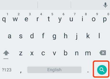
- textInputAction:键盘动作按钮图标 (即回车键位图标),它是一个枚举值,有多个可选值,全部的取值列表读者可以查看 API 文档,下面是当值为 TextInputAction.search 时,原生 Android 系统下键盘样式:
- style:正在编辑的文本样式。
- textAlign: 输入框内编辑文本在水平方向的对齐方式。
- autofocus: 是否自动获取焦点。
- obscureText:是否隐藏正在编辑的文本,如用于输入密码的场景等,文本内容会用 “•” 替换。
- maxLines:输入框的最大行数,默认为 1;如果为 null,则无行数限制。
- maxLength和maxLengthEnforcement :maxLength 代表输入框文本的最大长度,设置后输入框右下角会显示输入的文本计数。maxLengthEnforcement 决定当输入文本长度超过 maxLength 时如何处理,如截断、超出等。
- toolbarOptions:长按或鼠标右击时出现的菜单,包括 copy、cut、paste 以及 selectAll。
- onChange:输入框内容改变时的回调函数;注:内容改变事件也可以通过 controller 来监听。
- onEditingComplete和onSubmitted:这两个回调都是在输入框输入完成时触发,比如按了键盘的完成键(对号图标)或搜索键(🔍图标)。不同的是两个回调签名不同,onSubmitted 回调是
ValueChanged<String>类型,它接收当前输入内容做为参数,而 onEditingComplete 不接收参数 - inputFormatters:用于指定输入格式;当用户输入内容改变时,会根据指定的格式来校验。
- enable:如果为 false,则输入框会被禁用,禁用状态不能响应输入和事件,同时显示禁用态样式(在其 decoration 中定义)。
- cursorWidth、cursorRadius和cursorColor:这三个属性是用于自定义输入框光标宽度、圆角和颜色的。
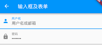
示例
登录输入框
1
2
3
4
5
6
7
8
9
10
11
12
13
14
15
16
17
18
19
20
Column(
  children: <Widget>[
    TextField(
      autofocus: true,
      decoration: InputDecoration(
        labelText: "用户名",
        hintText: "用户名或邮箱",
        prefixIcon: Icon(Icons.person)
      ),
    ),
    TextField(
      decoration: InputDecoration(
        labelText: "密码",
        hintText: "您的登录密码",
        prefixIcon: Icon(Icons.lock)
      ),
      obscureText: true,
    ),
  ],
);
获取输入内容
1
2
3
4
5
6
7
8
9
10
11
12
13
14
15
16
17
18
19
20
21
22
23
24
25
26
27
28
 Column demoWidget() {
    TextEditingController unameController = TextEditingController();
    return Column(
        mainAxisAlignment: MainAxisAlignment.start,
        crossAxisAlignment: CrossAxisAlignment.start, // 默认center
        children: [
          TextButton(onPressed: () => {
            // 获得输入框内容
            print(unameController.text)
          }, child: const Text('获取文本')),
          TextField(
            autofocus: true,
            controller: unameController,
            decoration: const InputDecoration(
                labelText: "用户名",
                hintText: "用户名或邮箱",
                prefixIcon: Icon(Icons.person)),
          ),
          TextField(
            controller: unameController,
            decoration: const InputDecoration(
                labelText: "密码",
                hintText: "您的登录密码",
                prefixIcon: Icon(Icons.lock)),
            obscureText: true,
          ),
      ]);
}
用户名和密码用的同一个 TextEditingController,其中一个输入的文本变化后,另外一个文本框会跟着变化
监听文本变化
- 设置 onChange 回调
1
2
3
4
5
6
TextField(
    autofocus: true,
    onChanged: (v) {
      print("onChange: $v");
    }
)
- 通过 controller 监听
1
2
3
4
5
6
7
@override
void initState() {
  //监听输入改变
  _unameController.addListener((){
    print(_unameController.text);
  });
}
两种方式相比,onChanged 是专门用于监听文本变化,而 controller 的功能却多一些,除了能监听文本变化外,它还可以设置默认值、选择文本。
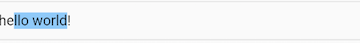
设置默认值,并从第三个字符开始选中后面的字符
1
2
3
4
5
_selectionController.text="hello world!";
_selectionController.selection=TextSelection(
    baseOffset: 2,
    extentOffset: _selectionController.text.length
);
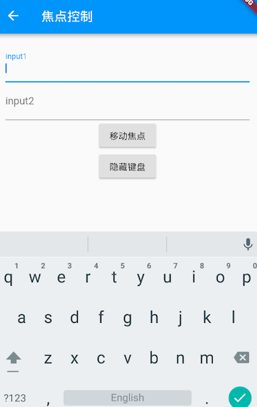
控制焦点
焦点可以通过 FocusNode 和 FocusScopeNode 来控制,默认情况下,焦点由 FocusScope 来管理,它代表焦点控制范围,可以在这个范围内通过 FocusScopeNode 在输入框之间移动焦点、设置默认焦点等。我们可以通过 FocusScope.of(context) 来获取 Widget 树中默认的 FocusScopeNode。
效果:
- 点击第一个按钮可以将焦点从第一个 TextField 挪到第二个 TextField。
- 点击第二个按钮可以关闭键盘。
1
2
3
4
5
6
7
8
9
10
11
12
13
14
15
16
17
18
19
20
21
22
23
24
25
26
27
28
29
30
31
32
33
34
35
36
37
38
39
40
41
42
43
44
45
46
47
48
49
50
51
52
53
54
55
56
57
58
class FocusTestRoute extends StatefulWidget {
  const FocusTestRoute({super.key});

  @override
  _FocusTestRouteState createState() => _FocusTestRouteState();
}

class _FocusTestRouteState extends State<FocusTestRoute> {
  FocusNode focusNode1 = FocusNode();
  FocusNode focusNode2 = FocusNode();
  FocusScopeNode? focusScopeNode;

  @override
  Widget build(BuildContext context) {
    return Padding(
      padding: const EdgeInsets.all(16.0),
      child: Column(
        children: <Widget>[
          TextField(
            autofocus: true,
            focusNode: focusNode1, //关联focusNode1
            decoration: const InputDecoration(labelText: "input1",hintText: "hint1"),
          ),
          TextField(
            focusNode: focusNode2, //关联focusNode2
            decoration: const InputDecoration(labelText: "input2"),
          ),
          Builder(
            builder: (ctx) {
              return Column(
                children: <Widget>[
                  ElevatedButton(
                    child: const Text("移动焦点"),
                    onPressed: () {
                      // 将焦点从第一个TextField移到第二个TextField
                      // 这是一种写法 FocusScope.of(context).requestFocus(focusNode2);
                      // 这是第二种写法
                      focusScopeNode ??= FocusScope.of(context);
                      focusScopeNode?.requestFocus(focusNode2);
                    },
                  ),
                  ElevatedButton(
                    child: const Text("隐藏键盘"),
                    onPressed: () {
                      // 当所有编辑框都失去焦点时键盘就会收起
                      focusNode1.unfocus();
                      focusNode2.unfocus();
                    },
                  ),
                ],
              );
            },
          ),
        ],
      ),
    );
  }
}
监听焦点状态改变事件
FocusNode 继承自 ChangeNotifier,通过 FocusNode 可以监听焦点的改变事件:
1
2
3
4
5
6
7
8
9
10
11
// ...
// 创建 focusNode
FocusNode focusNode = FocusNode();
// ...
// focusNode绑定输入框
TextField(focusNode: focusNode);
// ...
// 监听焦点变化
focusNode.addListener((){
   print(focusNode.hasFocus);
});
获得焦点时 focusNode.hasFocus 值为 true,失去焦点时为 false。
自定义样式
1
2
3
4
5
6
7
8
9
10
11
12
13
14
15
16
17
18
19
20
21
22
23
24
25
26
27
28
29
Theme(
    data: Theme.of(context).copyWith(
        hintColor: Colors.grey[200], //定义下划线颜色
        inputDecorationTheme: InputDecorationTheme(
            labelStyle: TextStyle(color: Colors.grey),//定义label字体样式
            hintStyle: TextStyle(color: Colors.grey, fontSize: 14.0)//定义提示文本样式
        )
    ),
    child: Column(
      children: <Widget>[
        TextField(
          decoration: InputDecoration(
              labelText: "用户名",
              hintText: "用户名或邮箱",
              prefixIcon: Icon(Icons.person)
          ),
        ),
        TextField(
          decoration: InputDecoration(
              prefixIcon: Icon(Icons.lock),
              labelText: "密码",
              hintText: "您的登录密码",
              hintStyle: TextStyle(color: Colors.grey, fontSize: 13.0)
          ),
          obscureText: true,
        )
      ],
    )
)
效果: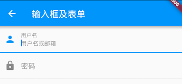
- 由于 TextField 在绘制下划线时使用的颜色是主题色里面的 hintColor,但提示文本颜色也是用的 hintColor, 如果我们直接修改 hintColor,那么下划线和提示文本的颜色都会变。值得高兴的是 decoration 中可以设置
hintStyle,它可以覆盖 hintColor,并且主题中可以通过 inputDecorationTheme 来设置输入框默认的 decoration
我们成功的自定义了下划线颜色和提问文字样式,但通过这种方式自定义后,输入框在获取焦点时,labelText 不会高亮显示了,正如上图中的 “ 用户名 “ 本应该显示蓝色,但现在却显示为灰色,并且我们还是无法定义下划线宽度。另一种灵活的方式是直接隐藏掉 TextField 本身的下划线,然后通过 Container 去嵌套定义样式,如:
1
2
3
4
5
6
7
8
9
10
11
12
13
14
15
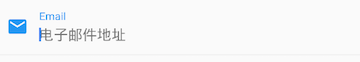
Container(
child: TextField(
keyboardType: TextInputType.emailAddress,
decoration: InputDecoration(
labelText: "Email",
hintText: "电子邮件地址",
prefixIcon: Icon(Icons.email),
border: InputBorder.none //隐藏下划线
)
),
decoration: BoxDecoration(
// 下滑线浅灰色,宽度1像素
border: Border(bottom: BorderSide(color: Colors.grey[200], width: 1.0))
),
)
通过这种组件组合的方式,也可以定义背景圆角等。一般来说,优先通过 decoration 来自定义样式,如果 decoration 实现不了,再用 widget 组合的方式。
Form 表单
Form
Form 类定义:
1
2
3
4
5
6
7
Form({
    super.key,
    required this.child,
    this.onWillPop,
    this.onChanged,
    AutovalidateMode? autovalidateMode,
})
- onWillPop 决定 Form 所在的路由是否可以直接返回(如点击返回按钮),该回调返回一个 Future 对象,如果 Future 的最终结果是 false,则当前路由不会返回;如果为 true,则会返回到上一个路由。此属性通常用于拦截返回按钮。
- onChanged Form 的任意一个子 FormField 内容发生变化时会触发此回调
- autovalidateMode AutovalidateMode 是否自动校验输入内容
- disabled 不自动校验
- always 自动校验,无需用户交互才校验,获取到焦点,有用户交互时校验
- onUserInteraction 有用户交互时才校验 每一个子 FormField 内容发生变化时都会自动校验合法性,并直接显示错误信息
FormField
1
2
3
4
5
6
7
8
9
10
FormField({
  super.key,
  required this.builder,
  this.onSaved, // FormFieldSetter<T>?
  this.validator, // FormFieldValidator<T>?
  this.initialValue, // T? 初始值
  this.enabled = true,
  AutovalidateMode? autovalidateMode, // 自动校验模式
  this.restorationId,
})
FormState
FormState 为 Form 的 State 类,可以通过 Form.of() 或 GlobalKey 获得。我们可以通过它来对 Form 的子孙
FormField 进行统一操作。
- FormState.validate():调用此方法后,会调用 Form 子孙 FormField 的 validate 回调,如果有一个校验失败,则返回 false,所有校验失败项都会返回用户返回的错误提示。
- FormState.save():调用此方法后,会调用 Form 子孙 FormField 的 save 回调,用于保存表单内容
- FormState.reset():调用此方法后,会将子孙 FormField 的内容清空
示例
用户登录表单校验:
- 用户名不能为空,如果为空则提示 “ 用户名不能为空 “。
- 密码不能少于 6 位,如果小于 6 为则提示 “ 密码不能少于 6 位 “。
1
2
3
4
5
6
7
8
9
10
11
12
13
14
15
16
17
18
19
20
21
22
23
24
25
26
27
28
29
30
31
32
33
34
35
36
37
38
39
40
41
42
43
44
45
46
47
48
49
50
51
52
53
54
55
56
57
58
59
60
61
62
63
64
65
66
67
68
69
70
71
72
73
74
75
76
77
78
79
80
81
82
83
84
85
86
87
88
89
90
91
92
class TextFieldFormDemo extends StatelessWidget {
  const TextFieldFormDemo({super.key});
  @override
  Widget build(BuildContext context) {
    return MaterialApp(
      theme: ThemeData(
        colorScheme: ColorScheme.fromSeed(seedColor: Colors.deepPurple),
        useMaterial3: true,
      ),
      home: Scaffold(
        appBar: AppBar(
          title: const Text("TextFieldForm Demo"),
        ),
        body: Container(
          decoration: const BoxDecoration(
            color: Colors.transparent,
          ),
          child: const FormTestRoute(),
        ),
      ),
    );
  }
}
class FormTestRoute extends StatefulWidget {
  const FormTestRoute({super.key});

  @override
  _FormTestRouteState createState() => _FormTestRouteState();
}
class _FormTestRouteState extends State<FormTestRoute> {
  final TextEditingController _unameController = TextEditingController();
  final TextEditingController _pwdController = TextEditingController();
  final GlobalKey _formKey = GlobalKey<FormState>();
  @override
  Widget build(BuildContext context) {
    return Form(
        key: _formKey,
        autovalidateMode: AutovalidateMode.onUserInteraction,
        child: Column(children: [
          TextFormField(
            autofocus: true,
            controller: _unameController,
            decoration: const InputDecoration(
              labelText: "用户名",
              hintText: "用户名或邮箱",
              icon: Icon(Icons.person),
            ),
            // 校验用户名
            validator: (name) {
              return name!.trim().isNotEmpty ? null : "用户名不能为空";
            },
          ),
          TextFormField(
            controller: _pwdController,
            decoration: const InputDecoration(
              labelText: "密码",
              hintText: "您的登录密码",
              icon: Icon(Icons.lock),
            ),
            obscureText: true,
            //校验密码
            validator: (pwd) {
              return pwd!.trim().length > 5 ? null : "密码不能少于6位";
            },
          ),
          Padding(
            padding: const EdgeInsets.only(top: 28),
            child: Row(
              children: [
                const Padding(padding: EdgeInsets.only(left: 20.0)),
                Expanded(
                    child: ElevatedButton(
                        onPressed: () {
                          // 通过_formKey.currentState 获取FormState后,
                          // 调用validate()方法校验用户名密码是否合法,校验
                          FormState state = _formKey.currentState as FormState;
                          if (state.validate()) {
                            // 验证通过提交数据
                            print('验证通过提交数据');
                          }
                        },
                        child: const Padding(
                          padding: EdgeInsets.all(16.0),
                          child: Text('登录'),
                        ))),
                const Padding(padding: EdgeInsets.only(right: 20.0))
              ],
            ),
          ),
        ]));
  }
}
登录按钮的 onPressed 方法中不能通过 Form.of(context) 来获取 FormState,原因是,此处的 context 为 FormTestRoute 的 context,而 Form.of(context) 是根据所指定 context 向根去查找,而 FormState 是在 FormTestRoute 的子树中,所以不行。正确的做法是通过 Builder 来构建登录按钮,Builder 会将 widget 节点的 context 作为回调参数:
1
2
3
4
5
6
7
8
9
10
11
12
13
14
Expanded(
 // 通过Builder来获取ElevatedButton所在widget树的真正context(Element)
  child:Builder(builder: (context){
    return ElevatedButton(
      ...
      onPressed: () {
        // 由于本widget也是Form的子代widget,所以可以通过下面方式获取FormState
        if(Form.of(context).validate()){
          // 验证通过提交数据
        }
      },
    );
  })
)
RichText 富文本
Image 和 ICON 图片
Flutter 中,我们可以通过 Image 组件来加载并显示图片,Image 的数据源可以是 asset、文件、内存以及网络。
Image 基本使用
加载图片的几种方式
ImageProvider
ImageProvider 是一个抽象类,主要定义了图片数据获取的接口 load(),从不同的数据源获取图片需要实现不同的 ImageProvider ,如 AssetImage 是实现了从 Asset 中加载图片的 ImageProvider,而 NetworkImage 实现了从网络加载图片的 ImageProvider
- Image.asset: 加载资源图片,就是加载项目资源目录中的图片,加入图片后会增大打包的包体体积,用的是相对路径。
- Image.network: 网络资源图片,意思就是你需要加入一段http://xxxx.xxx的这样的网络路径地址。
- Image.file: 加载本地图片,就是加载本地文件中的图片,这个是一个绝对路径,跟包体无关。
- Image.memory: 加载 Uint8List 资源图片\
Image widget 有一个必选的 image 参数,它对应一个 ImageProvider。
从 asset 中加载图片
- pubspec.yaml 中配置(先将图片 avatar.png 拷贝到 images 目录)
1
2
assets:
	- images/avatar.png
- AssetImage 来加载
1
2
3
4
Image(
  image: AssetImage("images/avatar.png"),
  width: 100.0
);
- Image.asset 加载
1
2
3
Image.asset("images/avatar.png",
  width: 100.0,
)
从网络加载图片
1
2
3
4
5
6
7
8
9
10
Image(
  image: NetworkImage(
      "https://avatars2.githubusercontent.com/u/20411648?s=460&v=4"),
  width: 100.0,
)
// 或
Image.network(
  "https://avatars2.githubusercontent.com/u/20411648?s=460&v=4",
  width: 100.0,
)
Image 参数
Image 主要参数:
1
2
3
4
5
6
7
8
9
10
11
const Image({
  // ...
  this.width, //图片的宽
  this.height, //图片高度
  this.color, //图片的混合色值
  this.colorBlendMode, //混合模式
  this.fit,//缩放模式
  this.alignment = Alignment.center, //对齐方式
  this.repeat = ImageRepeat.noRepeat, //重复方式
  // ...
})
width、height:用于设置图片的宽、高
当不指定宽高时,图片会根据当前父容器的限制,尽可能的显示其原始大小,如果只设置 width、height 的其中一个,那么另一个属性默认会按比例缩放,但可以通过下面介绍的 fit 属性来指定适应规则。
fit
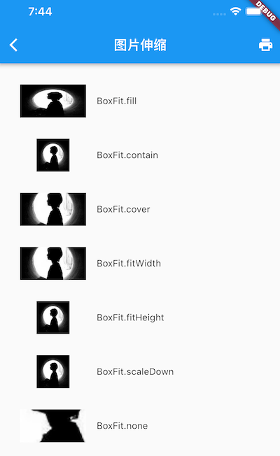
该属性用于在图片的显示空间和图片本身大小不同时指定图片的适应模式。适应模式是在 BoxFit 中定义,它是一个枚举类型,有如下值:
- fill:会拉伸填充满显示空间,图片本身长宽比会发生变化,图片会变形
全图显示,图片会被拉伸,并充满父容器
- cover:会按图片的长宽比放大后居中填满显示空间,图片不会变形,超出显示空间部分会被剪裁。
显示可能拉伸,可能裁切,充满(图片要充满整个容器,还不变形)
- contain:这是图片的默认适应规则,图片会在保证图片本身长宽比不变的情况下缩放以适应当前显示空间,图片不会变形
全图显示,显示原比例,可能会有空隙
- fitWidth:图片的宽度会缩放到显示空间的宽度,高度会按比例缩放,然后居中显示,图片不会变形,超出显示空间部分会被剪裁。
宽度充满(横向充满),显示可能拉伸,可能裁切
- fitHeight:图片的高度会缩放到显示空间的高度,宽度会按比例缩放,然后居中显示,图片不会变形,超出显示空间部分会被剪裁。
高度充满(竖向充满),显示可能拉伸,可能裁切。
- none:图片没有适应策略,会在显示空间内显示图片,如果图片比显示空间大,则显示空间只会显示图片中间部分。
- scaleDown:效果和 contain 差不多,但是此属性不允许显示超过源图片大小,可小不可大。
示例:
1
2
3
4
5
6
7
8
9
10
11
12
13
14
15
16
17
18
19
20
21
22
23
24
25
26
27
28
29
30
31
32
33
34
35
36
37
38
39
40
41
42
43
44
45
46
47
48
49
50
51
52
53
54
55
56
57
58
59
60
61
62
63
64
65
66
67
68
69
import 'package:flutter/material.dart';

class ImageAndIconRoute extends StatelessWidget {
  @override
  Widget build(BuildContext context) {
    var img=AssetImage("imgs/avatar.png");
    return SingleChildScrollView(
      child: Column(
        children: <Image>[
          Image(
            image: img,
            height: 50.0,
            width: 100.0,
            fit: BoxFit.fill,
          ),
          Image(
            image: img,
            height: 50,
            width: 50.0,
            fit: BoxFit.contain,
          ),
          Image(
            image: img,
            width: 100.0,
            height: 50.0,
            fit: BoxFit.cover,
          ),
          Image(
            image: img,
            width: 100.0,
            height: 50.0,
            fit: BoxFit.fitWidth,
          ),
          Image(
            image: img,
            width: 100.0,
            height: 50.0,
            fit: BoxFit.fitHeight,
          ),
          Image(
            image: img,
            width: 100.0,
            height: 50.0,
            fit: BoxFit.scaleDown,
          ),
          Image(
            image: img,
            height: 50.0,
            width: 100.0,
            fit: BoxFit.none,
          )
        ].map((e){
          return Row(
            children: <Widget>[
              Padding(
                padding: EdgeInsets.all(16.0),
                child: SizedBox(
                  width: 100,
                  child: e,
                ),
              ),
              Text(e.fit.toString())
            ],
          );
        }).toList()
      ),
    );
  }
}
color 和 colorBlendMode 图片的混合模式
在图片绘制时可以对每一个像素进行颜色混合处理,color 指定混合色,而 colorBlendMode 指定混合模式,
- color:是要混合的颜色,如果你只设置 color 是没有意义的。
- colorBlendMode: 是混合模式,相当于我们如何混合。
案例 1:
1
2
3
4
5
6
Image(
  image: AssetImage("images/avatar.png"),
  width: 100.0,
  color: Colors.blue,
  colorBlendMode: BlendMode.difference,
);
案例 2:
1
2
3
4
5
6
7
8
9
10
11
12
13
14
15
16
17
18
19
20
21
22
23
24
25
26
27
28
class MyApp extends StatelessWidget {
  @override
  Widget build(BuildContext context) {
    return MaterialApp(
      title: '这是title',
      home: Scaffold(

        appBar: AppBar(
          title: Text("这是AppBar的title"),
        ),

        body: Center(
            child: Container(
            child: Image(
                image: NetworkImage("https://10.url.cn/eth/ajNVdqHZLLB2ibIiaR23jaQpq0rTL1eXfBDkQzHc15ZH2qbl5Tn7A6HMnGfCfU3nDSqHHEuh8Lw7I/"),
              fit: BoxFit.scaleDown,
              color: Colors.blueGrey,
              colorBlendMode: BlendMode.multiply,
            ),
              width: 500.0,
              height: 600.0,
              color: Colors.deepOrangeAccent,
        )
        ),
      ),
    );
  }
}
- repeat 当图片本身大小小于显示空间时,指定图片的重复规则
- ImageRepeat.repeat : 横向和纵向都进行重复,直到铺满整个画布。
- ImageRepeat.repeatX: 横向重复,纵向不重复。
- ImageRepeat.repeatY:纵向重复,横向不重复。
1
2
3
4
5
6
Image(
  image: AssetImage("images/avatar.png"),
  width: 100.0,
  height: 200.0,
  repeat: ImageRepeat.repeatY ,
)
Image 圆形图片裁剪
在 Flutter 中图片圆形裁剪有两种方式:
- 将外层正方形的容器 Container 按圆形裁剪
使用 BoxDecoration 将 borderRadius 半价设置为边长的一半,就是圆形的效果了 设置 clipBehavior 边缘裁剪类型,默认是不裁剪的。这里使用了 Clip.antiAlias(抗锯齿)的方式进行裁剪,这种方式的裁剪效果最好,但是更耗资源,其他的裁剪方式如下:
- Clip.hardEdge:从名字就知道,这种方式很粗糙,但是裁剪的效率最快;
- Clip.antiAliasSaveLayer:最为精细的裁剪,但是非常慢,不建议使用;
- Clip.none:默认值,如果内容区没有超出容器边界的话,不会做任何裁剪。内容超出边界的话需要使用别的裁剪方式防止内容溢出
1
2
3
4
5
6
7
8
9
10
11
12
13
Widget _getRoundImage(String imageName, double size) {
  return Container(
    width: size,
    height: size,
    clipBehavior: Clip.antiAlias,
    decoration: BoxDecoration(
        borderRadius: BorderRadius.all(Radius.circular(size / 2))),
    child: Image.asset(
      imageName,
      fit: BoxFit.fitWidth,
    ),
  );
}
- 使用 CircleAvatar,一般用于头像
ICON
iconfont
Flutter 中,可以像 Web 开发一样使用 iconfont,iconfont 即 “ 字体图标 “,它是将图标做成字体文件,然后通过指定不同的字符而显示不同的图片。
在字体文件中,每一个字符都对应一个位码,而每一个位码对应一个显示字形,不同的字体就是指字形不同,即字符对应的字形是不同的。而在 iconfont 中,只是将位码对应的字形做成了图标,所以不同的字符最终就会渲染成不同的图标。
在 Flutter 开发中,iconfont 和图片相比有如下优势:
- 体积小:可以减小安装包大小。
- 矢量的:iconfont 都是矢量图标,放大不会影响其清晰度。
- 可以应用文本样式:可以像文本一样改变字体图标的颜色、大小对齐等。
- 可以通过 TextSpan 和文本混用。
Material Design 字体图标
Material Design 所有图标可以在其官网查看:https://material.io/tools/icons/
Flutter 默认包含了一套 Material Design 的字体图标,在 pubspec.yaml 文件中的配置如下:
1
2
flutter:
  uses-material-design: true
示例:
1
2
3
4
5
6
7
8
9
10
11
12
13
14
15
16
String icons = "";
// accessible: 0xe03e
icons += "\uE03e";
// error:  0xe237
icons += " \uE237";
// fingerprint: 0xe287
icons += " \uE287";

Text(
  icons,
  style: TextStyle(
    fontFamily: "MaterialIcons",
    fontSize: 24.0,
    color: Colors.green,
  ),
);
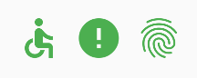
这种通过每个图标的码点对开发者不友好,Flutter 封装了 IconData 和 Icon 来专门显示字体图标:
1
2
3
4
5
6
7
8
Row(
  mainAxisAlignment: MainAxisAlignment.center,
  children: <Widget>[
    Icon(Icons.accessible,color: Colors.green),
    Icon(Icons.error,color: Colors.green),
    Icon(Icons.fingerprint,color: Colors.green),
  ],
)
Icons 类中包含了所有 Material Design 图标的 IconData 静态变量定义。
自定义字体图标
iconfont.cn 上有很多字体图标素材
- 下载导入字体图标文件;这一步和导入字体文件相同,假设我们的字体图标文件保存在项目根目录下,路径为 “fonts/iconfont.ttf”:
1
2
3
4
fonts:
  - family: myIcon  #指定一个字体名
    fonts:
      - asset: fonts/iconfont.ttf
- 为了使用方便,我们定义一个 MyIcons 类,功能和 Icons 类一样:将字体文件中的所有图标都定义成静态变量:
1
2
3
4
5
6
7
8
9
10
11
12
13
14
class MyIcons{
// book 图标
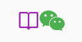
static const IconData book = const IconData(
0xe614,
fontFamily: 'myIcon',
matchTextDirection: true
);
// 微信图标
static const IconData wechat = const IconData(
0xec7d,
fontFamily: 'myIcon',
matchTextDirection: true
);
}
- 使用
1
2
3
4
5
6
7
Row(
  mainAxisAlignment: MainAxisAlignment.center,
  children: <Widget>[
    Icon(MyIcons.book,color: Colors.purple),
    Icon(MyIcons.wechat,color: Colors.green),
  ],
)
- 效果
Switch 和 CheckBox 单选和多选框
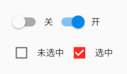
Material 组件库中提供了 Material 风格的单选开关 Switch 和复选框 Checkbox,虽然它们都是继承自 StatefulWidget,但它们本身不会保存当前选中状态,选中状态都是由父组件来管理的。当 Switch 或 Checkbox 被点击时,会触发它们的 onChanged 回调,我们可以在此回调中处理选中状态改变逻辑。
1
2
3
4
5
6
7
8
9
10
11
12
13
14
15
16
17
18
19
20
21
22
23
24
25
26
27
28
29
30
31
32
33
34
class SwitchAndCheckBoxTestRoute extends StatefulWidget {
  @override
  _SwitchAndCheckBoxTestRouteState createState() => _SwitchAndCheckBoxTestRouteState();
}

class _SwitchAndCheckBoxTestRouteState extends State<SwitchAndCheckBoxTestRoute> {
  bool _switchSelected=true; //维护单选开关状态
  bool _checkboxSelected=true;//维护复选框状态
  @override
  Widget build(BuildContext context) {
    return Column(
      children: <Widget>[
        Switch(
          value: _switchSelected,//当前状态
          onChanged:(value){
            //重新构建页面
            setState(() {
              _switchSelected=value;
            });
          },
        ),
        Checkbox(
          value: _checkboxSelected,
          activeColor: Colors.red, //选中时的颜色
          onChanged:(value){
            setState(() {
              _checkboxSelected=value;
            });
          } ,
        )
      ],
    );
  }
}
属性
- activeColor Switch 和 Checkbox 属性比较简单,读者可以查看 API 文档,它们都有一个 activeColor 属性,用于设置激活态的颜色
- 大小 Checkbox 的大小是固定的,无法自定义,而 Switch 只能定义宽度,高度也是固定的。
- tristate Checkbox 的属性 ,表示是否为三态,其默认值为 false ,这时 Checkbox 有两种状态即 “ 选中 “ 和 “ 不选中 “,对应的 value 值为 true 和 false ;如果 tristate 值为 true 时,value 的值会增加一个状态 null
状态
通过 Switch 和 Checkbox 我们可以看到,虽然它们本身是与状态(是否选中)关联的,但它们却不是自己来维护状态,而是需要父组件来管理状态,然后当用户点击时,再通过事件通知给父组件,这样是合理的,因为 Switch 和 Checkbox 是否选中本就和用户数据关联,而这些用户数据也不可能是它们的私有状态。我们在自定义组件时也应该思考一下哪种状态的管理方式最为合理。
ProgressIndicator 进度条
Material 组件库中提供了两种进度指示器:LinearProgressIndicator 和 CircularProgressIndicator,它们都可以同时用于精确的进度指示和模糊的进度指示。精确进度通常用于任务进度可以计算和预估的情况,比如文件下载;而模糊进度则用户任务进度无法准确获得的情况,如下拉刷新,数据提交等。
LinearProgressIndicator
LinearProgressIndicator 是一个线性、条状的进度条,定义如下:
1
2
3
4
5
6
LinearProgressIndicator({
  double value,
  Color backgroundColor,
  Animation<Color> valueColor,
  // ...
})
- value:value 表示当前的进度,取值范围为 [0,1];如果 value 为 null 时则指示器会执行一个循环动画(模糊进度);当 value 不为 null 时,指示器为一个具体进度的进度条。
- backgroundColor:指示器的背景色。
- valueColor: 指示器的进度条颜色;值得注意的是,该值类型是
Animation<Color>,这允许我们对进度条的颜色也可以指定动画。如果我们不需要对进度条颜色执行动画,换言之,我们想对进度条应用一种固定的颜色,此时我们可以通过AlwaysStoppedAnimation来指定。
示例:
1
2
3
4
5
6
7
8
9
10
11
12
13
14
15
16
17
18
19
Column demoWidget() {
    return Column(
      children: [
        const Padding(padding: EdgeInsets.all(16.0)),
        // 模糊进度条(会执行一个动画)
        LinearProgressIndicator(
          backgroundColor: Colors.grey[200],
          valueColor: const AlwaysStoppedAnimation(Colors.blue),
        ),
        const Padding(padding: EdgeInsets.all(16.0)),
//进度条显示50%
        LinearProgressIndicator(
          backgroundColor: Colors.grey[200],
          valueColor: const AlwaysStoppedAnimation(Colors.blue),
          value: .5,
        )
      ],
    );
  }
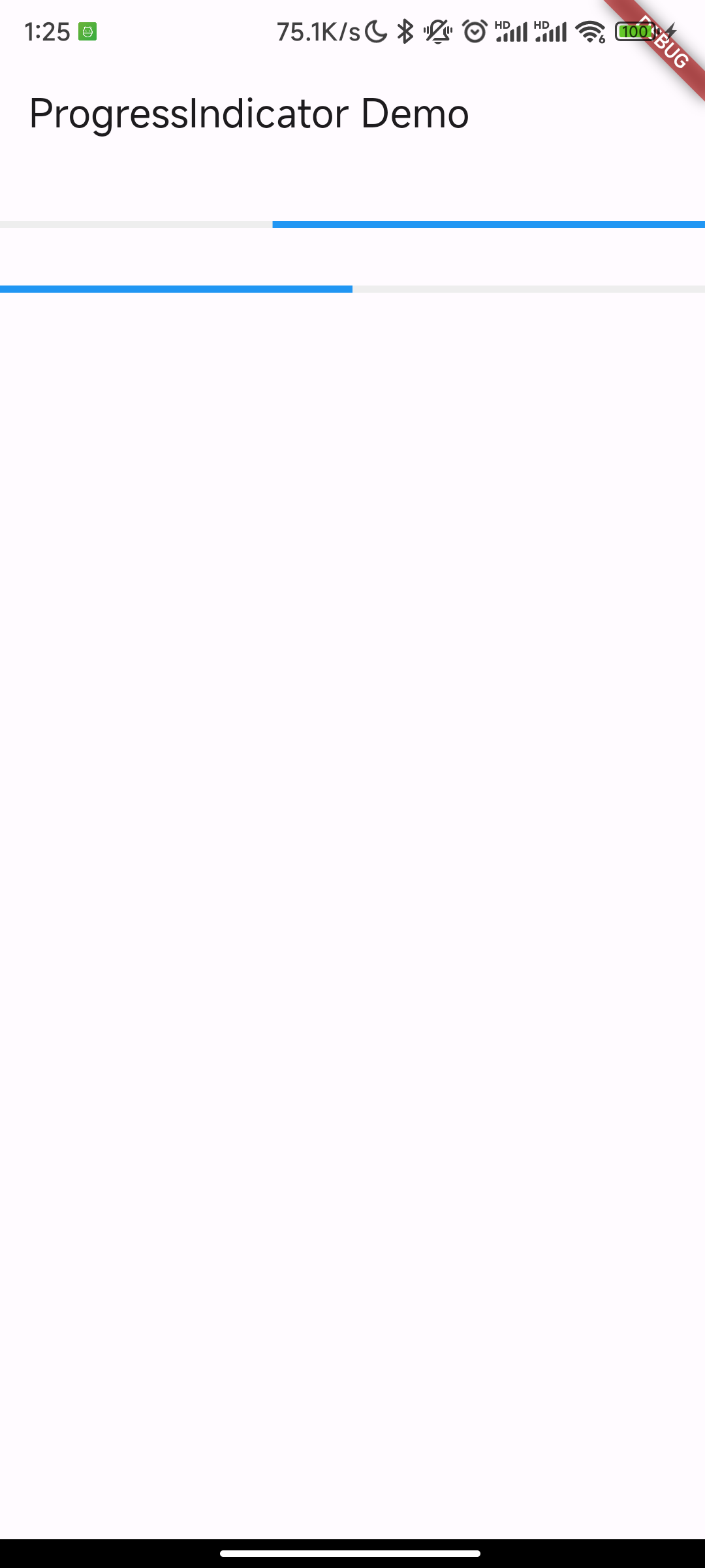
第一个进度条在执行循环动画:蓝色条一直在移动,而第二个进度条是静止的,停在 50% 的位置。
CircularProgressIndicator
CircularProgressIndicator 是一个圆形进度条,定义如下:
1
2
3
4
5
6
7
 CircularProgressIndicator({
  double value,
  Color backgroundColor,
  Animation<Color> valueColor,
  this.strokeWidth = 4.0,
  ...
})
前三个参数和 LinearProgressIndicator 相同,strokeWidth 表示圆形进度条的粗细。
示例:
1
2
3
4
5
6
7
8
9
10
11
// 模糊进度条(会执行一个旋转动画)
CircularProgressIndicator(
  backgroundColor: Colors.grey[200],
  valueColor: AlwaysStoppedAnimation(Colors.blue),
),
//进度条显示50%,会显示一个半圆
CircularProgressIndicator(
  backgroundColor: Colors.grey[200],
  valueColor: AlwaysStoppedAnimation(Colors.blue),
  value: .5,
),
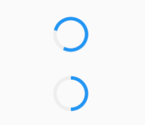
第一个进度条会执行旋转动画,而第二个进度条是静止的,它停在 50% 的位置
自定义尺寸
LinearProgressIndicator 和 CircularProgressIndicator,并没有提供设置圆形进度条尺寸的参数;
其实 LinearProgressIndicator 和 CircularProgressIndicator 都是取父容器的尺寸作为绘制的边界的。知道了这点,我们便可以通过尺寸限制类 Widget,如 ConstrainedBox、SizedBox 来指定尺寸,如:
1
2
3
4
5
6
7
8
9
10
11
12
13
14
15
16
17
18
19
// 线性进度条高度指定为3
SizedBox(
  height: 3,
  child: LinearProgressIndicator(
    backgroundColor: Colors.grey[200],
    valueColor: AlwaysStoppedAnimation(Colors.blue),
    value: .5,
  ),
),
// 圆形进度条直径指定为100
SizedBox(
  height: 100,
  width: 100,
  child: CircularProgressIndicator(
    backgroundColor: Colors.grey[200],
    valueColor: AlwaysStoppedAnimation(Colors.blue),
    value: .7,
  ),
),
注意,如果 CircularProgressIndicator 显示空间的宽高不同,则会显示为椭圆:
1
2
3
4
5
6
7
8
9
10
// 宽高不等
SizedBox(
  height: 100,
  width: 130,
  child: CircularProgressIndicator(
    backgroundColor: Colors.grey[200],
    valueColor: AlwaysStoppedAnimation(Colors.blue),
    value: .7,
  ),
),
进度色动画
实现一个进度条在 3 秒内从灰色变成蓝色,从左到右边的动画
1
2
3
4
5
6
7
8
9
10
11
12
13
14
15
16
17
18
19
20
21
22
23
24
25
26
27
28
29
30
31
32
33
34
35
36
37
38
39
40
41
42
43
44
45
46
class ProgressRoute extends StatefulWidget {
  @override
  _ProgressRouteState createState() => _ProgressRouteState();
}

class _ProgressRouteState extends State<ProgressRoute>
    with SingleTickerProviderStateMixin {
  late AnimationController _animationController;

  @override
  void initState() {
    // 动画执行时间3秒
    _animationController = AnimationController(
      vsync: this, //注意State类需要混入SingleTickerProviderStateMixin(提供动画帧计时/触发器)
      duration: const Duration(seconds: 3),
    );
    _animationController.forward();
    _animationController.addListener(() => setState(() => {}));
    super.initState();
  }

  @override
  void dispose() {
    _animationController.dispose();
    super.dispose();
  }

  @override
  Widget build(BuildContext context) {
    return SingleChildScrollView(
      child: Column(
        children: <Widget>[
          Padding(
            padding: const EdgeInsets.all(16),
            child: LinearProgressIndicator(
              backgroundColor: Colors.grey[200],
              valueColor: ColorTween(begin: Colors.grey, end: Colors.blue)
                  .animate(_animationController), // 从灰色变成蓝色
              value: _animationController.value,
            ),
          )
        ],
      ),
    );
  }
}
自定义进度指示器样式
定制进度指示器风格样式,可以通过 CustomPainter Widget 来自定义绘制逻辑,实际上 LinearProgressIndicator 和 CircularProgressIndicator 也正是通过 CustomPainter 来实现外观绘制的。
flutter_spinkit 包提供了多种风格的模糊进度指示器
BottomNavigationBar 底部导航
1
2
3
4
5
6
7
8
9
10
11
12
13
14
15
16
17
18
19
20
21
22
23
24
25
BottomNavigationBar({
  super.key,
  required this.items,
  this.onTap,
  this.currentIndex = 0,
  this.elevation,
  this.type,
  Color? fixedColor,
  this.backgroundColor,
  this.iconSize = 24.0,
  Color? selectedItemColor,
  this.unselectedItemColor,
  this.selectedIconTheme,
  this.unselectedIconTheme,
  this.selectedFontSize = 14.0,
  this.unselectedFontSize = 12.0,
  this.selectedLabelStyle,
  this.unselectedLabelStyle,
  this.showSelectedLabels,
  this.showUnselectedLabels,
  this.mouseCursor,
  this.enableFeedback,
  this.landscapeLayout,
  this.useLegacyColorScheme = true,
})
其中常用的参数为:
- items:对应的页面组件数组,必须参数
- currentIndex:默认显示第几个页面
- type:组件类型,使用 BottomNavigationBarType 枚举,有 fixed 和 shifting 两种。fixed 是图标固定位置,而 shifting 的图标点击后会有一个漂移效果,可以实际试一下,一般用 fixed 比较多
- onTap:点击后的事件,一般用这个更新状态数据,以便更新页面
- 其他参数用于控制样式的,可以根据实际需要设置图标大小,主题色,字体等参数
Decoration
容器需要额外的样式,如圆角、背景色等。Flutter 中各种容器有一个 decoration 属性用于装饰容器,可用于设置背景色(可渐变)、圆角、边框和阴影等
decoration 是一个 Decoration 对象,常用的是 BoxDecoration
BoxDecoration
1
2
3
4
5
6
7
8
9
10
const BoxDecoration({
    this.color,
    this.image,
    this.border,
    this.borderRadius,
    this.boxShadow,
    this.gradient,
    this.backgroundBlendMode,
    this.shape = BoxShape.rectangle,
})
- color 为使用颜色填充容器
- image 为使用图片作为背景
- border 为边框
- borderRadius 为边框圆角
- boxShadow 为容器阴影
- gradient 使用渐变色作为背景
- backgroundBlendMode 是指与容器的混合模型,默认是覆盖
- shape 是背景形状,默认是矩形
示例代码:
1
2
3
4
5
6
7
8
9
10
11
12
13
14
15
16
17
18
19
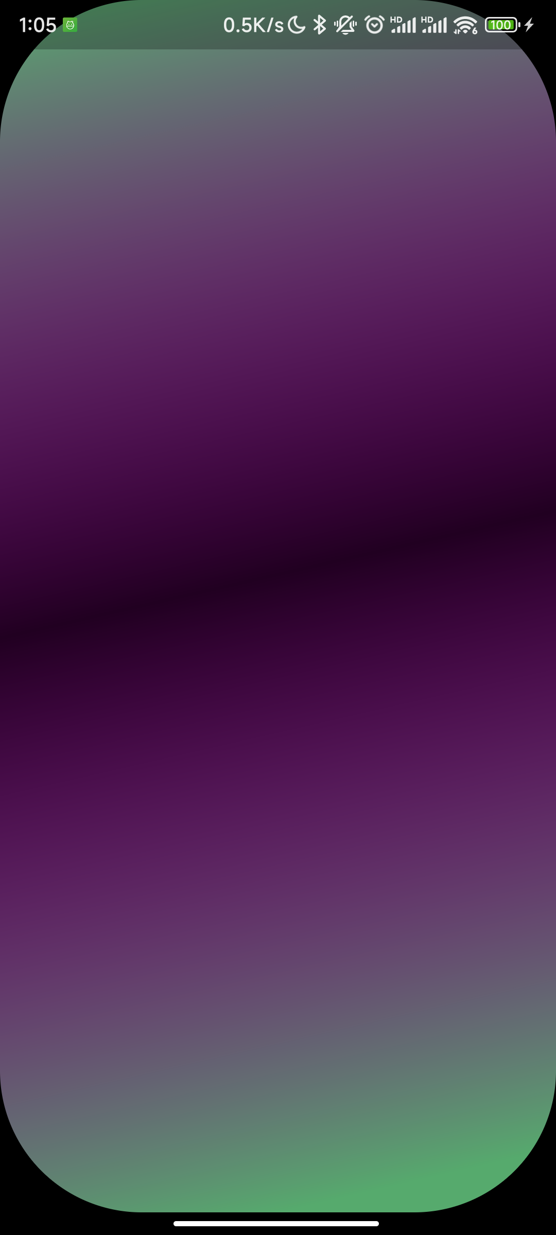
class WxPageTest extends StatelessWidget {
const WxPageTest({super.key});
@override
Widget build(BuildContext context) {
return Container(
decoration: BoxDecoration(
borderRadius: BorderRadius.circular(100.0),
gradient: const LinearGradient(
begin: Alignment.topLeft,
end: Alignment.bottomCenter,
colors: [
Color(0xFF56AF6D),
Color(0x21FF00FF),
Color(0xFF56AA6D),
])),
);
}
}
效果: