系统提供Drawable
ShapeDrawable 和 GradientDrawable
ShapeDrawable 和 GradientDrawable
ShapeDrawable
A Drawable object that draws primitive shapes. A ShapeDrawable takes a Shape object and manages its presence on the screen. If no Shape is given, then the ShapeDrawable will default to a
RectShape.
This object can be defined in an XML file with the<shape>element.
ShapeDrawable 是一个用来绘制原始形状的 Drawable 对象。
GradientDrawable
A Drawable with a color gradient for buttons, backgrounds, etc.
It can be defined in an XML file with the element. For more information, see the guide to Drawable Resources.
GradientDrawable 它是一个具有色彩梯度(color gradient)的 Drawable。
shape/gradient xml 语法
GradientDrawable 和 ShapeDrawable 都采用 shape 标签来定义,和 ShapeDrawable 最大的不同的就是它拥有 gradient 属性
1
2
3
4
5
6
7
8
9
10
11
12
13
14
15
16
17
18
19
20
21
22
23
24
25
26
27
28
29
30
31
32
33
34
35
36
<?xml version="1.0" encoding="utf-8"?>
<shape
    xmlns:android="http://schemas.android.com/apk/res/android"
    android:shape=["rectangle" | "oval" | "line" | "ring"] >
    <corners
        android:radius="integer"
        android:topLeftRadius="integer"
        android:topRightRadius="integer"
        android:bottomLeftRadius="integer"
        android:bottomRightRadius="integer" />
    <gradient
        android:angle="integer"
        android:centerX="integer"
        android:centerY="integer"
        android:centerColor="integer"
        android:endColor="color"
        android:gradientRadius="integer"
        android:startColor="color"
        android:type=["linear" | "radial" | "sweep"]
        android:usesLevel=["true" | "false"] />
    <padding
        android:left="integer"
        android:top="integer"
        android:right="integer"
        android:bottom="integer" />
    <size
        android:width="integer"
        android:height="integer" />
    <solid
        android:color="color" />
    <stroke
        android:width="integer"
        android:color="color"
        android:dashWidth="integer"
        android:dashGap="integer" />
</shape>
其中各个属性标签的含义分别是:
android:shape 根标签
表示形状,它的值可以是 rectangle(矩形)、oval(椭圆)、line(横线)和 ring(圆环),默认为 rectangle。 此外,当形状值是 ring 的时候,还有一下几个属性可配置: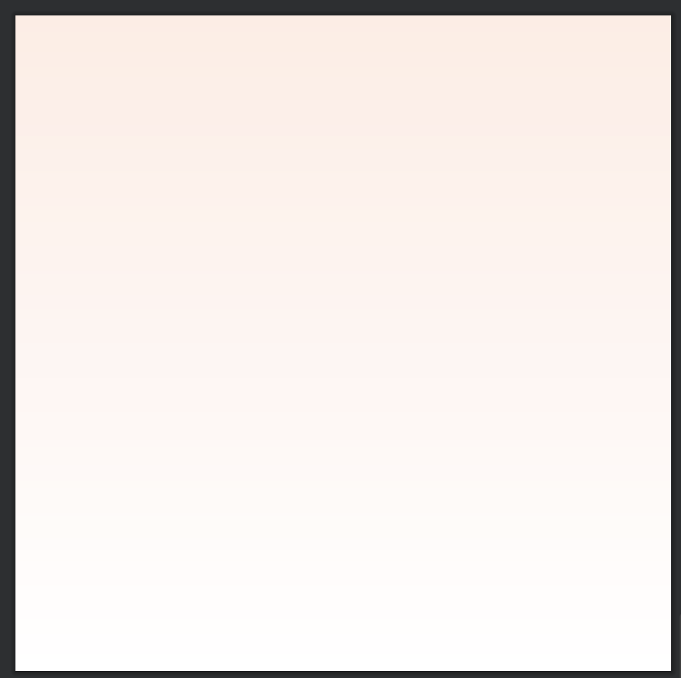
圆角半径
1
2
3
4
5
6
<corners
    android:radius="integer"
    android:topLeftRadius="integer"
    android:topRightRadius="integer"
    android:bottomLeftRadius="integer"
    android:bottomRightRadius="integer" />
指图形的圆角半径,仅当 shape 属性为 rectangle 即形状是矩形时生效,数值越小越接近直角,android:radius 同时设置四个角的半径,其他四个属性则可单独设置某个角的半径。
渐变属性
1
2
3
4
5
6
7
8
9
10
<gradient
    android:angle="integer"
    android:centerX="integer"
    android:centerY="integer"
    android:centerColor="integer"
    android:endColor="color"
    android:gradientRadius="integer"
    android:startColor="color"
    android:type=["linear" | "radial" | "sweep"]
    android:usesLevel=["true" | "false"] />
表示颜色渐变,它的各个属性值的含义分别是:
Radial GradientDrawable 兼容问题
- Radial GradientDrawable 兼容问题 https://www.jianshu.com/p/36affa6dac4b
设置 android:gradientRadius 属性值时:
- Api 21 以下:只能使用 Float 格式数据。%、%p、dimension 格式没有预期效果;
- Api 21 时:只能使用 Fraction(%,%p)、Dimension 格式数据。不能使用 Float 数据,否则 Float 会被解析为 Dimension,显示错误。drawable 自身 size 未指定时,使用% 格式不会显示;
- Api 22 及以上:可以正常使用 Float、Dimension、%、%p 格式。
内边距
距离内容或者子元素的内边距,每个方向可以单独设置。
shape 大小
设置 shape 大小,width 表示宽度,height 表示高度。需要注意的是,这个一般并不是 shape 的最终大小,如果用作 View 的背景,它的大小是由 View 的大小来决定的。
填充颜色
表示纯色填充,color 属性为填充的颜色。
边框
边框描述,它的各个属性值的含义分别是:
需要注意的是,如果需要设置边框虚线效果,则需要同时设置 dashWidth 和 dashGap 的值不为 0,否则无法显示虚线效果。
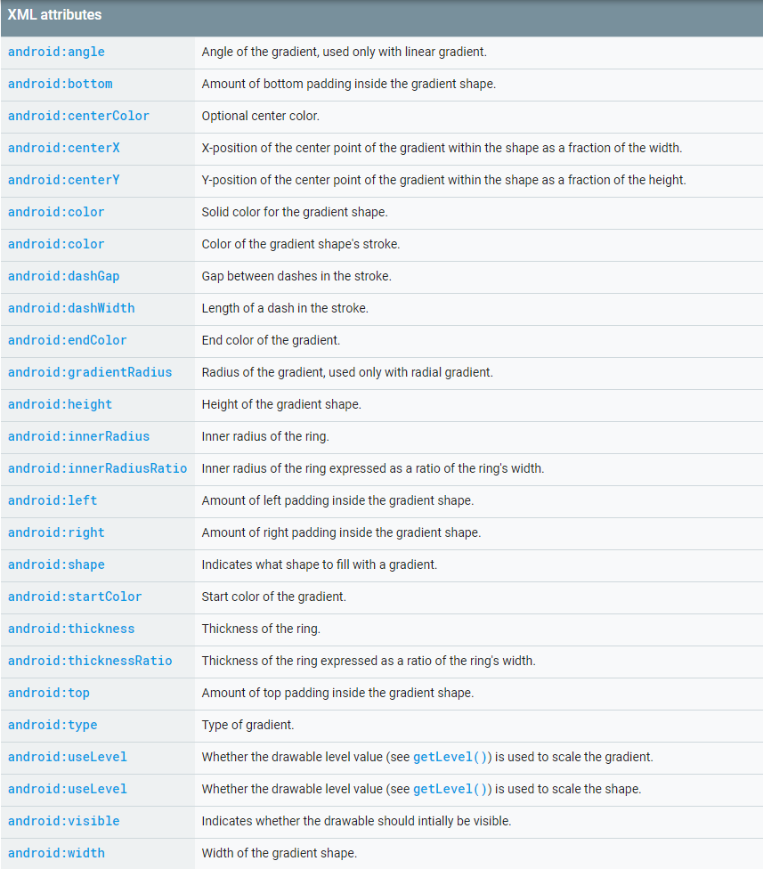
gradient 标签
<gradient> 标签它与 <solid> 标签是互相排斥的,其中 solid 表示纯色填充,而 gradient 则表示渐变效果。
gradient xml 属性介绍
1
2
3
4
5
6
7
8
9
10
<gradient
	android:angle="integer"
	android:centerX="integer"
	android:centerY="integer"
	android:centerColor="integer"
	android:endColor="color"
	android:gradientRadius="integer"
	android:startColor="color"
	android:type=["linear" | "radial" | "sweep"]
	android:useLevel=["true" | "false"] />
* android:type
- linear : 线性渐变
- radial:A radial gradient. 放射性渐变(圆形渐变),起始颜色从
centerX,centerY点开始。 - sweep:A sweeping line gradient. 扫描式渐变(扇形渐变)。
* android:angle
Integer,代表渐变颜色的角度, 0 is left to right, 90 is bottom to top. 必须是 45 的整数倍. 默认是 0.该属性只有在 type=linear 情况下起作用,默认的 type 为 linear。
* android:startColor
颜色渐变的开始颜色
* android:endColor
颜色渐变的结束颜色
* android:centerColor
颜色渐变的中间颜色
* android:centerX
Float.(0 - 1.0) 相对 X 的渐变位置。
* android:centerY
Float.(0 - 1.0) 相对 Y 的渐变位置。
centerX 和 centerY,这两个属性只有在
android:type不为linear情况下起作用。
* android:gradientRadius
Float. 渐变颜色的半径,单位应该是像素点。需要 android:type="radial"。
如果 android:type=”radial”,没有设置 android:gradientRadius,将会报错,error inflating class。
* android:useLevel
使用 LevelListDrawable 时就要设置为 true,设为 false 时才有渐变效果。
gradient 颜色渐变方向
1
2
3
4
当angle为0时,颜色渐变方向是从左往右;
当angle为90时,颜色渐变方向是从下往上;
当angle为180时,颜色渐变方向是从右往左;
当angle为270时,颜色渐变方向是从上往下;
默认方向是从左往右,逆时针;Android10.0 系统发现渐变方向是从上往下,需要加上 android:angle=”0”
示例:从上到下,粉色渐变到白色
1
2
3
4
5
6
7
8
9
10
11
12
<?xml version="1.0" encoding="utf-8"?>
<shape xmlns:android="http://schemas.android.com/apk/res/android"
    xmlns:tools="http://schemas.android.com/tools"
    android:shape="rectangle"
    android:useLevel="false"
    tools:ignore="ResourceName">

    <gradient
        android:angle="270"
        android:endColor="#FFFFFF"
        android:startColor="#FFECE4" />
</shape>
gradient 代码设置 - GradientDrawable
GradientDrawable 颜色渐变相关的方法
setGradientType(@GradientType int gradient)
setGradientType 对应 gradient 标签 android:type 属性,对应的值有:LINEAR_GRADIENT,RADIAL_GRADIENT,SWEEP_GRADIENT;分别是:线性渐变,放射性渐变,扫描式渐变。
setColor
1
2
3
setColor(@ColorInt int argb)
setColors(@ColorInt int[] colors)
setColor(@Nullable ColorStateList colorStateList)
setColors 设置渐变的颜色,包含一种,至少两种颜色等。对应 gradient 标签 android:startColor、android:centerColor 和 android:endColor; 但是 java 方法好像更加灵活,可以放多于三种颜色。
setOrientation(Orientation orientation)
setOrientation 设置线性渐变的方向。对应 gradient 标签 android:angle,可以取的值有:
1
2
3
4
5
6
7
8
9
10
11
12
13
14
15
16
17
18
19
20
21
22
23
24
25
26
27
28
29
30
31
32
33
34
35
36
37
/**
 * 控制渐变相对于可绘制边界的方向
 */
public enum Orientation {
    /**
     * 从顶部到底部绘制渐变
     */
    TOP_BOTTOM,
    /**
     * 绘制从右上角到左下角的渐变
     */
    TR_BL,
    /**
     * 从右到左绘制渐变
     */
    RIGHT_LEFT,
    /**
     * 从右下角到左上角绘制渐变
     */
    BR_TL,
    /**
     * 从底部到顶部绘制渐变
     */
    BOTTOM_TOP,
    /**
     * 从左下角到右上角绘制渐变
     */
    BL_TR,
    /**
     * 从左到右绘制渐变
     */
    LEFT_RIGHT,
    /**
     * 绘制从左上角到右下角的渐变
     */
    TL_BR,
}
setGradientRadius(float gradientRadius)
setGradientRadius 设置渐变的半径。,只有当渐变类型设置为{RADIAL_GRADIENT}时,半径才有效。对应 gradient 标签 android:gradientRadius。
setCornerRadii(float[] radii) 设置四个角的圆角半径
数组分别指定四个圆角的半径,每个角可以指定 [X_Radius,Y_Radius],四个圆角的顺序为左上,右上,右下,左下。如果 X_Radius,Y_Radius 为 0 表示还是直角
1
drawable?.cornerRadii = floatArrayOf(radius, radius, radius, radius, 0f, 0f, 0f, 0f)
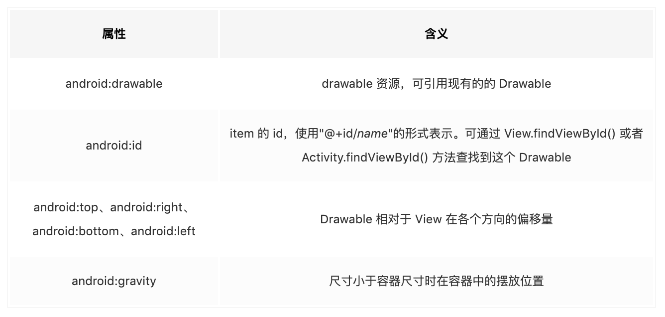
LayerDrawable
LayerDrawable 是管理 Drawable 列表的 Drawable。列表中的每个 item 按照列表的顺序绘制,列表中的最后 item 绘于顶部。根标签用 <layer-list> 表示,每一项用 <item> 表示。
语法
1
2
3
4
5
6
7
8
9
10
11
12
13
14
<?xml version="1.0" encoding="utf-8"?>
<layer-list
xmlns:android="http://schemas.android.com/apk/res/android" >
<item
android:drawable="@[package:]drawable/drawable_resource"
android:id="@[+][package:]id/resource_name"
android:top="dimension"
android:right="dimension"
android:bottom="dimension"
android:left="dimension"
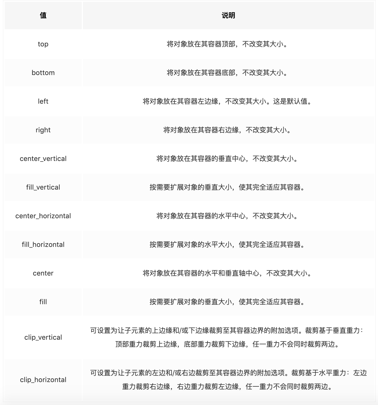
android:gravity=["top" | "bottom" | "left" | "right" | "center_vertical" |
"fill_vertical" | "center_horizontal" | "fill_horizontal" |
"center" | "fill" | "clip_vertical" | "clip_horizontal"] />
</layer-list>
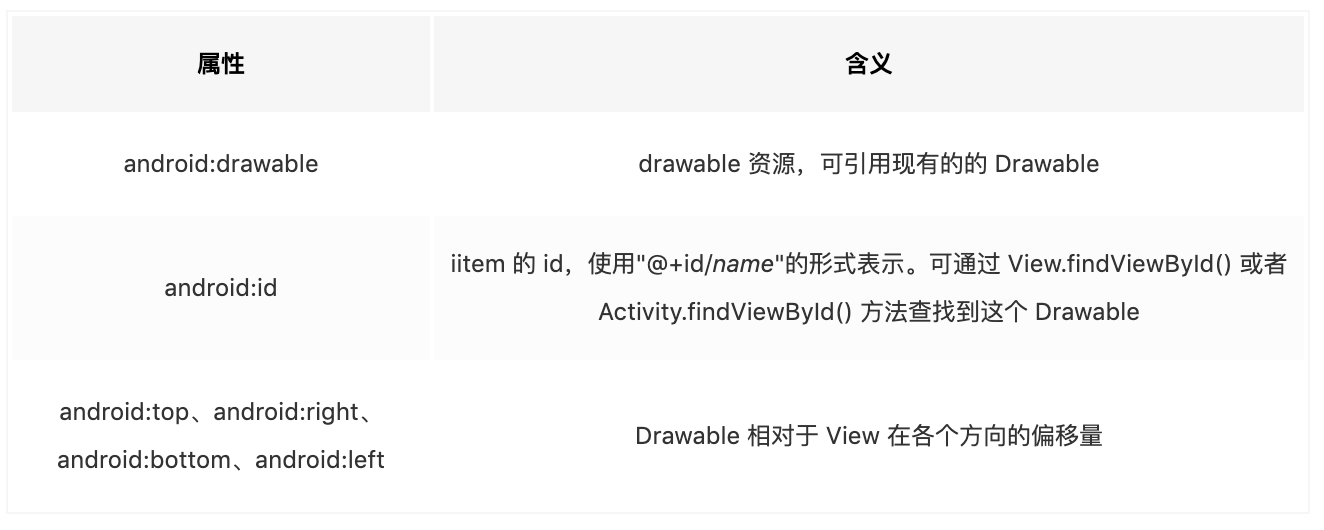
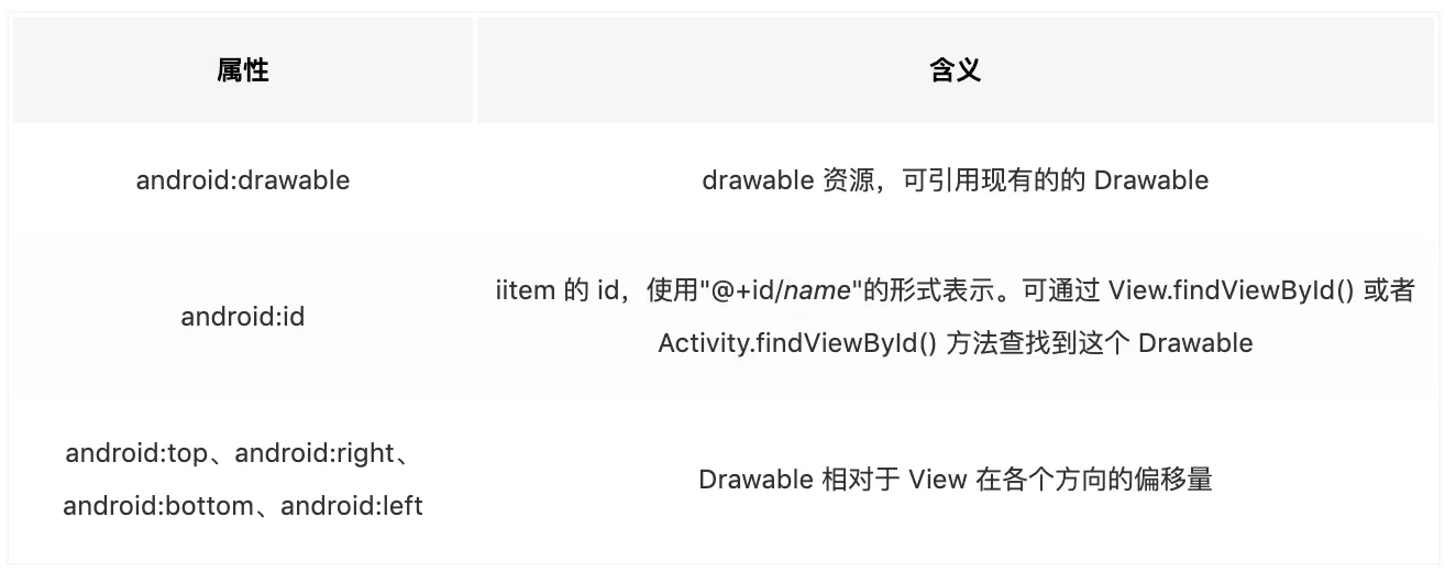
LayerDrawable 顶层标签为 ,它可以包含多个 标签,每个 item 表示一个 Drawable,item 的属性含义分别是:
|  |
案例
1
2
3
4
5
6
7
8
9
10
11
12
13
14
15
16
17
18
19
20
21
22
23
24
25
26
<?xml version="1.0" encoding="utf-8"?>
<layer-list xmlns:android="http://schemas.android.com/apk/res/android">
    <!--内部定义一个 Drawable-->
    <item
        android:left="2dp"
        android:top="4dp">
        <shape>
            <solid android:color="@android:color/holo_green_dark" />
            <corners android:radius="10dp" />
        </shape>
    </item>

    <!--指定现有的 Drawable-->
    <item
        android:bottom="4dp"
        android:right="2dp">
        <shape>
            <gradient
                android:endColor="@color/white"
                android:startColor="@color/white" />
            <corners android:radius="4dp" />
        </shape>

    </item>

</layer-list>
使用
1
2
3
4
5
6
7
8
9
10
11
12
13
14
15
16
17
18
19
20
21
22
23
24
25
26
27
28
29
30
31
32
33
34
35
36
37
<?xml version="1.0" encoding="utf-8"?>
<androidx.constraintlayout.widget.ConstraintLayout xmlns:android="http://schemas.android.com/apk/res/android"
    xmlns:app="http://schemas.android.com/apk/res-auto"
    xmlns:tools="http://schemas.android.com/tools"
    android:layout_width="match_parent"
    android:layout_height="match_parent"
    android:background="@android:color/holo_orange_dark">

    <LinearLayout
        android:layout_width="match_parent"
        android:layout_height="wrap_content"
        android:layout_margin="20dp"
        android:background="@drawable/layer_list_shadow"
        android:orientation="vertical"
        android:padding="10dp"
        app:layout_constraintBottom_toBottomOf="parent"
        app:layout_constraintEnd_toEndOf="parent"
        app:layout_constraintStart_toStartOf="parent"
        app:layout_constraintTop_toTopOf="parent"
        tools:layout_editor_absoluteX="190dp"
        tools:layout_editor_absoluteY="331dp">

        <TextView
            android:layout_width="match_parent"
            android:layout_height="wrap_content"
            android:text="I'm a title......."
            android:textColor="#000000"
            android:textSize="20sp" />

        <TextView
            android:layout_width="match_parent"
            android:layout_height="wrap_content"
            android:text="content content content content content content content content..."
            android:textColor="@android:color/darker_gray"
            android:textSize="16sp" />
    </LinearLayout>
</androidx.constraintlayout.widget.ConstraintLayout>
效果:
| 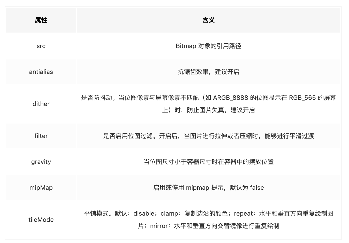 |
BitmapDrawable
语法
BitmapDrawable 对应 <bitmap> 标签定义,xml 语法如下:
1
2
3
4
5
6
7
8
9
10
11
12
13
<?xml version="1.0" encoding="utf-8"?>
<bitmap
    xmlns:android="http://schemas.android.com/apk/res/android"
    android:src="@[package:]drawable/drawable_resource"
    android:antialias=["true" | "false"]
    android:dither=["true" | "false"]
    android:filter=["true" | "false"]
    android:gravity=["top" | "bottom" | "left" | "right" | "center_vertical" |
                      "fill_vertical" | "center_horizontal" | "fill_horizontal" |
                      "center" | "fill" | "clip_vertical" | "clip_horizontal"]
    android:mipMap=["true" | "false"]
    android:tileMode=["disabled" | "clamp" | "repeat" | "mirror"]
    android:autoMirrored="true" <!--api19及+可以--> />
其中各个属性的含义分别是:
|  |
案例
- repeat
1
2
3
4
5
6
7
8
<?xml version="1.0" encoding="utf-8"?>
<bitmap xmlns:android="http://schemas.android.com/apk/res/android"
    android:src="@mipmap/kakarotto"
    android:antialias="true"
    android:dither="true"
    android:filter="true"
    android:gravity="center"
    android:tileMode="repeat"/>
|  |
- autoMirrored,水平镜像(api19 及 + 可用)
1
2
3
4
5
6
<?xml version="1.0" encoding="utf-8"?>
<bitmap xmlns:android="http://schemas.android.com/apk/res/android"
    android:antialias="true"
    android:autoMirrored="true"
    android:dither="true"
    android:src="@drawable/ic_room_latest_head_bg" />
LevelListDrawable
LevelListDrawable 同样表示一个 Drawable 列表,列表中的每个 item 都有一个 level 值, LevelListDrawable 会根据不同的 level 在不同的 item 之间进行切换。
语法
1
2
3
4
5
6
7
8
<?xml version="1.0" encoding="utf-8"?>
<level-list
    xmlns:android="http://schemas.android.com/apk/res/android" >
    <item
        android:drawable="@drawable/drawable_resource"
        android:maxLevel="integer"
        android:minLevel="integer" />
</level-list>
LayerDrawable 根标签为 ,它可以包含多个 标签,每个 item 表示一个 Drawable,item 的属性含义分别是:
| 属性 | 含义 |
|---|---|
| android:drawable | drawable 资源,可引用现有的的 Drawable |
| android:maxLevel | 该 item 允许的最大级别,取值范围为 [0, 10000] |
| android:minLevel | 该 item 允许的最小级别,取值范围为 [0, 10000] |
案例
1
2
3
4
5
6
7
8
9
10
11
12
13
14
15
16
17
18
19
20
21
<?xml version="1.0" encoding="utf-8"?>
<level-list xmlns:android="http://schemas.android.com/apk/res/android">
    <item
        android:drawable="@drawable/dice_one"
        android:maxLevel="0" />
    <item
        android:drawable="@drawable/dice_two"
        android:maxLevel="1" />
    <item
        android:drawable="@drawable/dice_three"
        android:maxLevel="2" />
    <item
        android:drawable="@drawable/dice_four"
        android:maxLevel="3" />
    <item
        android:drawable="@drawable/dice_five"
        android:maxLevel="4" />
    <item
        android:drawable="@drawable/dice_six"
        android:maxLevel="5" />
</level-list>
使用
1
2
3
4
5
6
7
8
9
10
11
12
13
14
15
16
17
18
19
<?xml version="1.0" encoding="utf-8"?>
<androidx.constraintlayout.widget.ConstraintLayout xmlns:android="http://schemas.android.com/apk/res/android"
    xmlns:app="http://schemas.android.com/apk/res-auto"
    xmlns:tools="http://schemas.android.com/tools"
    android:layout_width="match_parent"
    android:layout_height="match_parent">

    <ImageView
        android:id="@+id/img"
        android:layout_width="230dp"
        android:layout_height="150dp"
        android:src="@drawable/level_list_demo"
        android:text="Button"
        app:layout_constraintBottom_toBottomOf="parent"
        app:layout_constraintEnd_toEndOf="parent"
        app:layout_constraintStart_toStartOf="parent"
        app:layout_constraintTop_toTopOf="parent" />

</androidx.constraintlayout.widget.ConstraintLayout>
然后控制 ImageView 的 level 即可显示出效果:
1
2
3
4
5
6
7
8
9
10
11
12
13
14
15
16
17
18
19
class LevelListActivity : AppCompatActivity() {
    lateinit var mImageView: ImageView
    override fun onCreate(savedInstanceState: Bundle?) {
        super.onCreate(savedInstanceState)
        setContentView(R.layout.activity_level_list)

        mImageView = findViewById(R.id.img)
        for (i in 0..15) {
            mHandler.sendEmptyMessageDelayed(i, (1000 * i).toLong())
        }

    }
    private val mHandler: Handler = @SuppressLint("HandlerLeak")
    object : Handler() {
        override fun handleMessage(msg: Message?) {
            msg?.what?.let { mImageView.setImageLevel(it % 5) }
        }
    }
}
InsetDrawable
语法
1
2
3
4
5
6
7
8
<?xml version="1.0" encoding="utf-8"?>
<inset
    xmlns:android="http://schemas.android.com/apk/res/android"
    android:drawable="@drawable/drawable_resource"
    android:insetTop="dimension"
    android:insetRight="dimension"
    android:insetBottom="dimension"
    android:insetLeft="dimension" />
根标签为 ,它的各个属性含义分别是:
| 属性 | 含义 |
|---|---|
| android:drawable | drawable 资源,可引用现有的的 Drawable |
| android:insetTop、android:insetRight、android:insetBottom、android:insetLeft | 内容距离各个边框的距离 |
案例
1
2
3
4
5
6
7
<?xml version="1.0" encoding="utf-8"?>
<inset xmlns:android="http://schemas.android.com/apk/res/android"
    android:drawable="@drawable/bg2"
    android:insetLeft="10dp"
    android:insetTop="20dp"
    android:insetRight="30dp"
    android:insetBottom="60dp" />
使用
1
2
3
4
5
6
7
8
9
10
11
12
13
14
15
16
17
18
<?xml version="1.0" encoding="utf-8"?>
<androidx.constraintlayout.widget.ConstraintLayout xmlns:android="http://schemas.android.com/apk/res/android"
    xmlns:app="http://schemas.android.com/apk/res-auto"
    android:layout_width="match_parent"
    android:layout_height="match_parent"
    android:background="@drawable/inset_demo">

    <TextView
        android:layout_width="0dp"
        android:layout_height="0dp"
        android:text="TextTextTextTextTextTextTextTextTextTextTextTextTextTextTextTextTextText"
        android:textSize="20sp"
        app:layout_constraintBottom_toBottomOf="parent"
        app:layout_constraintEnd_toEndOf="parent"
        app:layout_constraintStart_toStartOf="parent"
        app:layout_constraintTop_toTopOf="parent" />

</androidx.constraintlayout.widget.ConstraintLayout>
ScaleDrawable
ScaleDrawable 可以根据 level 值动态地将 Drawable 进行一定比例的缩放。当 level 的取值范围为 [0, 10000],当 level 为 0 时表示隐藏;当 level 值为 1 时,Drawable 的大小为初始化时的缩放比例,当 level 值为 10000 时,Drawable 大小为 100% 缩放比例。
语法
1
2
3
4
5
6
7
8
9
<?xml version="1.0" encoding="utf-8"?>
<scale
    xmlns:android="http://schemas.android.com/apk/res/android"
    android:drawable="@drawable/drawable_resource"
    android:scaleGravity=["top" | "bottom" | "left" | "right" | "center_vertical" |
                          "fill_vertical" | "center_horizontal" | "fill_horizontal" |
                          "center" | "fill" | "clip_vertical" | "clip_horizontal"]
    android:scaleHeight="percentage"
    android:scaleWidth="percentage" />
它的根标签为 <scale>,它的各个属性的含义分别是:
android:drawable
drawable 资源,可引用现有的的 Drawable
android:scaleHeight
Drawable 高的缩放比例,值越高最终结果越小。
android:scaleGravity
Drawable 宽的缩放比例
android:scaleGravity
当图片尺寸小于 View 时,设置这个属性值可以对图片进行定位,可以使用 | 符号组合使用,所有值的含义分别为:
|  |
案例
1
2
3
4
5
6
<?xml version="1.0" encoding="utf-8"?>
<scale xmlns:android="http://schemas.android.com/apk/res/android"
    android:drawable="@drawable/bg2"
    android:scaleWidth="80%"
    android:scaleHeight="80%"
    android:scaleGravity="bottom" />
使用
1
2
3
4
5
6
7
8
9
10
11
12
13
14
15
16
17
18
<?xml version="1.0" encoding="utf-8"?>
<androidx.constraintlayout.widget.ConstraintLayout xmlns:android="http://schemas.android.com/apk/res/android"
    xmlns:app="http://schemas.android.com/apk/res-auto"
    android:layout_width="match_parent"
    android:layout_height="match_parent">

    <Button
        android:id="@+id/button"
        android:layout_width="200dp"
        android:layout_height="100dp"
        android:background="@drawable/scale_demo"
        android:text="Button"
        app:layout_constraintBottom_toBottomOf="parent"
        app:layout_constraintEnd_toEndOf="parent"
        app:layout_constraintStart_toStartOf="parent"
        app:layout_constraintTop_toTopOf="parent" />

</androidx.constraintlayout.widget.ConstraintLayout>
代码使用
1
2
3
4
5
6
7
8
9
10
11
12
13
14
15
16
17
18
19
20
class ScaleDrawableActivity : AppCompatActivity() {
    var curLevel = 0
    override fun onCreate(savedInstanceState: Bundle?) {
        super.onCreate(savedInstanceState)
        setContentView(R.layout.activity_scale_drawable)

        val scaleDrawable = findViewById<Button>(R.id.button).background as ScaleDrawable
        scaleDrawable.level = 0

        Observable.interval(200, TimeUnit.MILLISECONDS)
                .subscribeOn(Schedulers.io())
                .observeOn(AndroidSchedulers.mainThread()).subscribe {
                    scaleDrawable.level = curLevel
                    curLevel += 200
                    if (curLevel >= 10000) {
                        curLevel = 0
                    }
                }
    }
}
ClipDrawable
与 ScaleDrawable 原理相同,ClipDrawable 则可以根据 level 值动态地将 Drawable 进行一定比例的剪裁。当 level 的取值范围为 [0, 10000],当 level 为 0 时表示隐藏;当 level 值为 1 时,Drawable 的大小为初始化时的剪裁比例,当 level 值为 10000 时,Drawable 大小为 100% 剪裁比例。
语法
1
2
3
4
5
6
7
<?xml version="1.0" encoding="utf-8"?>
<clip xmlns:android="http://schemas.android.com/apk/res/android"
    android:drawable="@drawable/drawable_resource"
    android:clipOrientation=["horizontal" | "vertical"]
    android:gravity=["top" | "bottom" | "left" | "right" | "center_vertical" |
                     "fill_vertical" | "center_horizontal" | "fill_horizontal" |
                     "center" | "fill" | "clip_vertical" | "clip_horizontal"] />
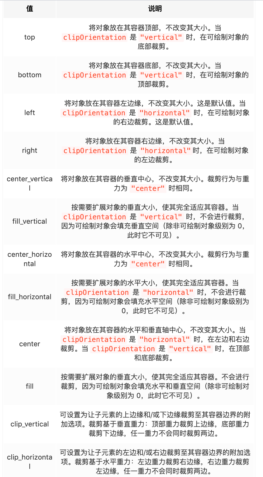
它的根标签为 <clip>,各个属性的含义分别是:
android:drawable
drawable 资源,可引用现有的的 Drawable
android:clipOrientation
剪裁方向,horizontal 表示水平方向剪裁,vertical 表示竖直方向剪裁
android:gravity
gravity 属性需要配合 clipOrientation 来使用,可以使用 | 符号组合使用,所有值的含义分别为:
|  |
案例
1
2
3
4
5
<?xml version="1.0" encoding="utf-8"?>
<clip xmlns:android="http://schemas.android.com/apk/res/android"
    android:clipOrientation="horizontal"
    android:drawable="@drawable/bg2"
    android:gravity="center" />
使用
1
2
3
4
5
6
7
8
9
10
11
12
13
14
15
16
17
18
<?xml version="1.0" encoding="utf-8"?>
<androidx.constraintlayout.widget.ConstraintLayout xmlns:android="http://schemas.android.com/apk/res/android"
    xmlns:app="http://schemas.android.com/apk/res-auto"
    android:layout_width="match_parent"
    android:layout_height="match_parent">

    <Button
        android:id="@+id/button"
        android:layout_width="200dp"
        android:layout_height="100dp"
        android:background="@drawable/clip_demo"
        android:text="Button"
        app:layout_constraintBottom_toBottomOf="parent"
        app:layout_constraintEnd_toEndOf="parent"
        app:layout_constraintStart_toStartOf="parent"
        app:layout_constraintTop_toTopOf="parent" />

</androidx.constraintlayout.widget.ConstraintLayout>
代码
1
2
3
4
5
6
7
8
9
10
11
12
13
14
15
16
17
18
19
20
21
22
23
class ClipDrawableActivity : AppCompatActivity() {
    lateinit var clipDrawable: ClipDrawable
    var curLevel = 0

    override fun onCreate(savedInstanceState: Bundle?) {
        super.onCreate(savedInstanceState)
        setContentView(R.layout.activity_clip_drawable)

        clipDrawable = findViewById<Button>(R.id.button).background as ClipDrawable
        clipDrawable.level = 0

        Observable.interval(50, TimeUnit.MILLISECONDS)
            .subscribeOn(Schedulers.io())
            .observeOn(AndroidSchedulers.mainThread()).subscribe {
                clipDrawable.level = curLevel
                curLevel += 200
                if (curLevel >= 10000) {
                    curLevel = 0
                }
                Log.e("gpj", "level ${curLevel}")
            }
    }
}
效果:
https://user-gold-cdn.xitu.io/2019/6/29/16ba291a4f1247bf?imageslim
RotateDrawable
与 ScaleDrawable 和 ClipDrawable 类似,RotateDrawable 可以根据 level 值将 Drawable 进行动态旋转。
语法
1
2
3
4
5
6
7
8
<?xml version="1.0" encoding="utf-8"?>
<rotate xmlns:android="http://schemas.android.com/apk/res/android"
    android:drawable="@drawable/drawable_resource"
    android:visible=["true" | "false"]
    android:fromDegrees="integer"
    android:toDegrees="integer"
    android:pivotX="percentage"
    android:pivotY="percentage" />
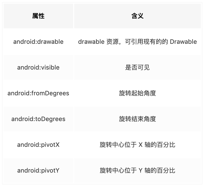
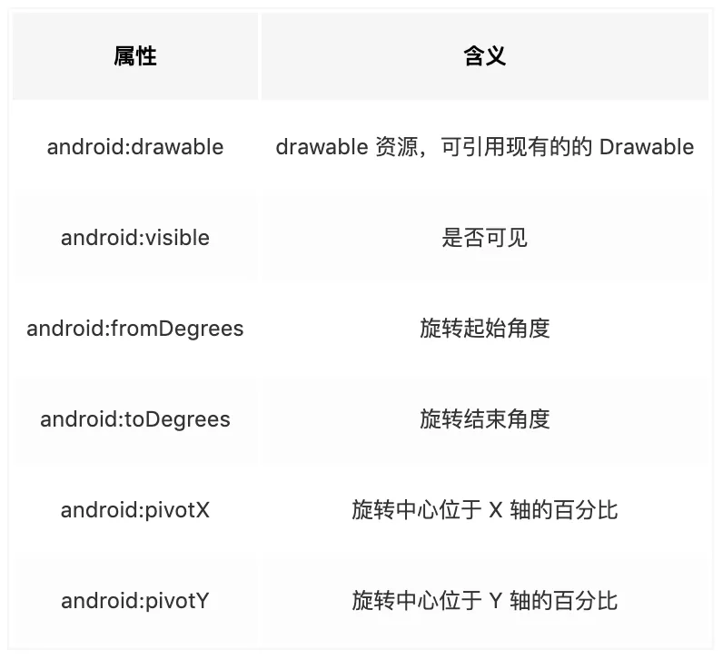
它的根标签为 <rotate>,各个属性的含义分别是:
案例
1
2
3
4
5
6
7
<?xml version="1.0" encoding="utf-8"?>
<rotate xmlns:android="http://schemas.android.com/apk/res/android"
    android:drawable="@drawable/bg2"
    android:fromDegrees="0"
    android:pivotX="50%"
    android:pivotY="50%"
    android:toDegrees="180" />
1
2
3
4
5
6
7
8
9
10
11
12
13
14
15
16
17
18
<?xml version="1.0" encoding="utf-8"?>
<androidx.constraintlayout.widget.ConstraintLayout xmlns:android="http://schemas.android.com/apk/res/android"
    xmlns:app="http://schemas.android.com/apk/res-auto"
    android:layout_width="match_parent"
    android:layout_height="match_parent">

    <Button
        android:text="Button"
        android:layout_width="200dp"
        android:layout_height="100dp"
        android:background="@drawable/rotate_demo"
        android:id="@+id/button"
        app:layout_constraintTop_toTopOf="parent"
        app:layout_constraintBottom_toBottomOf="parent"
        app:layout_constraintStart_toStartOf="parent"
        app:layout_constraintEnd_toEndOf="parent"/>

</androidx.constraintlayout.widget.ConstraintLayout>
1
2
3
4
5
6
7
8
9
10
11
12
13
14
15
16
17
18
19
20
21
class RotateDrawableActivity : AppCompatActivity() {
    private lateinit var rotateDrawable: RotateDrawable
    var curLevel = 0

    override fun onCreate(savedInstanceState: Bundle?) {
        super.onCreate(savedInstanceState)
        setContentView(R.layout.activity_rotate_drawable)
        rotateDrawable = findViewById<Button>(R.id.button).background as RotateDrawable
        rotateDrawable.level = 0

        Observable.interval(50, TimeUnit.MILLISECONDS)
                .subscribeOn(Schedulers.io())
                .observeOn(AndroidSchedulers.mainThread()).subscribe {
                    rotateDrawable.level = curLevel
                    curLevel += 200
                    if (curLevel >= 10000) {
                        curLevel = 0
                    }
                }
    }
}
TransitionDrawable(transition)
在两个图片切换的时候增加渐变效果,除了使用动画之外,这里还可以用 TransitionDrawable 轻松实现。
1
2
3
4
5
6
7
8
9
10
11
<?xml version="1.0" encoding="utf-8"?>
<transition
xmlns:android="http://schemas.android.com/apk/res/android" >
    <item
        android:drawable="@[package:]drawable/drawable_resource"
        android:id="@[+][package:]id/resource_name"
        android:top="dimension"
        android:right="dimension"
        android:bottom="dimension"
        android:left="dimension" />
</transition>
根标签为 <transition>,它可以包含多个 <item> 标签,每个 item 表示一个 Drawable,item 的属性含义分别是:
案例
1
2
3
4
5
<?xml version="1.0" encoding="utf-8"?>
<transition xmlns:android="http://schemas.android.com/apk/res/android">
    <item android:drawable="@drawable/kakarotto1" />
    <item android:drawable="@drawable/kakarotto2" />
</transition>
使用
1
2
3
4
5
6
7
8
9
10
11
12
13
14
15
16
17
<?xml version="1.0" encoding="utf-8"?>
<androidx.constraintlayout.widget.ConstraintLayout xmlns:android="http://schemas.android.com/apk/res/android"
    xmlns:app="http://schemas.android.com/apk/res-auto"
    android:layout_width="match_parent"
    android:layout_height="match_parent">

    <ImageView
            android:layout_width="230dp"
            android:layout_height="150dp"
            android:background="@drawable/drawable_transition"
            android:id="@+id/img"
            app:layout_constraintTop_toTopOf="parent"
            app:layout_constraintBottom_toBottomOf="parent"
            app:layout_constraintStart_toStartOf="parent"
            app:layout_constraintEnd_toEndOf="parent"/>

</androidx.constraintlayout.widget.ConstraintLayout>
代码
1
2
3
4
5
6
7
8
9
10
11
12
13
14
15
16
17
18
19
20
21
22
23
24
25
26
27
28
29
30
31
32
33
34
35
36
class TransitionDrawableActivity : AppCompatActivity() {
    lateinit var disposable: Disposable
    var reverse = false

    override fun onCreate(savedInstanceState: Bundle?) {
        super.onCreate(savedInstanceState)
        setContentView(R.layout.activity_transition_drawable)

        var transitionDrawable = findViewById<ImageView>(R.id.img).background as TransitionDrawable

        Observable.interval(3000, TimeUnit.MILLISECONDS)
            .subscribeOn(Schedulers.io())
            .observeOn(AndroidSchedulers.mainThread())
            .subscribe(object : Observer<Long> {
                override fun onSubscribe(d: Disposable) {
                    disposable = d
                }
                override fun onComplete() {
                }

                override fun onNext(t: Long) {
                    if (!reverse) {
                        transitionDrawable.startTransition(3000)
                        reverse = true
                    } else {
                        transitionDrawable.reverseTransition(3000)
                        reverse = false
                    }
                }

                override fun onError(e: Throwable) {
                }

            })
    }
}
Ref
- Android 这些 Drawable 你都会用吗?Part1
https://juejin.im/post/6844903877007900685
RippleDrawable
StateListDrawable
StateListDrawable 可以根据对象的状态并使用不同的 item(Drawable) 对象来表示同一个图形。如可以根据 Button 的状态(按下、获取焦点等)来显示不同的 Drawable 从而实现点击的效果。
语法
1
2
3
4
5
6
7
8
9
10
11
12
13
14
15
16
17
18
19
20
<?xml version="1.0" encoding="utf-8"?>
<selector xmlns:android="http://schemas.android.com/apk/res/android"
    android:constantSize=["true" | "false"]
    android:dither=["true" | "false"]
    android:variablePadding=["true" | "false"]
    android:autoMirrored=["true" | "false"]
    android:enterFadeDuration="integer"
    android:exitFadeDuration="integer">
    <item
        android:drawable="@[package:]drawable/drawable_resource"
        android:state_pressed=["true" | "false"]
        android:state_focused=["true" | "false"]
        android:state_hovered=["true" | "false"]
        android:state_selected=["true" | "false"]
        android:state_checkable=["true" | "false"]
        android:state_checked=["true" | "false"]
        android:state_enabled=["true" | "false"]
        android:state_activated=["true" | "false"]
        android:state_window_focused=["true" | "false"] />
</selector>
slector 标签
android:constantSize
由于 StateListDrawable 会根据不同的状态来显示不同的 Drawable,而每个 Drawable 的大小不一定相同,因此当 constantSize 属性的值为 true 时表示固定大小(值为所有 Drawable 固有大小的最大值),值为 false 时则大小为当前状态下对应的 Drawable 的大小。默认值为 false。
android:variablePadding
表示 StateListDrawable 的 padding 值是否随状态的改变而改变,默认为 false。
android:dither
是否开启抖动效果,默认为 true,建议开启。
android:autoMirrored
某些西亚国家文字是从右至左的,设置此值表示当系统为 RTL (right-to-left) 布局的时候,是否对图片进行镜像翻转。
android:enterFadeDuration 和 android:exitFadeDuration
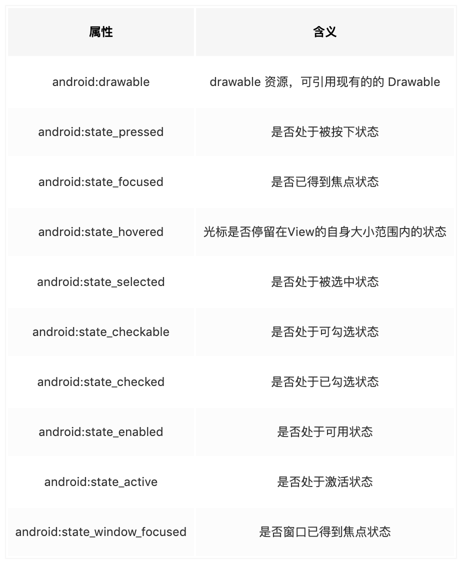
状态改变时的淡入淡出效果的持续时间
item 标签
每个 item 表示一个 Drawable,item 的属性含义分别是:
|  |
- android:state_pressed 设置是否按压状态,一般在 true 时设置该属性,表示已按压状态,默认为 false
- android:state_selected 设置是否选中状态,true 表示已选中,false 表示未选中
- android:state_checked 设置是否勾选状态,主要用于 CheckBox 和 RadioButton,true 表示已被勾选,false 表示未被勾选
- android:state_checkable 设置勾选是否可用状态,类似 state_enabled,只是 state_enabled 会影响触摸或点击事件,state_checkable 影响勾选事件
- android:state_focused 设置是否获得焦点状态,true 表示获得焦点,默认为 false,表示未获得焦点
- android:enabled
- android:state_activated 设置是否被激活状态,true 表示被激活,false 表示未激活,API Level 11 及以上才支持,可通过代码调用控件的
setActivated(boolean) - android:state_window_focused 设置当前窗口是否获得焦点状态,true 表示获得焦点,false 表示未获得焦点,例如拉下通知栏或弹出对话框时,当前界面就会失去焦点;另外,ListView 的 ListItem 获得焦点时也会触发 true 状态,可以理解为当前窗口就是 ListItem
案例
1
2
3
4
5
6
7
8
9
10
11
12
13
14
15
16
17
18
19
20
21
22
<?xml version="1.0" encoding="utf-8"?>
<selector
        xmlns:android="http://schemas.android.com/apk/res/android"
        android:visible="true"
        android:dither="true"
        android:autoMirrored="true"
        android:enterFadeDuration="200"
        android:exitFadeDuration="200" >
    <!--获取焦点状态-->
    <item
            android:state_focused="true"
            android:drawable="@drawable/shape_dark" />

    <!--按下状态-->
    <item
            android:state_pressed="true"
            android:drawable="@drawable/shape_dark"/>

    <!--默认状态-->
    <item
            android:drawable="@drawable/shape_light"/>
</selector>
https://user-gold-cdn.xitu.io/2019/6/29/16ba291a1a930d5b?imageslim
TextView 字体 Color Selector
1
2
3
4
5
<?xml version="1.0" encoding="utf-8"?>
<selector xmlns:android="http://schemas.android.com/apk/res/android">
    <item android:color="@color/white" android:state_selected="true" />
    <item android:color="@color/transparent_50_percent_white" />
</selector>
自定义 Drawable
Ref
- Android 13 种 Drawable,全面掌握!https://mp.weixin.qq.com/s/L572_c2xTssoiFd9ypsN5w