文字渐变
文字渐变
TextView 文字渐变
TextView 文字渐变
文字渐变基础
LinearGradient
是 Android 中用于实现线性渐变的核心类,通过定义起点、终点和颜色分布,可在 View 的绘制过程中实现颜色过渡效果
构造函数:
1
2
3
4
5
6
7
8
9
10
11
12
13
14
15
16
17
18
19
20
21
22
23
24
25
public LinearGradient(float x0, float y0, float x1, float y1, int[] colors, float[] positions, TileMode tile) {
    this(x0, y0, x1, y1, convertColors(colors), positions, tile, ColorSpace.get(ColorSpace.Named.SRGB));
}
public LinearGradient(float x0, float y0, float x1, float y1, long[] colors, float[] positions, TileMode tile) {
    this(x0, y0, x1, y1, colors.clone(), positions, tile, detectColorSpace(colors));
}
private LinearGradient(float x0, float y0, float x1, float y1, long[] colors, float[] positions, TileMode tile, ColorSpace colorSpace) {
    super(colorSpace);
    if (positions != null && colors.length != positions.length) {
        throw new IllegalArgumentException("color and position arrays must be of equal length");
    }
    mX0 = x0;
    mY0 = y0;
    mX1 = x1;
    mY1 = y1;
    mColorLongs = colors;
    mPositions = positions != null ? positions.clone() : null;
    mTileMode = tile;
}
public LinearGradient(float x0, float y0, float x1, float y1, int color0, int color1, TileMode tile) {
    this(x0, y0, x1, y1, Color.pack(color0), Color.pack(color1), tile);
}
public LinearGradient(float x0, float y0, float x1, float y1, long color0, long color1, TileMode tile) {
    this(x0, y0, x1, y1, new long[] {color0, color1}, null, tile);
}
参数说明:
(x0, y0):渐变起始点坐标(x1, y1):渐变结束点坐标color0:渐变起始颜色color1:渐变终止颜色long[] colors颜色数组,要和 positions 数量对应,否则报错float[] positions位置数组,要和 colors 数量对应,否则报错tile:填充模式(超出渐变区域的颜色填充模式)- CLAMP:边缘拉伸。使用边缘颜色对区域外的范围进行填充
- REPEAT:重复模式。在水平和垂直两个方向上重复填充
- MIRROR:镜像模式。在水平和垂直两个方向上以镜像的方式重复填充,相邻图像间有间隙
核心参数说明
- 起点与终点 (
x0, y0, x1, y1)- 定义渐变方向:从起点到终点的连线方向即为颜色过渡方向。
- 示例:
- 垂直渐变:
(0f, 0f, 0f, height)(从上到下) - 对角线渐变:
(0f, 0f, width, height)(左上到右下)
- 垂直渐变:
- 颜色数组 (
colors)- 必须至少包含两个颜色值,支持任意数量的颜色过渡。
- 颜色格式:ARGB(如
Color.argb(255, 255, 0, 0))或资源颜色(如Context.getColor(R.color.red))。
- 位置数组 (
positions, 可选)- 每个颜色对应的起始位置,范围为
[0, 1],例如:floatArrayOf(0f, 0.5f, 1f)表示三种颜色分别在 0%、50%、100% 的位置。
- 若为
null,颜色将自动均匀分布(如两种颜色各占 50%)。
- 每个颜色对应的起始位置,范围为
- 填充模式 (
Shader.TileMode)CLAMP:边缘颜色延伸填充超出区域。REPEAT:重复渐变图案。MIRROR:镜像重复渐变图案。
文字渐变使用
使用步骤
- 初始化 Shader : 在 View 尺寸确定后(如
onLayout或onSizeChanged)创建LinearGradient:
1
2
3
4
5
override fun onSizeChanged(w: Int, h: Int, oldw: Int, oldh: Int) {
    super.onSizeChanged(w, h, oldw, oldh)
    val gradient = LinearGradient(0f, 0f, w.toFloat(), 0f, colors, null, Shader.TileMode.CLAMP)
    paint.shader = gradient
}
- 应用到 Paint : 将
LinearGradient设置到 View 的Paint对象:
1
2
3
4
val paint = textView.paint.apply {
    shader = gradient
}
textView.invalidate() // 触发重绘
- 动态更新渐变(可选) 通过动画或用户交互动态修改渐变的起点、终点或颜色:
1
2
3
4
5
6
7
8
9
10
11
12
13
// 使用 ValueAnimator 实现颜色过渡动画
val animator = ValueAnimator.ofFloat(0f, 1f).apply {
    duration = 1000
    repeatCount = ValueAnimator.INFINITE
    addUpdateListener { anim ->
        val progress = anim.animatedValue as Float
        val endX = width * progress
        gradient = LinearGradient(0f, 0f, endX, 0f, colors, null, Shader.TileMode.CLAMP)
        paint.shader = gradient
        textView.invalidate()
    }
}
animator.start()
1、自定义 TextView 设置 LinearGradient,渐变是整体的
继承 TextView,重写 onLayout 方法后设置 Shader
1
2
3
4
5
6
7
8
9
10
11
12
13
14
15
16
17
18
19
20
21
22
23
24
25
26
27
28
29
public class GradientTextViewLayout extends androidx.appcompat.widget.AppCompatTextView {
    public GradientTextViewLayout(@NonNull Context context) {
        super(context);
    }

    public GradientTextViewLayout(@NonNull Context context, @Nullable AttributeSet attrs) {
        super(context, attrs);
    }

    public GradientTextViewLayout(@NonNull Context context, @Nullable AttributeSet attrs, int defStyleAttr) {
        super(context, attrs, defStyleAttr);
    }

    @SuppressLint("DrawAllocation")
    @Override
    protected void onLayout(boolean changed, int left, int top, int right, int bottom) {
        super.onLayout(changed, left, top, right, bottom);
        if (changed) {
            int startColor = Color.RED;
            int midColor = Color.GREEN;
            int endColor = Color.BLUE;
            getPaint().setShader(
                    new LinearGradient(0, 0, getWidth(), 0F,
                            new int[]{startColor, midColor, endColor},
                            new float[]{0F, 0.3F, 0.5F},
                            Shader.TileMode.CLAMP));
        }
    }
}
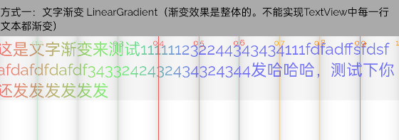
0.0RED[0.0f, 0.3f)RED→GREEN[0.3f, 0.5f)GREEN→BLUE[0.5f, 1.0f]BLUE
创建 LinearGradient 时,传入的起始坐标为 (0,0),结束坐标为 (getWidth(), getHeight()),所以渐变效果是从左上角向右下角渐变的:
改成从上往下渐变的效果:
1
2
3
4
getPaint().setShader(new LinearGradient(0, 0, 0, getHeight(),
        startColor,
        endColor,
        Shader.TileMode.CLAMP));

这种做法是为了获取 View 的宽或高作为 LinearGradient 的构造参数。如果渐变效果与 View 的宽或高无关,则无需使用此做法。
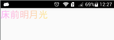
2、给 TextView 设置 Shader(所有文本渐变)
直接给 TextView 设置 Shader,无需自定义 TextView
1
2
3
4
5
6
7
8
9
10
11
12
val startColor = Color.RED
val endColor = Color.BLUE
val shader = LinearGradient(
    1000F,
    0f,
    1000F,
    binding.tvGradientDemo.lineHeight.toFloat() * 5,
    startColor,
    endColor,
    Shader.TileMode.CLAMP
)
binding.tvGradientDemo.paint.shader = shader
前 5 行渐变,从上到下:

多行渐变,效果不错。但是这种做法有一点缺陷,那就是所有文字都变成渐变色了。假设我们只需要部分字符是渐变色的话,这种方式就不太合理了。特别是在一些使用了 Span 的场景下。
注意在 onCreate 获取不到 widget 和 height 的情况
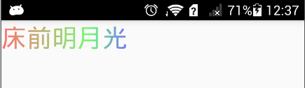
3、自定义 Span
参考官方 ForegroundColorSpan 的实现,在 updateDrawState() 方法中改变颜色
1
2
3
4
5
6
7
8
9
10
11
12
13
14
15
16
17
class LinearGradientForegroundSpan extends CharacterStyle implements UpdateAppearance {
    private int startColor;
    private int endColor;
    private int lineHeight;

    public LinearGradientForegroundSpan(int startColor, int endColor, int lineHeight) {
        this.startColor = startColor;
        this.endColor = endColor;
        this.lineHeight = lineHeight;
    }

    @Override
    public void updateDrawState(TextPaint tp) {
        tp.setShader(new LinearGradient(0, 0, 0, lineHeight,
                startColor, endColor, Shader.TileMode.REPEAT));
    }
}
文字渐变注意
布局时机
- 必须在 View 完成测量后 获取其宽高(
width/height),否则起点/终点坐标可能为 0。 解决方案:在onGlobalLayout回调中初始化 Shader:
1
2
3
4
5
6
textView.viewTreeObserver.addOnGlobalLayoutListener {
	textView.viewTreeObserver.removeOnGlobalLayoutListener(this)
    if (textView.width > 0) {
        // 创建 Shader
    }
}
颜色与位置数组匹配
colors和positions数组长度必须一致,且positions必须递增(如[0f, 0.3f, 1f])。
性能优化
- 避免在
onDraw()中频繁创建LinearGradient,应在初始化或尺寸变化时生成。 - 动态渐变时,尽量复用
Shader对象或控制刷新频率(如限制动画帧率)。
硬件加速兼容性
- 默认开启硬件加速,但某些
TileMode或复杂渐变可能导致渲染异常,可通过View.setLayerType(LAYER_TYPE_SOFTWARE, null)临时禁用硬件加速。
多行文本对齐
- 渐变方向会影响多行文本的每行颜色分布,需根据需求调整起点/终点坐标。
- 示例:垂直渐变每行文字颜色一致:
1
LinearGradient(0f, 0f, 0f, textView.height.toFloat(), colors, null, Shader.TileMode.CLAMP)
文字渐变小结
- 法一:渐变效果与 View 的宽或高相关。适用于所有文本整体渐变的场景
- 法二:渐变效果与行相关,每行的渐变效果一致。适用于每行文本渐变效果一致的场景
- 法三:用 Span 来实现,适用于局部文本渐变,多行文本渐变的场景
- 使用渐变效果会增加绘制成本,避免在列表或频繁刷新的界面中过度使用。
- 默认是横向(从左到右),可以调整坐标实现纵向(从上到下)或其他方向:
示例
从左到右
LinearGradient
- 2 种颜色
1
2
3
4
5
private void setTextViewStyles(TextView textView) {
	LinearGradient mLinearGradient = new LinearGradient(0, 0, textView.getPaint().getTextSize()* textView.getText().length(), 0, Color.parseColor("#FFFF68FF"), Color.parseColor("#FFFED732"), Shader.TileMode.CLAMP);
	textView.getPaint().setShader(mLinearGradient);
	textView.invalidate();
}
- 3 种颜色
1
2
3
4
5
6
7
private void setTextViewStyles(TextView textView) {
	int[] colors = {Color.RED, Color.GREEN, Color.BLUE};//颜色的数组
	float[] position = {0f, 0.7f, 1.0f};//颜色渐变位置的数组
	LinearGradient mLinearGradient = new LinearGradient(0, 0, textView.getPaint().getTextSize() * textView.getText().length(), 0, colors, position, Shader.TileMode.CLAMP);
	textView.getPaint().setShader(mLinearGradient);
	textView.invalidate();
}
自定义 GradientTextViewLayout
- 代码
1
2
3
4
5
6
7
8
9
10
11
12
13
14
15
16
17
18
19
20
21
22
23
24
25
26
27
28
29
public class GradientTextViewLayout extends androidx.appcompat.widget.AppCompatTextView {
    public GradientTextViewLayout(@NonNull Context context) {
        super(context);
    }

    public GradientTextViewLayout(@NonNull Context context, @Nullable AttributeSet attrs) {
        super(context, attrs);
    }

    public GradientTextViewLayout(@NonNull Context context, @Nullable AttributeSet attrs, int defStyleAttr) {
        super(context, attrs, defStyleAttr);
    }

    @SuppressLint("DrawAllocation")
    @Override
    protected void onLayout(boolean changed, int left, int top, int right, int bottom) {
        super.onLayout(changed, left, top, right, bottom);
        if (changed) {
            int startColor = Color.RED;
            int midColor = Color.GREEN;
            int endColor = Color.BLUE;
            getPaint().setShader(
                    new LinearGradient(0, 0, getWidth(), 0F,
                            new int[]{startColor, midColor, endColor},
                            new float[]{0F, 0.3F, 0.5F},
                            Shader.TileMode.CLAMP));
        }
    }
}
坐标 (0,0) 到 (width, 0),水平方向渐变;0F 表示红色,0.3F 表示绿色,0.5F 表示蓝色
- 效果
从上到下
- 代码:
1
2
3
4
5
6
7
8
9
10
11
12
val startColor = Color.RED
val endColor = Color.BLUE
val shader = LinearGradient(
	1000F,
	0f,
	1000F,
	binding.tvGradientDemo.lineHeight.toFloat() * 5,
	startColor,
	endColor,
	Shader.TileMode.CLAMP
)
binding.tvGradientDemo.paint.shader = shader
效果:

严格的颜色分界 (精确比例控制)
- 严格控制颜色分界技巧 前 2 个 color 设置为同一种颜色
- 代码
1
2
3
4
5
6
7
8
9
10
11
12
13
14
15
16
17
18
19
20
21
22
23
24
25
26
27
28
29
30
31
32
33
34
35
36
37
38
39
40
41
42
43
44
45
46
47
48
49
50
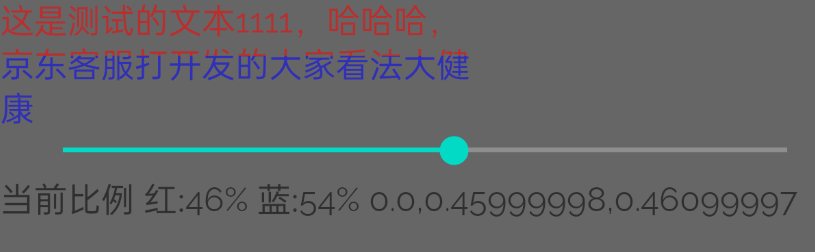
binding.seekBar.setOnSeekBarChangeListener(object : SeekBar.OnSeekBarChangeListener {
// 颜色配置
private val startColor = Color.RED
private val endColor = Color.BLUE
@SuppressLint("SetTextI18n")
override fun onProgressChanged(
seekBar: SeekBar?,
progress: Int,
fromUser: Boolean
) {
// 计算颜色分割点(反向比例:进度0=全红,进度100=全蓝)
val progressRatio = progress / 100f
val splitPoint = 1f - progressRatio
// 创建硬边渐变
val colors = intArrayOf(
startColor, // 0%位置颜色
startColor, // 分割点前颜色
endColor // 分割点后颜色
)
val positions = floatArrayOf(
0f, // 起始位置
splitPoint.coerceIn(0f, 1f), // 颜色分割点
(splitPoint + 0.001f).coerceAtMost(1f) // 避免位置重复
)
// 创建垂直渐变
val shader = LinearGradient(
0f,
0f,
0f,
tvGradient.measuredHeight.toFloat(), // 使用实际高度
colors,
positions,
Shader.TileMode.CLAMP
)
// 应用渐变
with(tvGradient) {
paint.shader = shader
invalidate()
}
// 更新比例显示(可选)
binding.tvProgress.text =
"当前比例 红:${100 - progress}% 蓝:$progress% ${positions.joinToString(",")}"
}
})
- 精确比例控制:
1
val splitPoint = 1f - progressRatio
- 进度 0%:splitPoint=1.0 → 全红
- 进度 100%:splitPoint=0.0 → 全蓝
- 进度 50%:splitPoint=0.5 → 红蓝各占一半
一个颜色逐渐改变的 textview,类似歌词效果

本文由作者按照 CC BY 4.0 进行授权