常用布局
常用布局
LinearLayout
android:layout_weight
特点
- LinearLayout 中的 layout_weight 属性,首先按照控件声明的尺寸进行分配,然后再将剩下的尺寸按 weight 分配。
- layout_width 都为 wrap_content 时,权重表示的是,按比例分配,值越大,占用的宽度(比例)越大
- layout_width 都为 match_parent 时,权重表示的是,优先级,值越大,优先级越小
- layout_width 为固定的值时,如 100dp 时,两个组件先占用 100dp,剩下的宽度根据组件的 layout_weight 的值来分配剩余的宽度,值越大,占用宽度越宽。
- 一般 layout_width 都为 0dp,权重值越大,占用空间越大
计算公式: 控件宽度+父控件剩余宽度*比例
剩下的空间有可能为负数,一般是设置 match_parent 了
width 为 0dp
1
2
3
4
5
6
7
8
9
10
11
12
13
14
15
16
17
18
19
20
21
22
23
24
25
26
27
<LinearLayout
        xmlns:android="http://schemas.android.com/apk/res/android"
        android:orientation="horizontal"
        android:layout_width="match_parent"
        android:layout_height="match_parent">
    <TextView
            android:layout_width="0dp"
            android:layout_weight="1"
            android:text="1234567"
            android:background="#f00"
            android:gravity="center"
            android:layout_height="48dp"/>
    <TextView
            android:layout_width="0dp"
            android:layout_weight="2"
            android:gravity="center"
            android:text="2"
            android:background="#0f0"
            android:layout_height="48dp"/>
    <TextView
            android:layout_width="0dp"
            android:layout_weight="2"
            android:text="3"
            android:gravity="center"
            android:background="#00f"
            android:layout_height="48dp"/>
</LinearLayout>
- 首先分配每个控件的 width 为 0dp,剩余 1080px
- 剩下的 1080px 按 weight 比例分配
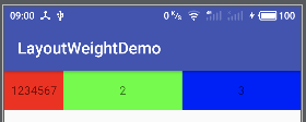
- 第一个 textview:
0+1080*(1/5) = 1080*(1/5) - 第二、三个 textview:
0+1080*(2/5) = 1080*(2/5)
width 为 match_parent
1
2
3
4
5
6
7
8
9
10
11
12
13
14
15
16
17
18
19
20
21
22
23
24
25
26
27
<LinearLayout
        xmlns:android="http://schemas.android.com/apk/res/android"
        android:orientation="horizontal"
        android:layout_width="match_parent"
        android:layout_height="match_parent">
    <TextView
            android:layout_width="match_parent"
            android:layout_weight="1"
            android:text="1234567"
            android:background="#f00"
            android:gravity="center"
            android:layout_height="48dp"/>
    <TextView
            android:layout_width="match_parent"
            android:layout_weight="2"
            android:gravity="center"
            android:text="2"
            android:background="#0f0"
            android:layout_height="48dp"/>
    <TextView
            android:layout_width="match_parent"
            android:layout_weight="2"
            android:text="3"
            android:gravity="center"
            android:background="#00f"
            android:layout_height="48dp"/>
</LinearLayout>
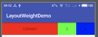
- 剩余空间:
1080-3*10180 = -2*1080 - 第一个 textview:
1080+(-2*1080)*(1/5) = 1080*(3/5) - 第二、三个 textview:
1080+(-2*1080)*(2/5) = 1080*(1/5)
LinearLayoutCompat
1、 应用
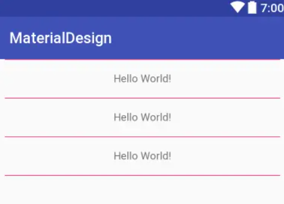
在布局当中使用 分割线 区分每个 Item 布局;这样的实现同样还减少了 View 的绘制。那么 Google 在 support.v7 当中提供了 LinearLayoutCompat 这样的一个控件
2、属性
| 标签 | 属性内容 |
|---|---|
| app:divider | 设置分割线的样式支持自定义 drawable |
| app:dividerPadding | 设置分割线两端的距离 |
| app:showDividers | 设置分割线显示的位置 [beginning middle end none] |
3、案例
1
2
3
4
5
6
7
8
9
10
11
12
13
14
15
16
17
18
19
20
21
22
23
24
25
26
27
28
<?xml version="1.0" encoding="utf-8"?>
<android.support.v7.widget.LinearLayoutCompat xmlns:android="http://schemas.android.com/apk/res/android"
    xmlns:app="http://schemas.android.com/apk/res-auto"
    android:layout_width="match_parent"
    android:layout_height="match_parent"
    android:orientation="vertical"
    app:divider="@drawable/bootom_line"
    app:dividerPadding="10dp"
    app:showDividers="middle|end">

    <TextView
        android:layout_width="match_parent"
        android:layout_height="50dp"
        android:gravity="center"
        android:text="Hello World!" />

    <TextView
        android:layout_width="match_parent"
        android:layout_height="50dp"
        android:gravity="center"
        android:text="Hello World!" />
    <TextView
        android:layout_width="match_parent"
        android:layout_height="50dp"
        android:gravity="center"
        android:text="Hello World!" />

</android.support.v7.widget.LinearLayoutCompat>
4、效果
RelativeLayout
- android:layout_above 将该控件的底部至于给定 ID 的控件之上,但不会左对齐,默认置于父窗口最左边,会覆盖最左边的控件
- android:layout_below 将该控件的顶部至于给定 ID 的控件之下,但不会左对齐,默认置于父窗口最左边,会覆盖最左边的控件
- android:layout_toLeftOf 将该控件的右边缘和给定 ID 的控件的左边缘对齐,默认置于父窗口最上面,会覆盖最上面的控件 android:layout_toRightOf 将该控件的左边缘和给定 ID 的控件的右边缘对齐,默认置于父窗口最上面,会覆盖最上面的控件
- android:alignParentBottom 如果该值为 true,则将该控件的底部和父控件的底部对齐,默认置于父窗口最左下,会覆盖最左下的控件
- android:layout_alignParentLeft 如果该值为 true,则将该控件的左边与父控件的左边对齐,默认置于父窗口最左上,会覆盖最左上的控件
- android:layout_alignParentRight 如果该值为 true,则将该控件的右边与父控件的右边对齐,默认置于父窗口最右上,会覆盖最右上的控件
- android:layout_alignParentTop 如果该值为 true,则将控件的顶部与父控件的顶部对齐,默认置于父窗口最左上,会覆盖最左上的控件
- android:layout_alignBaseline 该控件的 baseline 和给定 ID 的控件的 baseline 对齐,并置于父窗口最左边,会覆盖最左边的控
- android:layout_alignBottom 将该控件的底部边缘与给定 ID 控件的底部边缘对齐,并置于父窗口最左边,会覆盖最左边的控件
- android:layout_alignLeft 将该控件的左边缘与给定 ID 控件的左边缘对齐,并置于父窗口最上边,会覆盖最上边的控件
- android:layout_alignRight 将该控件的右边缘与给定 ID 控件的右边缘对齐,并置于父窗口最上边,会覆盖最上边的控件
- android:layout_alignTop 将给定控件的顶部边缘与给定 ID 控件的顶部对齐,并置于父窗口最左边,会覆盖最左边的控件
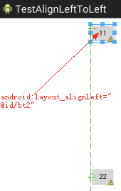
android:layout_toLeftOf 和 android:layout_alignLeft 区别
- android:layout_toLeftOf=”@id/safe_textview” 该组件的右边和指定组件的左边对齐,默认在 Top 位置
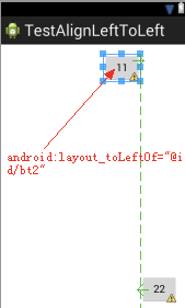
- android:layout_alignLeft=”@id/safe_textview” 该组件的左边和指定组件的左边对齐,默认在父组件的 top 位置
布局层级
Android view 层级
后布局的 View 显示在线布局的 view 上面
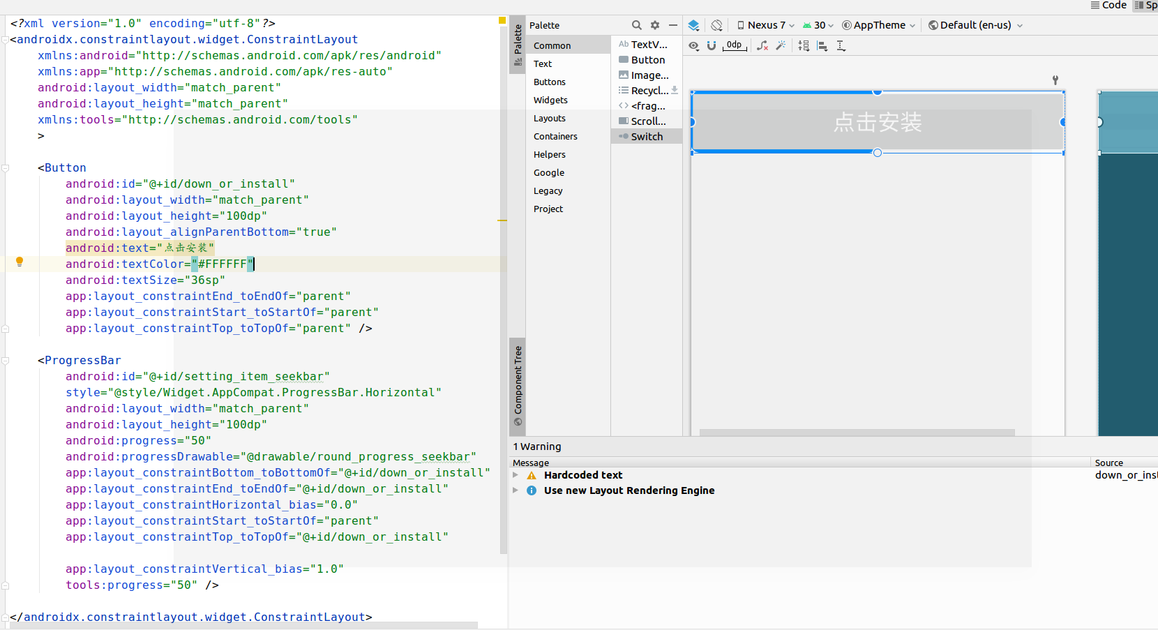
Button 导致的层级问题
Button 不管先布局还是后布局,总是显示在最上层
- 原因:
Button 有个默认的 elevation,默认为 2dp - 解决
其他 view 也设置 elevation 属性,比 Button 默认的 2dp 大,就可以了
ProgressBar 不能在 Button 上面显示
- 原因
Android 5.0 之后,Button 默认有 Z 轴方向的位移。 - 解决方法:
android:translationZ="2dp"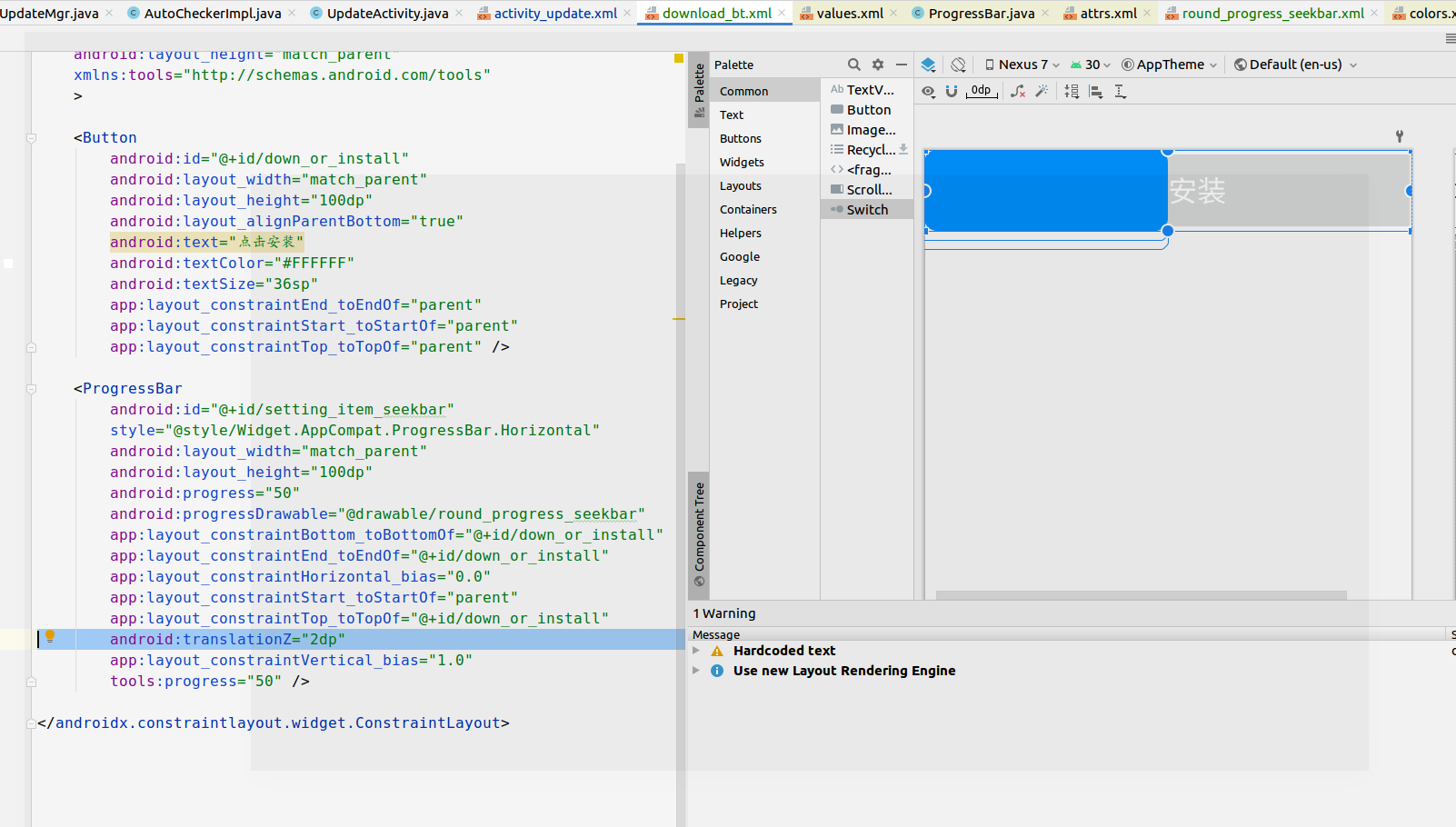
本文由作者按照 CC BY 4.0 进行授权